Fast because you had to fast for 24 hours before you get your next news hit on 10???
Doesn’t really seem to give any reason to watch tbh.
Off topic in this thread, but FAST channels are meant for passive easy watching… they’re not must watch first-run tv.
It’s just a way to create additional ways for people to watch (particularly interstate news or stories) and utilising the content they’re producing in different ways.
It would be a very cheap way to appear they’re producing more than they are and reinforce their news brand if that was a key focus for them.
And now it’s Channel 5’s turn for the CBS Evening News graphics… if they (ever) wished/have the finances to do in-depth reporting.
Title - using the (kinda) circular negative space in the 5 numeral, encased by a simple circle as the gradients didn’t really work. The domes from the top are an homage to their 2003 intro, with the wordmark repeated and dropped down.
The graphics, largely modified from the official accord or my own spin on Weekend News. 5 News has a 5 Things You Need to Know segment, which kind of shares the same name with Evening News Plus (3 Things).
For Breaking News, I know CBS uses red for its coverage, but I wanted to retain C5’s yellow tone for it to stand out from the news channels (also bright red supers is a nuisance cough BBC News cough). I also think putting the headline text in italics also distinguishes it from the normal reporting.
Some graphics 7 could try out for the AFL season based off their refreshed 7Cricket package.
Spent majority of the afternoon putting these all together ![]()
Used Canva to make it so if you feel like you can improve them in Photoshop or something go for it ![]()
The Alister Nicholson who commentates for Seven is not to be confused with the former Melbourne AFL footballer (Alistair Nicholson).
Also, you got the two teams swapped around, Brisbane is supposed to be the home side.
Otherwise, a pretty good concept with the graphics.
Oops. Goes to show how much AFL I watch when not engaging in MS discussion!
Don’t mind some of this, would def prefer a different scoreboard style than it being “G / B / T” vs “T / G / B” though just for readability
It’d be G/B/T on each side:
One on the end would be G
Centre one would be B
And the one closest to the clock would be T
Am I missing something but would that still not read as backwards for the right hand side club?
Actually, now that I think about it - yes ![]()
You’d only look at the figures next to the clock portion most of the match I’d assume (I don’t watch AFL)
Might have to rejig it.
started on a new 10 mock - got some ambitious stuff, but it’s my vision on how 10 News should be if they weren’t on a tight budget, just title cards/promo graphics at the moment, but more stuff on the way!
an easy way to get back into the brekky scene - taps into CBS resources, and cheap to produce hourly quick noodle updates from 10 News as well for Aussie headlines too.
also a custom ticker during CBS programming
the afternoon bulletin stays, but the 3:30pm bulletin doesn’t
the 5PM bulletin
8:30pm primetime bulletin instead of the late news
and finally, the return of MTP!
I can’t imagine there would be enough attachment to the old brand to not just use “Face the Nation”. It’s kinda a stronger brand anyway.
cursed geelong logo
(i do like the rest, well done)
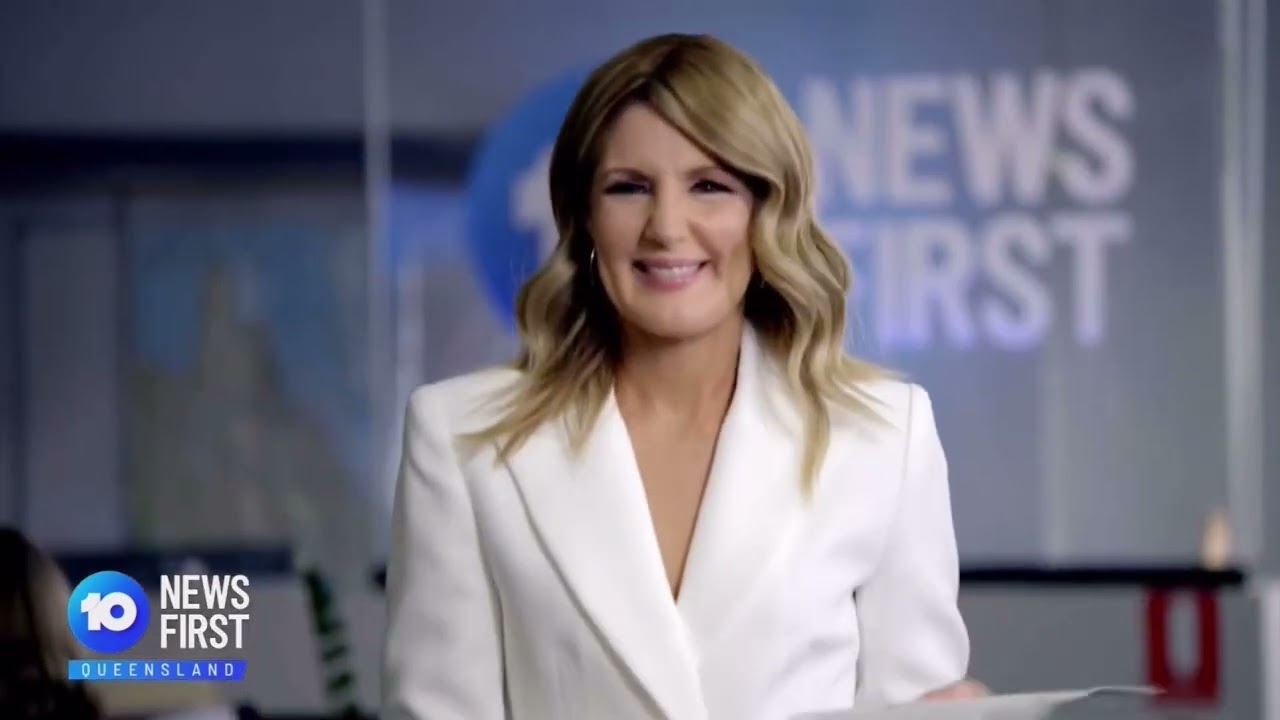
5 minute mock: if 10 News First QLD used their news theme in tonight’s opener.
Original vision: @TV.Cynic Music: @WAtvVideos
Looks good. The only thing I would suggest is to slightly raise the left side of the cross-stroke of the ‘A’ to follow the curve.
Like the all-orange logo more - the black/orange combo looks more like a heavy machinery brand somehow ![]()
Saw the discussion on LocalNewsTalk about CBS’ confusing weekday breakfast show names (News Mornings at 5 on network, then Morning News at 7 on streamer) and came up with this…
Chose Daybreak because words that mean ‘first thing in the morning’ are either occupied (First by ABC, Early and previously Sunrise by NBC) or not that good (e.g. CBS Mornings at Dawn). Eye Opener can be a streaming extension to the headline sequence on the main show, which I think makes sense given how ABC rebranded America This Morning with a GMA segment.
Daybreak can be positioned as catching up on different time zones, then Eye Opener as a fast-paced, ‘all you need to know’ show with brief headlines and lighter stories.
Wanted the titles to deviate a bit from the CBS Mornings orange. Daybreak was slightly inspired by Early Today’s blue backdrop with a rising sun symbol, and the arches kind of form the C in CBS. For Eye Opener, I simply carried the updated screen graphics over.
Also links to breaking news - which I wish a news network would use as it has a great slogan opportunity of “As the day breaks, so does news. Starts your day informed with Daybreak”


