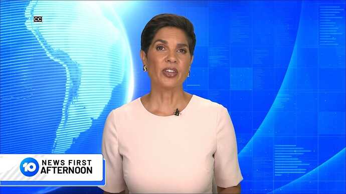
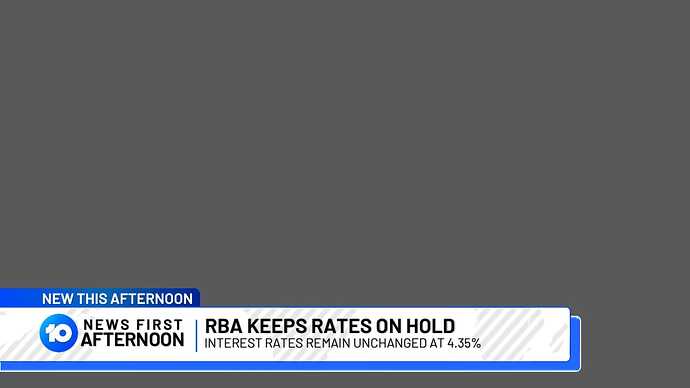
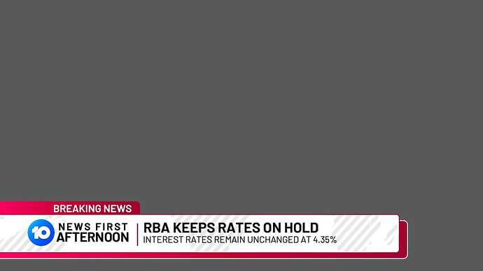
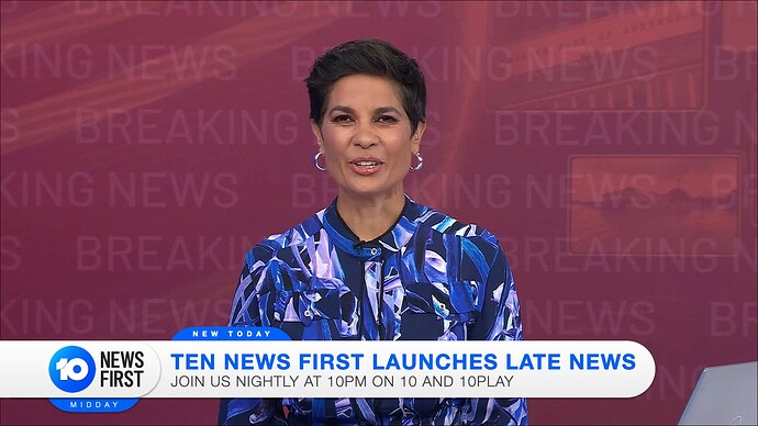
Really love the bones of this! You could mess around with the fonts a bit perhaps, but is a nice evolution of the current graphics, good work.
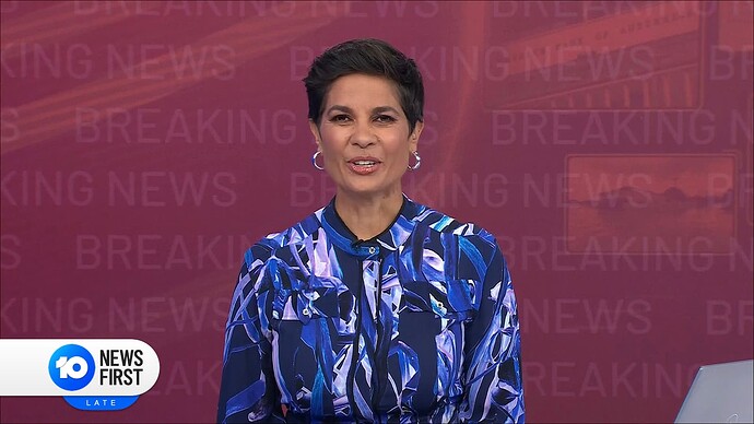
Did a little mockup when the new CBS Mornings ticker was out on TVNewsTalk before the main supers…
Like what I said on the CBS News thread, I felt its pointy end looks like 10 News, so I tried some of its aspects like the gradients on the headline.
The colour around the edge was originally a strip at the end, but I figured it should be in the same style as the ticker. Also following it was the straight edge between the brand and the headline, contrary to 10’s slanted one.
Fun fact: I originally positioned the Mornings wordmark under a gigantic CBS logo, but I decided to stack it up and added the sun icon underneath - basically calling the official version ![]()
This is amazing!
I’m not a big fan of the spacing used for “News First” but other then that this looks really good.
I don’t mind it, nice refresh.
Though the bottom line of the strap would need to be slightly bolder IMO.
@killy06 And what about the font? It looks different from Network 10’s and seems to be unmatched.
I think that’s the point @PaddyTePou, it’s a refresh so nice to see a new typeface used.
Matches the 10 logo and a nice spin on the CBS super update. Maybe a touch too much white space in the strap. You either need a taller font or less kerning with the font bigger. Maybe bold the second line so it’s not lost.
Looks great.
Only thing I think it needs is all of the light weight text to be bold. It’s not legible enough.
Interesting concept - not sure about the font choice though, too different from the News First text.
Also the “Afternoons” doesn’t work with that alignment.
This is pleasing to the eye.
Is it necessary at all? The mock looks much cleaner than what they currently have but why do 10 even have it at all? It’s obviously a bulletin at XX time of day.
Thanks for all the feedback everyone. Agree re the fonts; was trying something different by having it light weight but think it’s more legible bold. Dropped the bulletin title too.
Looks awesome great work.
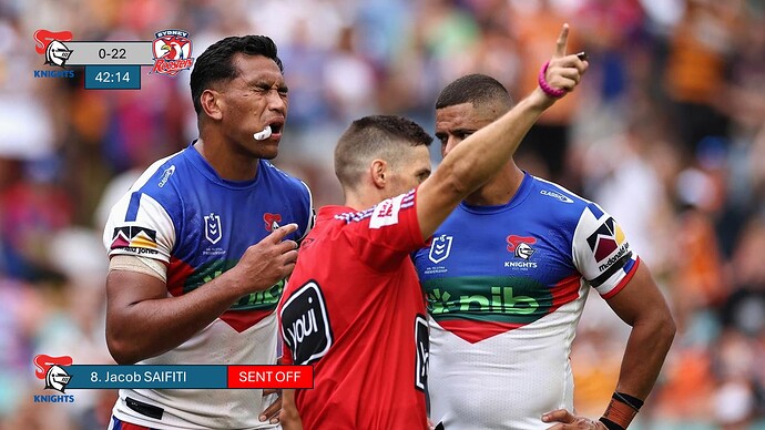
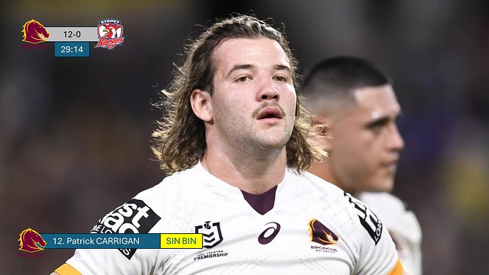
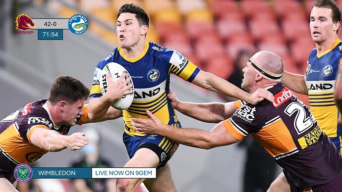
My version of the new NRL graphics:
Intro
Commentators/Golden Point Super
Player sent off Super
Player sin binned Super
Player stats Super
In-program sporting event Super
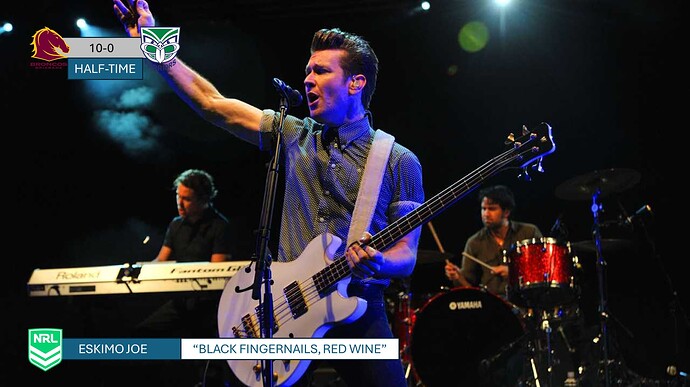
Musical performance
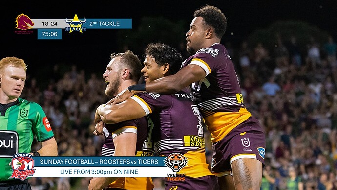
Sunday Football Super
Nine News advisory Super
Basically, the less space used on the graphics supers, the better.
Sorry the font weight is way too light and the colour scheme is too hard to distinguish from the field.
I would agree with the font, it’s too light for the use case. The grey on the scorebug is inconsistent with the rest of the colour scheme and overall it swings too far to the simple side. Plus, the layout of the scorebug seems more suited to soccer than rugby league.
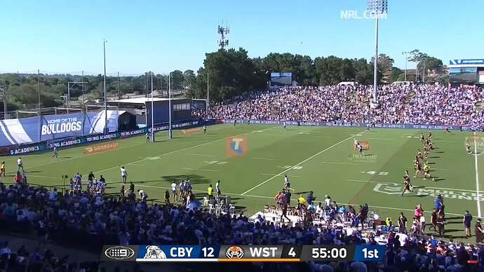
OK, now you have got me thinking about mock scorebugs. Here is a rough first go. Thought I would base my idea off of the NBC Sunday Night scorebug from 2018-21:
I like the idea of the team logos extruding out of the graphics, but eligibility wise they might need a thick white outline.


