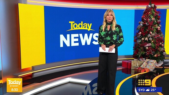
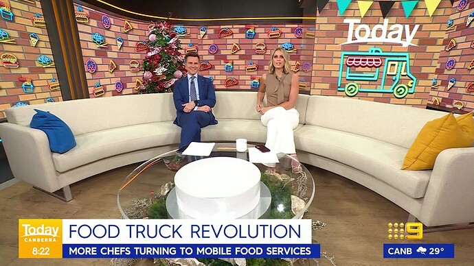
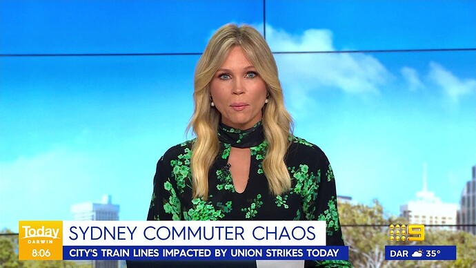
Version 2 - tried to distinguish the show text even more and better integration of the 9/9Now logo.
This looks great. exactly what I think nine should do.
Looks great. There still needs to be more of a dark shade or something behind the shows title, it’s still too hard to read
Looks great, but I can’t imagine Nine using the circle; that element is probably best left to 10, but it could work with some of the other networks main channel logos (any with a generally as-wide as as-tall logo rather than Nine’s wider-than-tall logo).
The circle sure isn’t something nine would generally do but even without the circle it looks great especially the good doctor program promo.
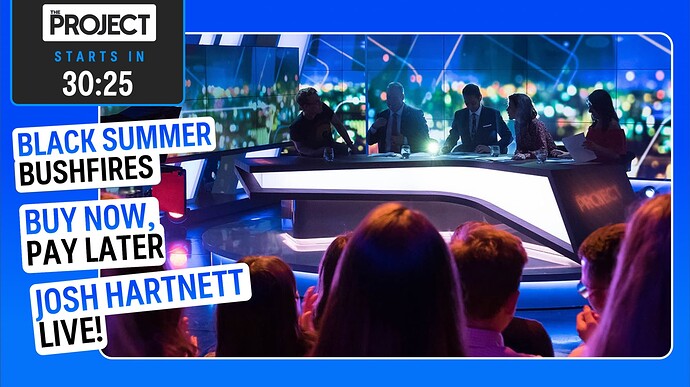
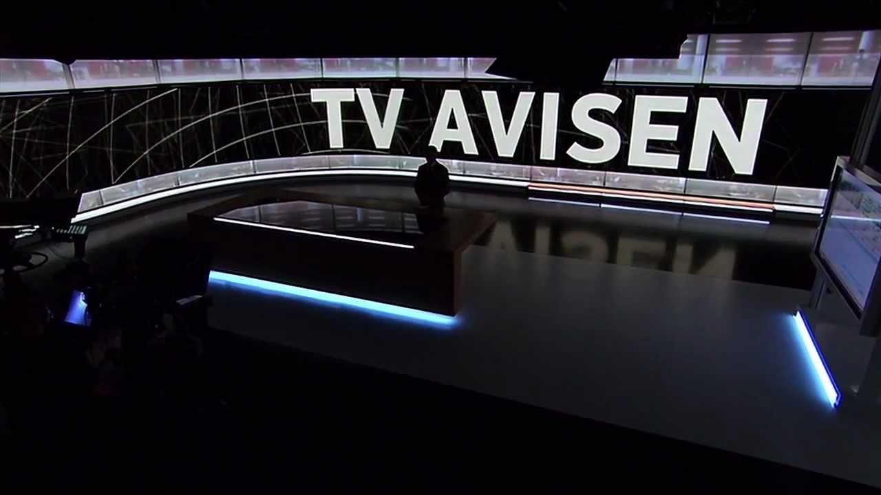
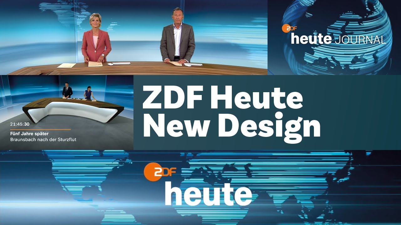
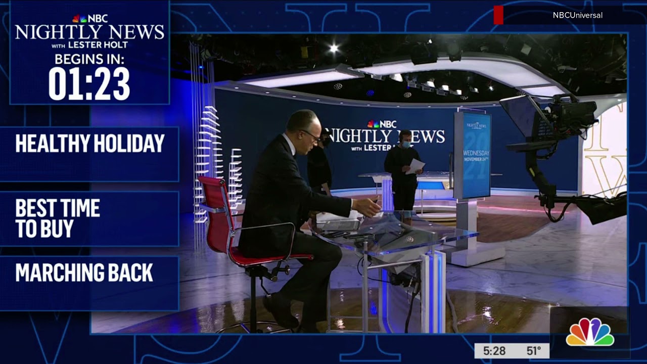
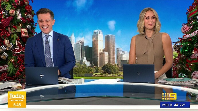
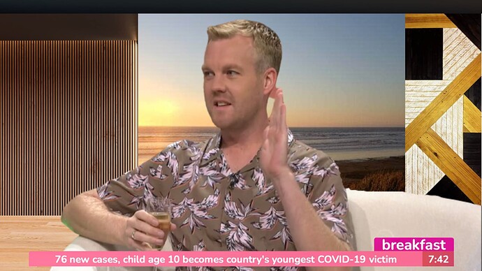
Reading this article, it got me thinking that 10 could do something similar for the project as part of 10 News First. So I mocked this up:
With a script something like this:
The Project is coming up straight after 10 News First, as we take a live look at Walleed & the team preparing for tonight’s show. Tonight, they survived the worst fires in Australia’s history. But now, almost 2 years on, why do they seem to be all but forgetten? Plus an important warning about the Buy Now, Pay Later trap this Christmas, and Hollywood heartthrob Josh Hartnett joins them live. That’s all coming up in just over 30 Minutes Time on The Project, straight after 10 News First
That’s just weird.
Why is it weird?
Yeah but I’d just rather they cross to them to do a 30 second preview.
Ah ok. I’ve never seen it before that this that’s all! 
Understood. But I just saw it and thought it was cool, and 10 could easily do that.
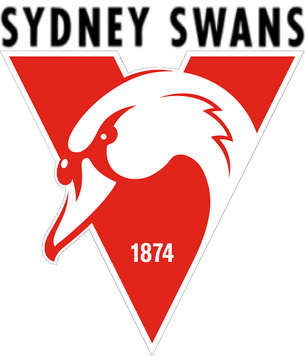
The current Sydney Swans logo, with the SYDNEY SWANS text from the 1997-2020 logo replacing the red SYDNEY from the current logo.
I wonder when the Saints and the Bombers will update their logos.
Essendon updated there’s this year for our anniversary.
