That would roll off the tongue better than ABCTVPlus.
6 Likes
So so so much better!
5 Likes
Brilliant! Could you try making one with “TWO” written? I’m thinking when ABC is written it looks better with a numerical 2 but if the logo is used it might look better with “TWO” spelled out (i.e. ABC2 vs [~]TWO). Especially since none of ABC’s other multichannels use numerals in their logo anymore.
4 Likes


Love it! Big improvement IMO.
7 Likes
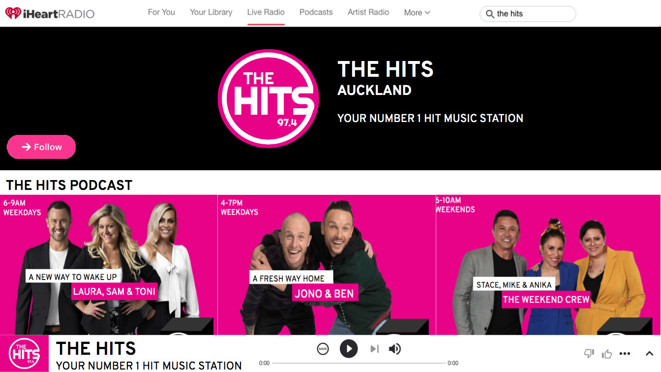
I was just playing around with The Hits (NZ) Logo (I made) and website. I also change the shows because i feel like they need some change for 2021. Feedback welcome 


5 Likes
Kickstart you afternoon?
3 Likes
![]()
3 Likes


2 posts were merged into an existing topic: Mock news presenting/reporting teams
workshopping some ideas for BBC1, want to work on them here before I move the final ideas to TV Forum - thoughts?
idea 1:

idea 2:

15 Likes
Love both! The first idea is the best in my opinion, much simpler
Maybe mix idea 1 text to the image on idea 2
3 Likes


this looks awesome
5 Likes
That colour scheme though… ![]()
8 Likes
I’d watch that.
9 Likes
This is amazing! 
I love a good colour gradient, and you’ve certainly delivered!
3 Likes


MUCH MORE ACCEPTABLE ON TELEVISION!!!
(love that logo, have you got a transparent png file of the logos?)
2 Likes
Certified freak, seven days a week!
Wet Ass Pussy, make that pull out game weak!
7 Likes