If you’re a fan of 70s, 80s and 90s US local news presentation:
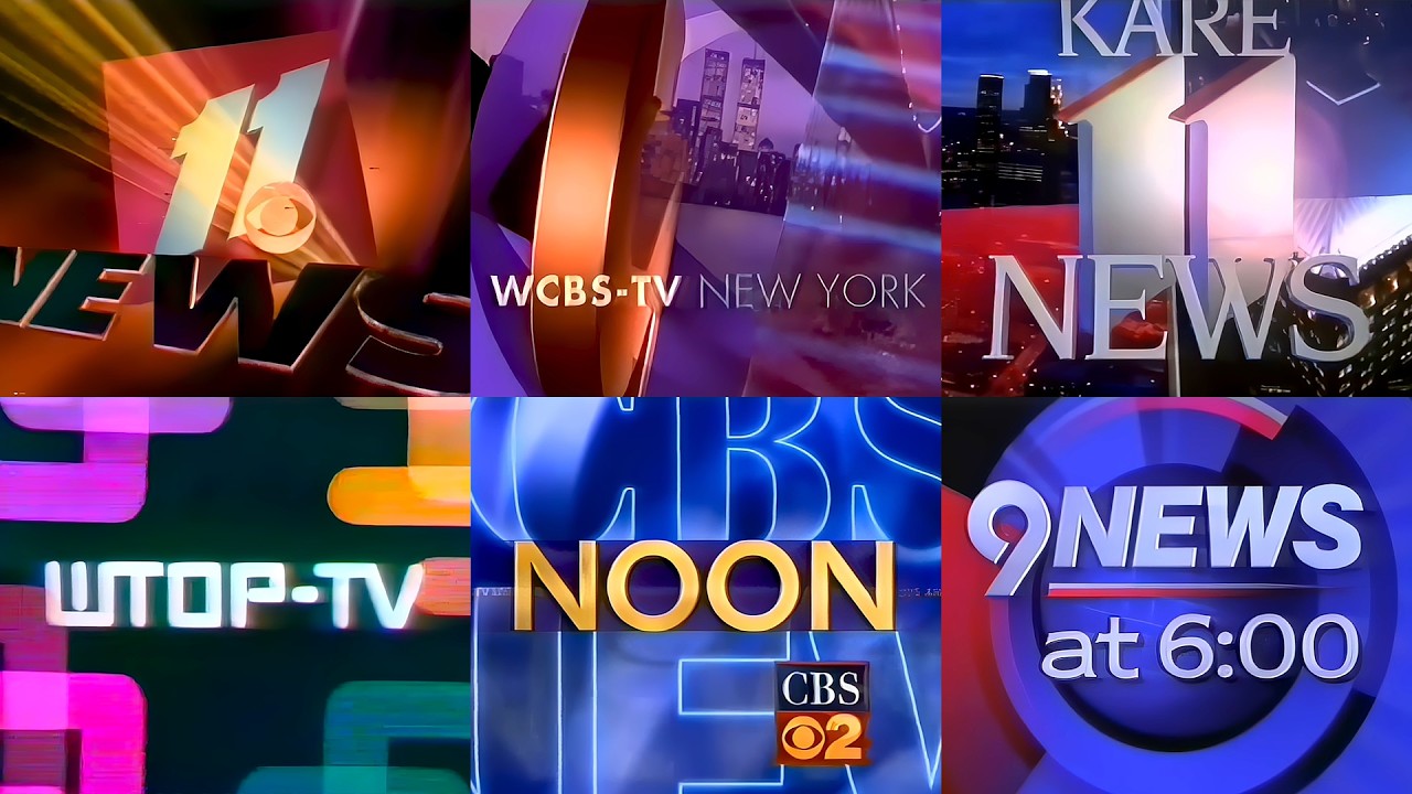
If you’re a fan of 70s, 80s and 90s US local news presentation:
Do you like your British TV clocks?
With the local council election underway in the UK, here’s an excellent write-up on the BBC’s election sets since the 50s. Not surprisingly scathing review on the one they’re using now…
Video
On this day in 1986, the peacock made its official appearance in the NBC logo. Since then, it's become an iconic part of our brand and a familiar sight to our dedicated viewers. #NBC100 pic.twitter.com/O13HUlAIkl
— NBC Entertainment (@nbc) May 22, 2026
Was much earlier than 1986 i thought?
Wasnt it introduced at the start of colour television? I think they’re talking about the current version of the logo
This is from a couple of weeks ago - with a slightly different anniversary date.
But although NBC first started using a peacock to promote color TV in 1956, the ubiquitous six-feathered Peacock everyone now identifies as NBC’s logo didn’t premiere until forty years ago today.
The Peacock as we now know it was first introduced on screen on May 12, 1986, at the very end of the star-studded “NBC 60th Anniversary Celebration” special. The event, hosted by “The Cosby Show” stars Malcolm-Jamal Warner and Keshia Knight Pulliam, featured some of the most iconic NBC stars of all time: Bob Hope, Milton Berle, Sid Caesar, Johnny Carson, Jack Paar, Steve Allen and more. At the end of the three-hour special, a crowd of NBC stars gathered to sing a tribute song to the network — as they surrounded the new NBC logo, the first time that version of the Peacock had been seen.
Actually, there was a predecessor to the Peacock when colour TV started: it was a stylised xylophone and mallet design which symbolised the famous chimes. Despite some indication that the xylophone was used at 5:32pm on December 17, 1953, to formally symbolise the approval by the FCC of a colour TV standard for the U.S., most say that the logo debuted on the 1954 Rose Parade, where colour TV finally started experimental broadcasts in America, though there is no clarity on the logo’s real original broadcast.
That colour TV standard was the NTSC system, which had been developed by the FCC as a compromise to resolve conflicts between RCA and Philco; the former was testing a 441-scan line standard, and the latter wanted to increase to the lines to between 605 and 800; both systems had technical inaccuracies, and CBS had also developed a 405-line system in 1950 which had been approved by the FCC and tested by NBC, but ultimately rescinded the system in 1953, citing incompatibilities with black and white sets, instead preferring the NTSC system, which NBC named as “compatible colour”, which would be developed by a consortium led by RCA and Philco. After tests, NBC started airing regular OTA broadcasts in colour that same fall.

After two years using the xylophone logo, NBC wanted an improved logo to promote increased adaptation of colour TV sets; NBC was slowly starting to air regular prime time programming in colour, with a full switch happening ten years later. As a result, network art director John J. Graham asked Herb Lubalin, then a designer at Sudler & Hennessey, to design a new logo to be used before colour programming and also as a marketing tool to promote the purchase of colour sets. Lubalin came with the idea of a peacock, and designed an eleven-feather bird which indicated an idea of “richness in colour”. Graham made some minor modifications before the emblem went on-air on May 22, 1956.
During the first few months, the peacock was static, and featured an announcement saying that the show had been filmed and broadcast “in compatible color, pioneered and developed by RCA”, boasting NBC’s parent company’s involvement in the development of NTSC. Within a few months, however, the familiar “living color” announcement made its appearance.
It was on September 7, 1957, before an episode of variety show “Your Hit Parade”, that the peacock became animated. The first version, often named as the “Bonanza Peacock” because of its association with the high-rated and ground-breaking Western drama, which was produced by the network’s NBC Films syndication division, and having debuted two years after the animated peacock’s introduction, being filmed in colour from the outset, involved the feathers of the peacock changing, from a black-and-white outline, to full colour, and spreading out before morphing to the peacock design. The animation was made by Elektra Films using cel-based animation.
Normally, the animation was accompained by a strident musical backing, starting with a gong and then crescendoing to a nine-note bombastic orchestral fanfare, all to an agressive VO speaking the “living color” announcement. According to Game Show Network executive David Schwartz, the announcer might had been Ben Grauer, an NBC staff announcer since 1930. With all the aggressive animation and music, the peacock looked quite eery and scary on screen.
Sometimes this same animation was shown with different music and announcers, often played live: once the announcement could be made with a big band tune based around the NBC chimes for the Steve Allen Show, with the announcement made live by his announcer Gene Rayburn; or, in Howdy Doody, the animation was shown with a special guitar song performed by the cast of the show. Sometimes, the animation was shown with no music, with a different announcer, Bill Hanrahan, another NBC staff announcer, speaking the “living color” announcement; his rendition was known for emphasizing the “N-B-C” part.
However, in 1962, it was decided to make an update to the animation, with Elektra Films again handling the job: the “Laramie Peacock”, the most famous version of the “living colour” animation, came to air during the final season of the Western drama that gave its name: Laramie. Unlike the prior version, the animation and music were gentler and softer: it was done with cels, with a kaleidoscopic colour background eventually morphing into the peacock’s form, accompaing by a soft, woodwind-based music cue, and the calmer voice of Mel Brandt, another NBC staff announcer, as VO.
With NBC in the process of fully converting to full colour ongoing, with most prime time, news and sports programming having coverted to the format by 1965, the “Laramie Peacock” started to lose prominence on screen. As such, it became only used to introduced NBC-produced shows, plus the broadcasts of special events, including The Wizard of Oz and Peter Pan. In April 1968, the animation was shortened to only the final 3 seconds, with a shorter, faster and lower-pitched version of the music.
The symbol was also parodied or adapted in numerous forms: the most famous was before Rowan and Martin’s Laugh-In, where the peacock sneezed after the animation, with the feathers flying off and the peacock clearly being puzzled; this was very clearly plastered at the end of the normal animation, as the feathers have brighter and cooler colouring than normal. In other parody, before the broadcast of The Beatles’ A Hard Day’s Night, which was filmed in black-and-white, NBC embraced the fact that the film was monochrome, and a caption announcing the preemption of I Dream of Jennie and The Jerry Lewis Show was pushed by a penguin in a top hat, flapping its wings, in clear imitation of the peacock. Furthermore, the penguin unzipped his chest to reveal the Beatles.
Further parodies included one in 1972 where a person disguised in a red chicken suit was posing as the peacock, only to be removed by a cane; that was used to introduced a preview of Saturday morning kids’ programming that year. Another one aired in May 23 and June 12, 1970, which was more serious in tone: it was animated by Jean Falcone, then a 6-year-old member of a children’s filmmaking workshop, Yellow Ball Workshop, under instruction of Yvonne Andersen, the workshop’s founder. Despite three more logos being produced, Falcone’s version of the peacock was the only one used by the network. It was used to introduce The New Communicators, two specials produced by Lee Mendelson and introduced by Peter Fonda, which showcased the works and profiles of young filmmakers.

The longevity of the animation, which from 1959 was paired with the “snake” typographic anagram designed in-house by Graham (normally used for promos and production endcaps at the time), led to the network continuously bringing back the “Laramie Peacock” in following years, particularly as part of nostalgia promotion and/or to commemorate a significant event on NBC’s schedule, for example, during the premiere of The Tonight Show with Conan O’Brien in 2009, or to promote the NASCAR Darlington throwback round from 2015 to 2020.
Its most recent appearance was before the 2024 airings of Rudolph the Red-Nosed Reindeer, Frosty The Snowman and How the Grinch Stole Christmas!, in commemoration with the first returning to NBC, the network which commissioned the special, after 52 years on CBS, which dropped the special and other Rankin-Bass animated specials as part of cost cutting measures under the final months of Paramount’s pre-Skydance regime. That time round, the 1968 version was used; the subsequent airing of all the specials last year used the current NBC curtain raiser.
Contemporary versions of the NBC logo also paid tribute to the “Laramie Peacock”. In 2006, as part of a larger NBC rebrand overseen by Capacity, Dave Hummel was tapped to develop a new sounder which rescued the final stanza of that animation’s music. In 2018, as part of a branding update, NBCUniversal’s in-house team, led by Len Fogge and Ron Hayes asked designers Grant Okita and Brian Williams to develop a new curtain raiser for the network’s promotions and shows; similar to both the “Bonanza” and “Laramie” peacocks, a feather extends into 13 feathers to morph into the NBC logo, in reference to both versions of the animation and NBC’s storied history.
However, the most famous reversions of the logo were designed as part of that fall’s campaign, “The Stars Are Back on NBC”, which set the start of the heyday era of “Must See TV”; as part of this, NBC invited various star animators to make their renditions of the peacock as part of a larger modernisation of its presentation; the first one was animated by the now-disgraced animator John Kricfalusi at Spümcø, which features an animated peacock in shock that its feathers are not open, so he breathes in to open them, and morphing into the NBC logo, all in a cartoonish reversion of the “Laramie Peacock” music; the other, animated by Mark Malmberg, shows a group of fireflies transforming into the peacock, with a majestic synth theme which takes cues from the “Laramie Peacock” music. As part of a new batch of animations commissioned in 1995, a version of the “Laramie Peacock”, “Laramie Redux”, was introduced; it featured the exact animation, but, at the end, the Lubalin peacock morphed into the current NBC logo, made by Pinnacle Productions in Los Angeles.
The “Laramie Peacock” was retired at the end of 1975: by the prior year, NBC executives wanted to modernise the network’s branding. In June, they asked NYC-based consultancy Lippincott & Margulies (now Lippincott) to develop a more contemporary brand identity, which would be standarised to all its divisions. The symbol was teased in October 1975, consisting of two trapezoids in red and blue, forming a bold, abstract “N”. The symbol, which debuted on January 1, 1976, to coincide with the start of the American bicentennial and NBC’s 50th anniversary celebrations, initially was rumoured to cost US$1 million, which led to mocking and criticism from some sectors, including NBC personalities.
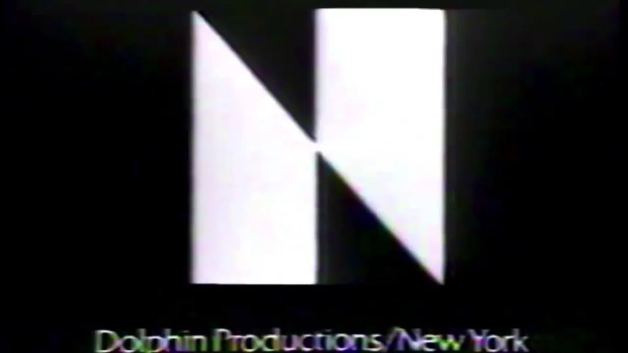
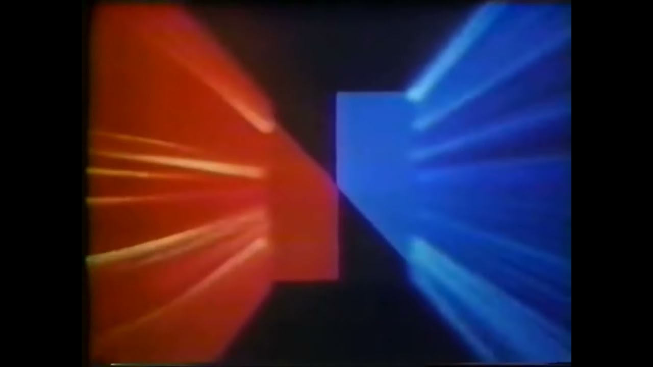
One of the criticisms came from Chevy Chase, who in the ninth episode of Saturday Night Live, he poked fun at the logo, noting that the logo was similar to that of PBS affiliate Nebraska ETV Network, and then went on to list other small business which had similar logo. However, the NETV issue was real, and they soon sued NBC for trademark infringement, as the logo was identical to theirs, designed by its in-house art director in a US$30 budget, with the only difference being the colour: NETV’s logo used burgundy red. Then, it was disclosed NBC’s proposals were revealed to be completed by Lippincott & Margulies in January 1975, with NETV having being designed and selected in March, ready for a quick roll-out. Additionally, NBC’s new logo had cost US$62,500, US$750,000 if counting development and implementation costs, a fraction of what had been initially speculated by the press.
Here’s how Tom Snyder reported on the dispute during a KNBC newscast shortly after launch:
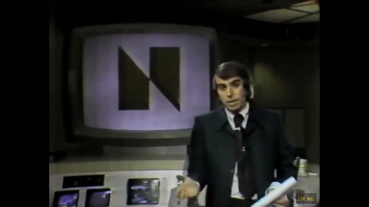
Eventually, NBC and NETV settled out of court. NBC would retain their logo, and gave NETV over $800k of new broadcasting equipment, including a colour OB unit, and an additional $55,000 to design a new logo. However, the logo was unpopular, and came at a time NBC was starting to have trouble in the network ratings: under Herbert Schlosser, NBC had lost ground to ABC, which Fred Silverman led, and a resurgent CBS, which under John Backe had successfully watered the rural purge and had started to regain ground with more “authentic”, slice-of-life family-friendly rural dramas like The Waltons.
Additionally, research from NBC’s corporate planning department, led by Peter H. Kliegman, showed that the Peacock had become closely associated with NBC, and recommended to bring it back as part of the logo. Quickly, Silverman, who had joined NBC in 1979, moved to reintroduce it, and asked Gene Kolomatsky and Ted Szumila to integrate the abstract N, which became outlined, with a new, pared-down peacock, which used a simpler colour scheme and more stylised forms.
The logo was introduced in May 1979, as part of a campaign called “Proud as a Peacock”. Silverman wanted to present NBC in a positive way and project an image of excitement in its programming, in an attempt to take it away from third place. The ads were produced for TV and radio, including customised versions for affiliates. It included a jingle written by Joey Levine and produced by Telesound, which also provided nifty Scanimate graphics for the local stations. Image West did the network graphics package for this period.
However, despite NBC wanting to restore its reputation with this campaign, it soon turned out to be a failure, as was most of the string of programs he brought to the network, many of which soon became expensive flops (the star-studded sci-fi adventure endeavour Supertrain was so expensive it nearly bankrupted the network), which were derided by critics or tuned out by viewers; despite this, it had gained a series of hits during Silverman’s tenure, including Little House on the Prairie, the Shogun miniseries, Diff’rent Strokes, Hill Street Blues and The Smurfs, and was able to revitalise NBC News’ operations and ratings amidst ABC News’ resurgency under Roone Arledge.
Unlike his successful periods as CBS, where he instigated the rural purge to include family sitcoms aimed at a urban audience, and at ABC, where he introduced edgy programming and escapist fare which led to sound criticism from certain sectors of American society, his tenure on NBC was all over the place, as the network never took off from third place and began to make significant and constant changes to its schedule and shows that worsened the decline. Affiliates also started to drive away en masse to ABC, which was comfortably leading in the network ratings at the time, with CBS a close second. The difficulties were also boosted by the near-wholesale reduction of the plans to cover the 1980 Summer Olympics to highlights over the U.S.’ boycott, with NBC losing nearly all of the money from sponsorship and investments.
The campaign was revised for the fall 1980 season, emphasizing “We’re Proud!” as the leit motiv. However, it was too late for Silverman: his failures were now the ridicule of NBC staff: in October 13, 1979, SNL made a parody of the jingle as “Smart as a Peacock”, a message sent by the staff to ridicule Silverman for causing major behind-the-scenes problems and disputes and enhancing a toxic workplace environment, which led to the downfall of Lorne Michaels and the installation of Jean Doumanian to lead what became one of the most critically panned eras of the show; even some staffers recorded a parody jingle in late 1980 (using as basis the revised “We’re Proud!” version) to voice their frustration for Silverman’s failures, which was widely distributed to NBC staff and local affiliates.
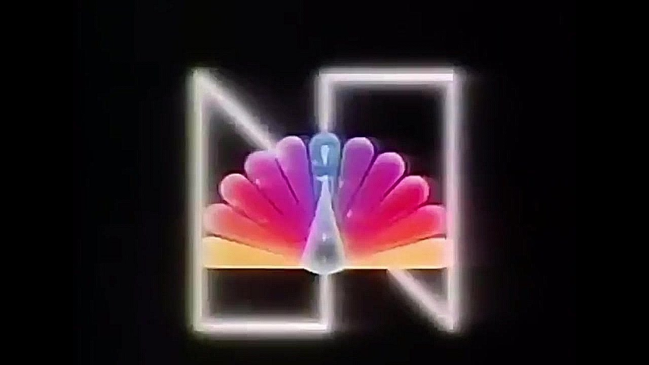

However, as Don Imus played the parody on WNBC radio, Silverman was angered and ordered to destroy any remaining copies of the parody to no avail. Silverman himself left NBC in 1981; he was replaced by Grant Tinker and Brandon Tartikoff. However, both inherited the fall 1981 campaign, “Our Pride Is Showing”, a spiritual successor of the “Proud” campaign, to little difference in ratings and continued ridicule: in its S7 premiere on October 3, 1981, now under Dick Ebersol as producer, SNL parodied the campaign as “Our Age Is Showing”, a clear diss to the ongoing situation at the network.
However, Tinker and Tartikoff were already making changes inside NBC and soon ratings started slowly to increase, with both emphasizing edgy family comedies with “slice-of-life” plots and casts primarily made of very diverse actors from minority (particularly African American) and up-and-coming backgrounds, and gritty, upscale and sophisticated dramas which led to NBC climbing back to the top; during this period, memorable campaigns from Harry Marks, David Buskin and Rob Mounsey (Just Watch Us Now and Be There/Let’s All Be There) brought back viewers to the network.
His successors, Bob Wright, who replaced Tinker after GE bought NBC in 1986, and Tartikoff’s protégé Warren Littlefield, who took his post in 1991, continued to cement NBC’s position and reputation as a powerful media leader, a ratings juggernaut during the 90s, and leading to NBC becoming known as the home of “Must See TV” with the same formula of quality comedies, gritty dramas, and strong news and sports content.
Precisely, in 1986, a familiar symbol would be freed from the “Proud N”, given a new look and become one of the most identifiable TV logos of all time… I’ve talked about this on a previous post.
An interesting promotional practice was carried out by Mexican networks beginning in the 1960s. The daily schedules were published as advertisements full of pictures (sort of a “star system”) and not as dull sections inside newspapers. Here’s a comparison between 1986 and 2010.
The format was “exported” to the Argentine province of Mendoza. The largest stations there (channels 7 and 9) used it for 4 years: between 1993 and 1997.
In light of today’s holiday in Hong Kong, here’s the continuities and closedown from the era before… RTV2 (later ATV Diamond/World), 1981:
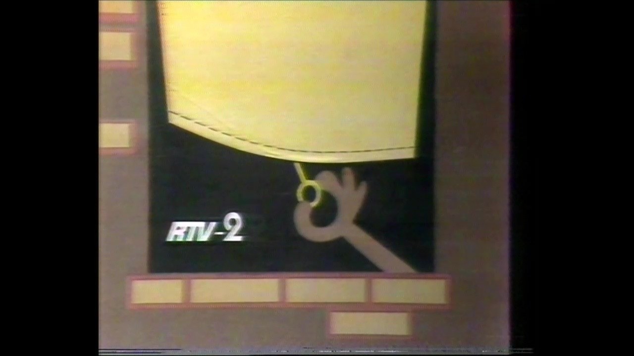
Interesting that there are more English RTV2 recordings than the Cantonese RTV1 from this period online - more expats could afford VCRs, perhaps?
I wonder who the Australian group was that took over RTV when it became ATV?
Wasn’t it Associated Broadcasting Services? (BTV6/GMV6)
I’m not sure. They did use the Living Your Kind of Life slogan and jingle, but it may have been brought either off the shelf or from ABS. I’ve looked before couldn’t find anything.
Huh, that’s something I’ve never looked into until now.
In describing the Australian takeover, the newspapers credited in the Chinese Wikipedia article for ATV pointed to these 3 companies:
Under the Australians, the station was still named RTV until 1982, when Deacon Chiu (of local land developer Far East) bought them out and renamed it to ATV.
Considering MTN later became part of Mid-state 6-8-9 and was quite a distance away from where BTV/GMV was, I’m not too sure where the on-screen association with the latter came from… Someone from the pre-aggression regional TV thread can answer this question better than I do 
Although Granada used the Generic logo by Merging their ident into there and Using the Basic ITV Logo, Border and Tyne Tees used the music after their variants were removed, Yorkshire revised theirs by making their chevron replace the triangle and Central used their own music and also combined their logo in there, Grampian was the only one who kept it in all the way until the logo change
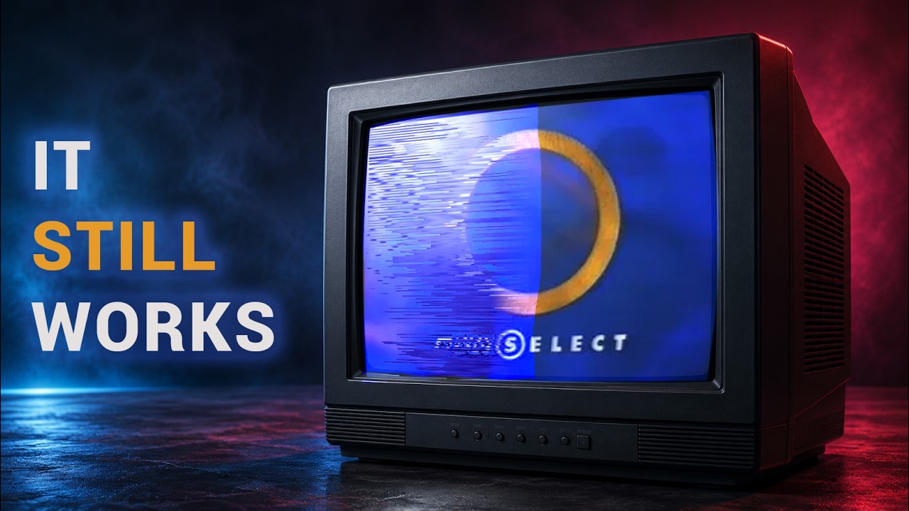
Was a bit hesitant on the thumbnail, but it’s an interesting first look at a quite rare (and kind of working) equipment
And this niche service apparently became the basis for BBC Select!


