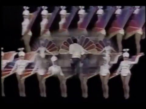
Today, 38 years ago, NBC debuted its current Peacock logo at the tail end of the NBC 60th Anniversary Celebration, a three-hour long spectacular mixing documentary, musical and sitcom elements homaging the entire history of NBC, from the Golden Age of Radio to the entire history of the television network, going from late-night to daytime programming, earlier entertainment, comedy, drama, sitcoms, specials, movies, sports, and news shows.
The logo was designed by Steff Geissbühler of Chermayeff & Geismar in 1980. The new brand was commissioned by then-new NBC president Fred Silverman, who had commissioned the Proud N from Lippincott & Marguiles the year before; however, a 1977 study by Peter H. Kliegman saw the Peacock’s value in identifying NBC-TV as key, with the “Proud N” seen as a stopgap measure.
Geissbühler pared down the 11 feathers of the Proud N to six, encompassing each of the primary and secondary colors in the RYB color palette and also representing NBC’s six divisions: News (Yellow), Sports (Orange), Entertainment (Red), Stations (Purple), Network (Blue), and Productions (Green). Additionally, the peacock’s head was flipped to right and simplified, becoming more vertical and on the negative space. The word marks were done in a custom typeface, NBC Futura, which takes cues from the Proud N logo and the art deco style of 30 Rock.
However, NBC management decided to freeze the new logo until further notice: NBC was ranked last among the Big Three television networks in ratings at the time, and wanted to hold off on the expense of rebranding until it had returned to the number one spot. The network was all over the place with Silverman, with bad management, poorly received programming and controversial moves made during his tenure, plus losing major affiliation deals to ABC. It was until Grant Tinker and Brandon Tartikoff took over that the network gradually went back to the top with a strong lineup of family sitcoms and grittier, quality dramas.
By 1986, things were already well better, and, to commemorate the anniversary, the new logo went on-air. Its adoption was slow, and was not completed until 1988. When the new logo launched, the network launched a glitzy new campaign, “Come Home to NBC”, with new idents and graphics designed by Pacific Data Images.
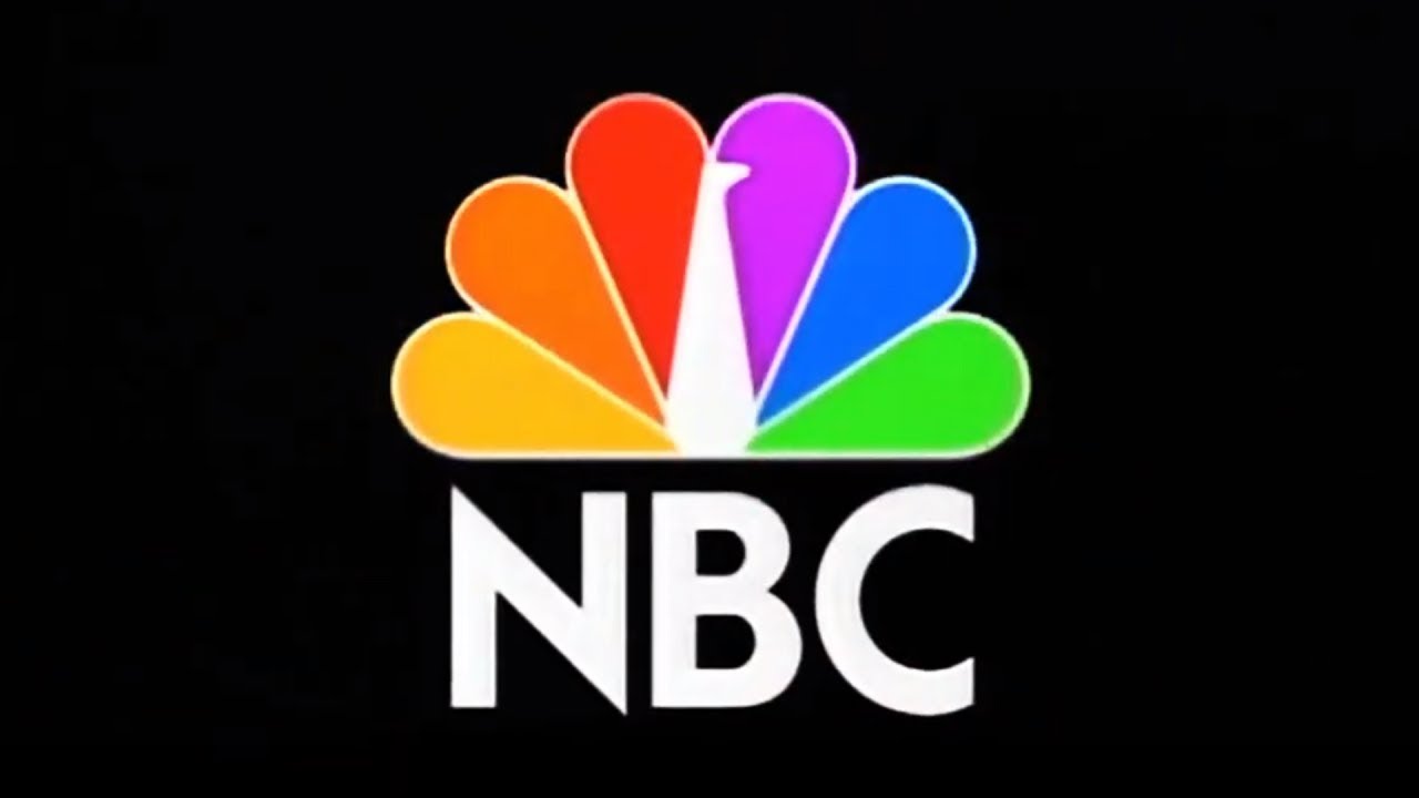
The new logo is still in use today: suffering minor adaptations and alterations to reflect the changing times of broadcasting, a major revision was recently done by LA agency Sibling Rivalry in 2022; the revision was designed to make the Peacock look better in smaller screens, with shorter, brighter and balanced feathers (with color hues in line with the Peacock logo) and a bigger “beak”.
This post is dedicated to prolific contributor @south_97, whose birthday is today!