Hopefully they come up with a better name for the new company than Banijay or All3Media.
BanAll3MediaJay? 
3 Likes
1 Like
2 Likes
Major changes coming to Portuguese broadcaster RTP next Monday: after having soft launched in October 2025 with the relaunch of RTP3 as RTP Notícias, an 18-month rebranding plan is set to be completed on March 30. With the arrival of Luís Montenegro as Prime Minister, a decision was made to boost investments on RTP by injecting a major stream of State budget capital to the broadcaster to better compete in a very atomised broadcast industry in the country: indeed, RTP has to contend with two national commercial TV channels, various dozens of subscription channels, four national radio networks (Renascença, Rádio Comercial, RFM and TSF), various dozens of quasi- or semi-national radio networks, hundreds of independent local radio stations and various streaming services.
In what recently the Minister of the Presidency of the Ministry of Councils, António Leitão Amaro, described as “the biggest investment of the century”, RTP is investing in improving its technical facilities, and is also planning to merge both radio and TV newsrooms into a single facility, with teams working for all platforms.
Despite the relaunch of RTP3 as RTP Notícias being more of an urgent issue (RTP3 was poorly rated and newly appointed news director Víctor Gonçalves, an RTP veteran, wanted the network to compete with its commercial rivals by prioritising more live and breaking news coverage, hence the relaunch during the October 2025 local elections), the rebrand was in the books since October 2024. In January, IvityBrandCorp, one of the leading branding agencies in Portugal led by Carlos Coehlo, won the tender to redesign the corporation’s branding, in a contract worth €70K.
It was until recently when more details of the new look were unveiled: the plan by IvityBrandCorp is to drop the distinction between the TV side (Radiotelevisão Portuguesa) and the radio side (Radiodifusão Portuguesa); both divisions remained tightly separate despite being integrated into the public company (Rádio e Televisão de Portugal). As a result, all TV channel and radio networks will now use a single RTP brand, and overlapping services will have common names.
For example, Antena 1, Antena 2 and Antena 3 (RDP’s national radio stations) will be renamed RTP Antena 1, RTP Antena 2 and RTP Antena 3 (their online-only radio streams will also get new names, e.g. Antena 1 Lusitânia becomes RTP Lusitânia, Antena 2 Ópera becomes RTP Ópera…), whilst RDP África (the service targeted at Portuguese-speaking African continents) will be integrated into the RTP África brand used for the existing TV channel. Additionally, RTP Internacional and RDP Internacional will be subsumed into a single RTP Mundo brand for use in all platforms.
This brand uniformisation has been rejected by the TV and radio journalist unions, citing a “potential loss of identity and editorial capacity.” In an emergency meeting in March 18, the plan was unanimously rejected by these unions, arguing that it would “weaken public service information […] imply the emptying of consolidated historical brands, loss of autonomy for their respective newsrooms, and evident harm to all citizens and to democracy.” The common newsroom plan has been also rejected by them, though the plans are in an early stage.
In response, Leitão Amaro, during a press conference, stressed that the decision to standardize the public broadcaster’s branding "is not a measure that depends on the Government”, whilst highlighting “the administration’s ability to carry out this transformation process”.
Despite this, the plans are still underway: in the start of March, RTP Play published an Instagram reel which leaked the new logo; then, Free uploaded to its channel lineup website the new RTP Mundo logo, and during the last few days, files uploaded to the RTP website (which are unlisted, though publicly accessible) have revealed the remaining new logos for each service (which follow the RTP Notícias logo, and retain their brand-specific colours in new hues), and even a corporate logo, which might sign the demise of the historical antenna symbol which has identified RTP since launch in 1956. The channel logos have been released in colour, whilst the corporate logo was only published (at the time of publication) in white colouring, with the official colour of the logo remaining a mystery (whether is black/white, or the blue hue used in the channel logos, likely to be this).
It is the biggest RTP rebrand since 2004, and the first time most of its services would have a total rebrand on the same day (the 2015 rebrand, developed by AC Brand Design, was a piecemeal one, with services launching the new look in phases). Expect new graphics and presentation too.
Here’s a preview of what to expect (sourced from the aforementioned files mentioned prior):

2 Likes
1 Like
Some cases of resurrected TV names with Easter coming up…
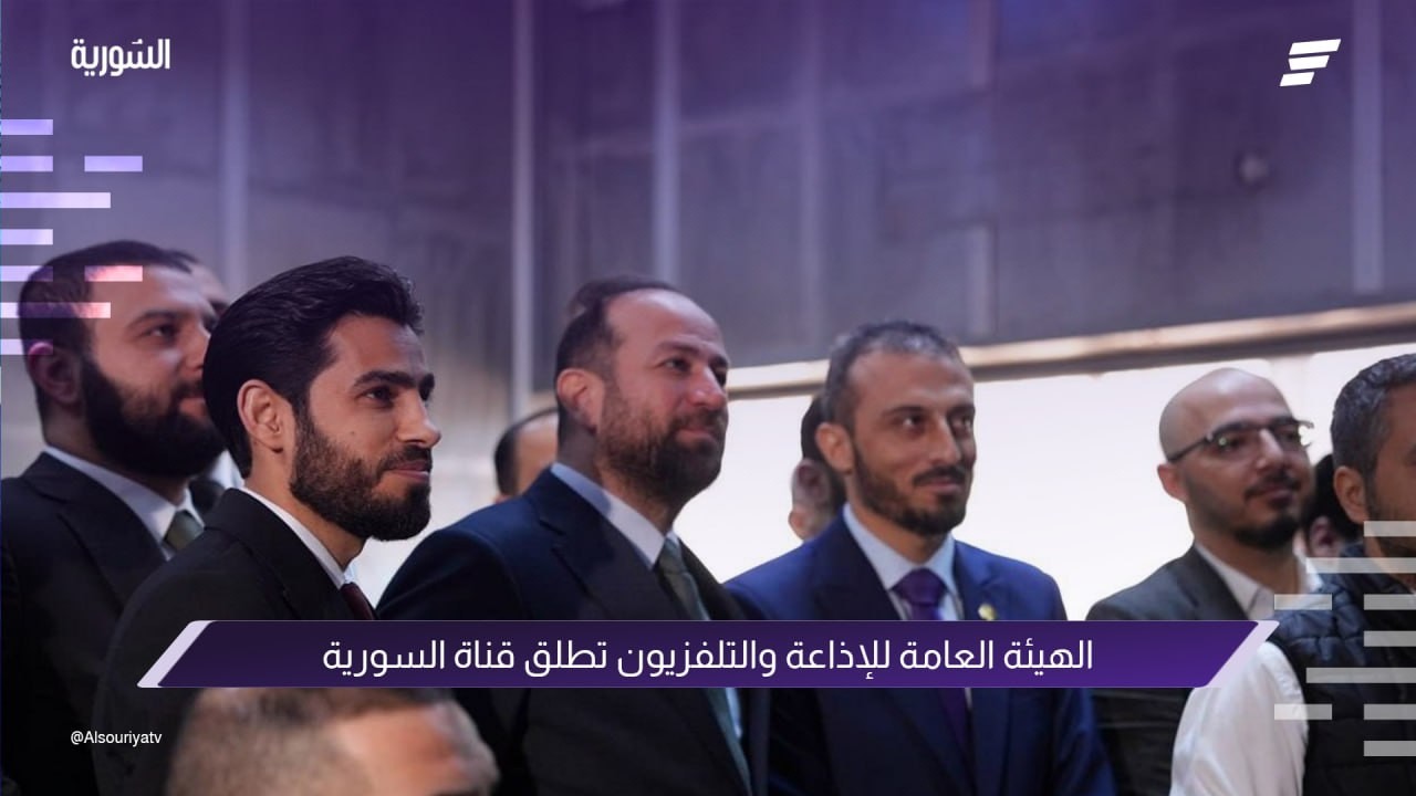
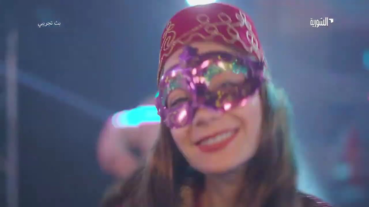
After the news channel last May, general entertainment channel Syria TV is the next station relaunched by the state broadcaster in mid-February, now known on screen as Al-Souriya and positioned as the family channel.
This seems to be the first thing it transmitted, sans the box:
The ident and junctions can be seen here:
In the Philippines, the legendary ABS-CBN name officially returned to TV, as they renamed their programme block on AllTV channel 2.
The channel has been airing some of their shows since 2024, but the block moved from TV5 earlier this year after financial disputes, as a near simulcast of their cable channel, Kapamilya. Since their shows now take up the majority of the channel’s schedule, it makes sense for them to rename the block after the name synonymous with the dial instead.

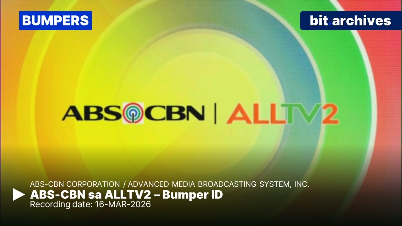
Speaking of, the cable channel (and its online livestream) added ABS-CBN to the name too:


Heading out to Vietnam in the coming days for a holiday, anyone know what the TV is like over there?
Is ABC Australia accessible over there for some semblance of Oz? What’s the TV situation like as a whole.
There’s a lot of complex layers, so I don’t know where to start. But hopefully this gives you a sense of idea.
At the top of the chain is VTV, the state-owned national broadcaster. It consists of 9 channels (although numbering 1 to 10, skipping 6), each serving different programming.
Then there’s regional and provincial broadcasters - some are more well-known than others. Even that varies between north, central and south regions.
And the bottom is international channels, which all suffer a 10-minute delay for content filtering reasons - unless they have playout at Vietnam or already comply with it in some form.
ABC Australia is among that delayed list, and is accessible on a number of platforms.
1 Like
Similar to what has happened in Australia - simulcast of the first minutes of season premier of MasterChef España on 4 channels.
La emisión en simultáneo de los primeros minutos de MasterChef en La 1, La 2, Teledeporte, y Clan, nos permite ver recursos curiosos como este, en el que tenemos animación, fondo, y logo de las cuatro cadenas al mismo tiempo.
— Paco Padilla (@pacop_1985) April 9, 2026
Queda muy colorido y dinámico. pic.twitter.com/v3ooU3NnI0

As expected, it’s to try to reverse the audience decline.
Last season saw an average of 793,000 viewers - lowest in franchise history.
This episode (with a brief quad-mulcast) secured 1,010,000 viewers, though 13.6% share is the lowest for a season premiere since the first season.
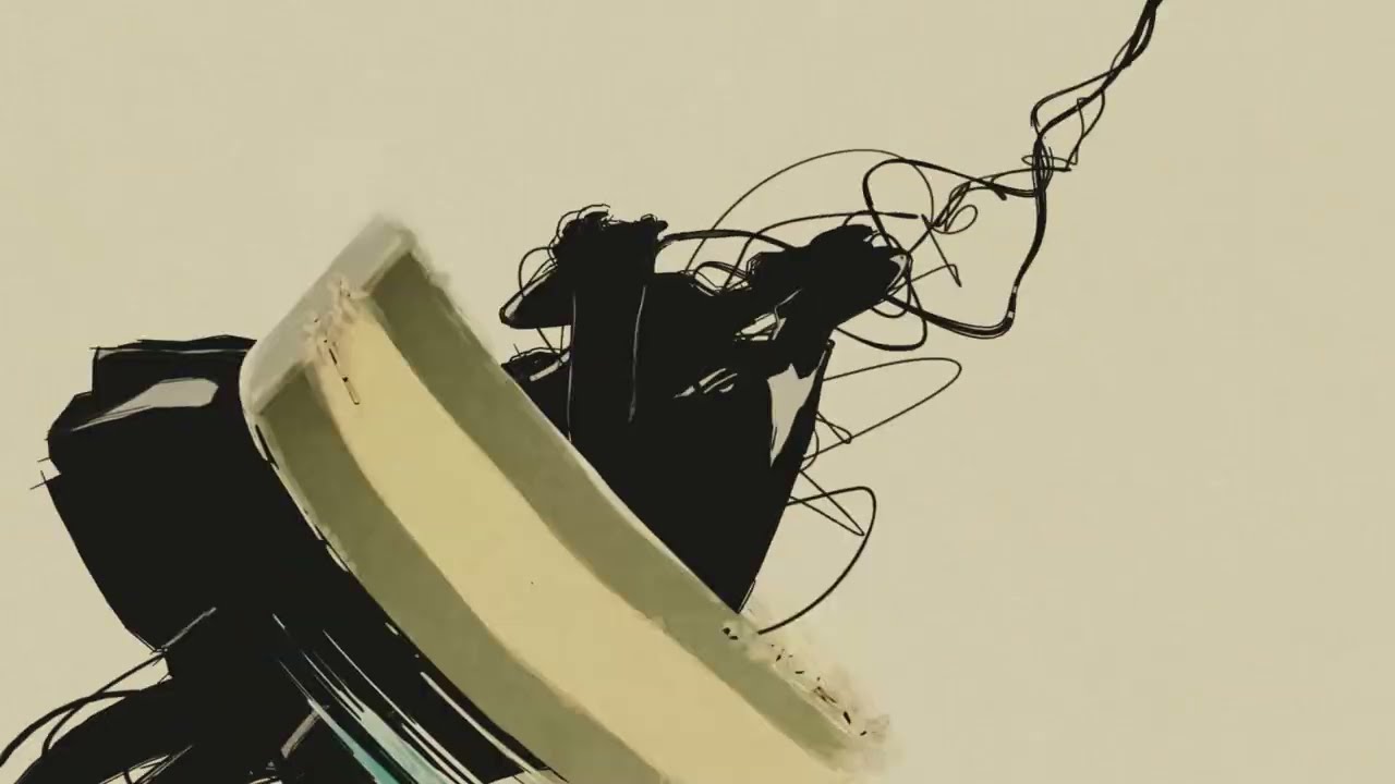
RTÉ One launched 3 new idents yesterday, as part of the ongoing celebration of 100 years of public service broadcasting in Ireland. These are based on the specially commissioned 60-second film, “The Signal”.
3 Likes
A dark day for French public broadcasting as the Alloncle report has been voted narrowly in favor of a public release.
The result was 12-10 with 8 members abstaining (so basically “for”).
The report contained 80 proposals, some of which has been leaked out already and are utterly stupid. France 2 and France 5 merger? France 4 closing? Franceinfo and France 24 merger? Mouv’ (the hip-hop radio outlet) closing? Heads of France Télévisions and Radio France decided by Élysée?
Are we serious?
1 Like
He’s a right wing douchebag. What else do you expect? He’d have TF1 and M6 et al telling him to tear the joint apart.
TV5 in Quebec updated their wordmark to that of TV5Monde last month, but went their own way otherwise with the trapezoids.
Unis TV, their second channel, is now TV5 Unis and focuses on local and Canadian Francophone programming. The original TV5 Unis - their online streamer - is now TV5+.


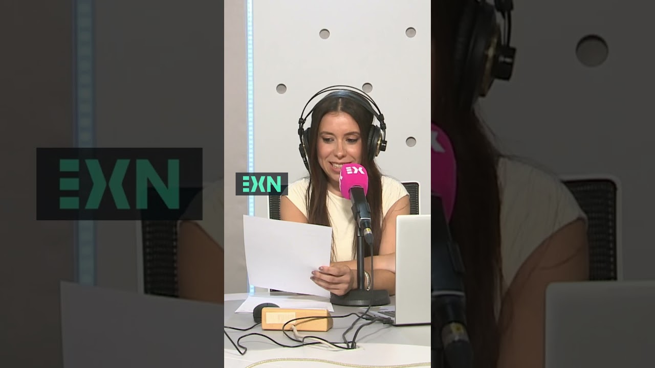
Spain is certainly busy revamping TV brands this year, this time the public broadcaster in Extremadura (an autonomous community bordering Portugal).
Celebrating their 20th birthday, they also roll out a new streaming platform to secure their presence in the digital age and the community. More details on the new streamer here:
The ≡ represents radio, TV and digital platforms, while the >< envisions the broadcaster as a meeting point and connects them to the viewers’ hearts (plus being a flexible on-screen device).
This is the rebrand reel, which includes their news and current affairs offerings. The action feels quite NRK Norway!
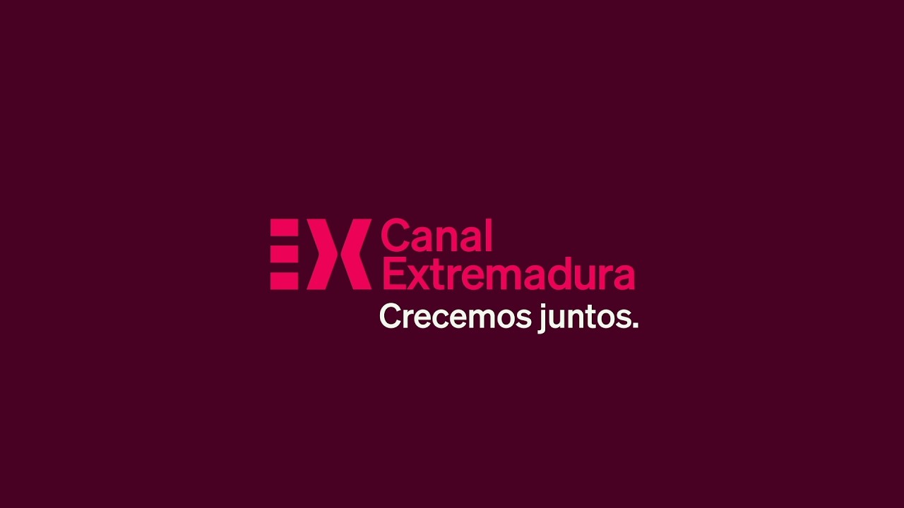
The designer behind the identity is not publicly named, but it’s developed both in-house and by Madrid/Barcelona-based agency Brand in action for two years.
The radio side got new jingles too.
This is an opinion post. All this is entirely me discussing RTP’s rebrand last month and how it compares to other recent European TV rebrands.
It’s been a month since the big RTP rebrand in Portugal, but I find it funny that no one posted any details about it here after the rebrand took place. And yet, the Lenodal forum in France has an extensive post about RTP’s rebrand, not to mention Lenodal’s video archive has been updated with plenty of RTP idents and bumpers. It’s funny that Lenodal has far more videos on the RTP rebrand than YouTube…
As a graphics and presentation nerd, am I the only one who feels that, in spite of all the organisational and structural changes at RTP, its graphics output isn’t as comprehensive as what RTVE of neighbouring Spain did in January? I feel like there’s no emotional connection from this graphics package with the audience. Look at the consistent theme music that RTVE has, and all the RTVE channels’ idents project some sort of energy and joy. France.tv did the same with its midlife facelift in June 2025, introducing a common soundtrack for all channels. In contrast, in terms of music, RTP has the same chime for most channels in its idents.
There is still no corner logo animation, which is guaranteed on Spanish and French channels. I understand that Portuguese channels don’t tend to have corner logo animations — what is called the DSK in France — unlike channels in most other European countries. But this would have been a good opportunity for RTP to introduce them, to add a little more flair to the identity.
See how dry, cold and corporate this presentation identity (RTP Mundo) feels…

…as compared to how full of life, energy and joy this (RTVE’s La 1) feels — of course you don’t need to agree with me here…
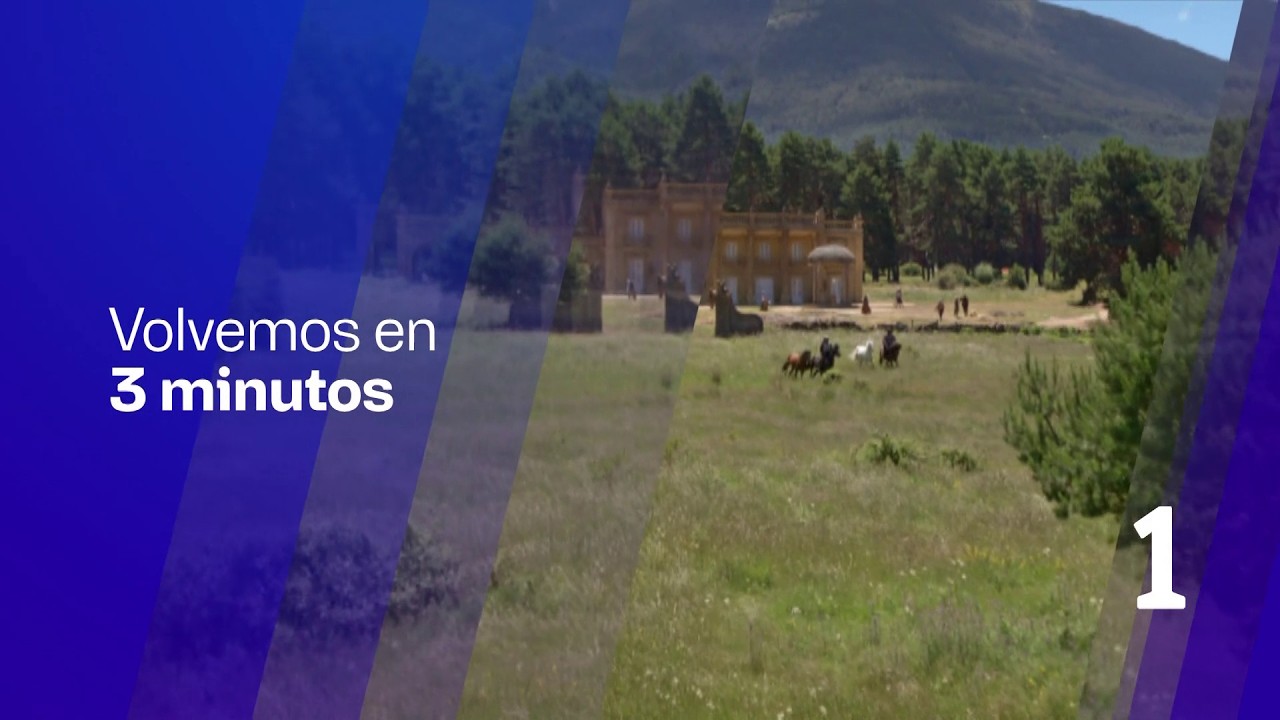
…or for that matter Antena 3, the biggest Spanish commercial channel, which rebranded last year.

Perhaps I’m reading too much into this, but I get the feeling that Portuguese broadcasters (not just RTP) don’t have the same expectations from their graphics packages and music tracks that those in other European countries do. I get the same feeling when watching continuity of SIC or TVI on YouTube, and it just lacks that emotional connect — especially in terms of music — that an Antena 3 (Spain) or an M6 (France) or, heck, a TVN (Poland) would have.
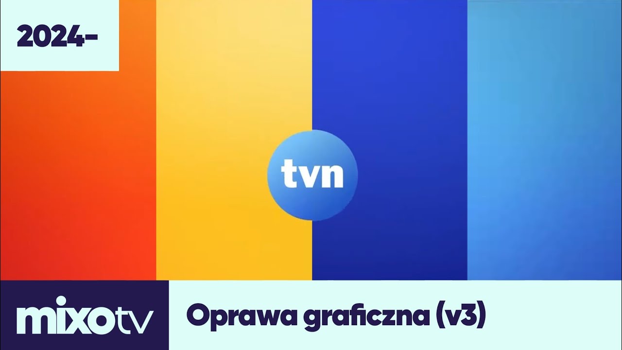
Just look at TVN (Poland)’s 2024 rebrand, with all the big colourful bouncy balls and the peppy music… it’s hard not to fall in love! (Admittedly Polish channels tend to have far more idents — ogłoszenie nadawcy, autopromocja, telesprzedaż, etc. — than those in most other European countries, except perhaps Hungary.)
With regard to RTP’s big rebrand, it’s clean, it’s consistent and it conveys a big structural change from an organisational point of view (especially with the radio channels dropping the RDP brand)… but I still think RTVE — or Antena 3 (ES), TVN (PL) and for that matter Nova in Bulgaria, which rebranded on New Year’s Day 2026 — did it much better overall.
Rant over!
2 Likes
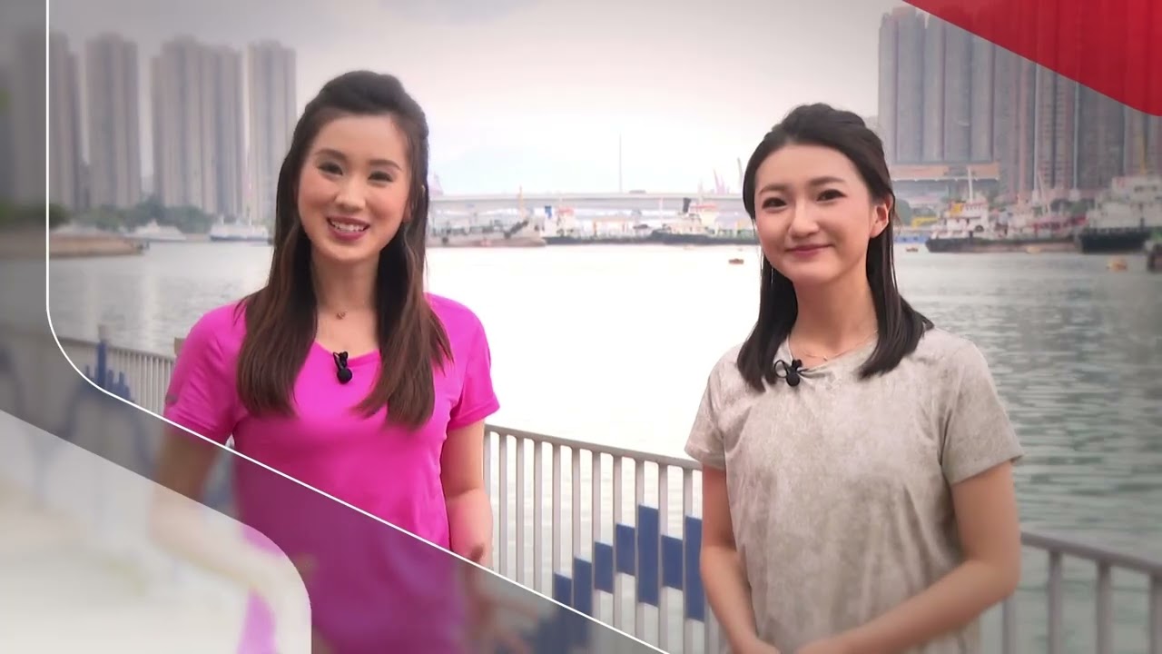
Over 3 years after relaunching their flagship channel, the Hoy TV group of channels revamped yesterday, repositioning themselves as an “all-platform content ecosystem” and seeing their streamer as ‘the fourth channel’.
Instead of the standard red, the three channels now have their own bespoke gradient, not unlike Australia in branding the multichannels, plus being identified fully by their channel numbers - i.e. no Hoy TV/IBC/Info, only Hoy 77/76/78.
Respectively, the channels are now:
Hoy 76 - in purplish gradient and soundwave-esque ident, the colour represents passion, innovation and fashion, presenting international and multicultural programming (translation: same roster of DW infotainment shows, Bloomberg simulcasts and leftover sports events in a newer paint).


Hoy 77 - in teal, the Cantonese channel now targets the middle-aged audience with a desire for taste, providing a slew of new homemade shows under a more energetic look.



Hoy 78 - the news channel retains their shade of red, symbolising their professionalism, authority and depth (plus ties to the former cable channel). The backdrop and newsdesk are also slightly updated.


To me:
- It’s good that 76 finally got some love after limping on with the HKIBC look. The soundwaves reminds me of BBC4’s initial idents. It also seems like they’re dropping generic promo endboards in favour of show titles, which makes sense given that’s how TV trailers work nowdays. 76’s promo designs have been terrible either way (just look at their sport event ones), so I don’t miss those that much.
- The teal on 77 feels the most out-of-the-blue and takes some time to get used to. A bit garish in the watermark, but otherwise the package is okay - if they don’t replace it with random live action bumpers after 6 months.
- The 78 update is unnecessary. The blob ident is very generic versus the previous globe - like it can be used on pre-teal 77 no problem, not to mention the lack of a solid jingle. I like the real-life backdrop, but the desk deco feels cheap.
1 Like