And next ad break it was back to the fly in. 
1 Like
They have been running those at random breaks for a week or so. I can’t see the pattern except it seems to usually be mid program.
3 Likes
It’s the tv equivalent of Triple M… you’ll never know what we’ll play out next!
3 Likes
Well, hello, I’m a new member, and I just wanna ask, what were your thoughts on when Nine launched their 2012 look? And would you like to see elements of it come back in some way like their idents and schedules? I know I would.
1 Like
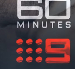
Interesting… different logo position on the new 60mins promo, and the end card logo going from the old glossy transition to a flat logo…


3 Likes


4 Likes


Nine claiming their network is  ?
?
4 Likes
This has to be a joke. They can’t possibly air that on TV.
1 Like
Here is the promo

Just the old logo - now the butt of their own promo department jokes 
5 Likes
Well, when you’re basically the only television network in the country that doesn’t air any traditional network IDs or stuff like that, you can bet someone at the network must have been following this thread and expressing their frustration at how stale the look has become.
2 Likes
I miss the old days of station ID’s
6 Likes
The station IDs from the 70s to the 90s are classics.
1 Like


Leading up to a full relaunch with the Paris Olympics I’d say
6 Likes
I like the RBT logo.
Flat 2D logo used. The short-lived dotty Choose|9 presentation should’ve lasted longer
2 Likes
I feel like when NRL starts
Another 5 months - That’s cruel and unusual punishment.
I reckon 30th February
2 Likes
that was a great package, they should just click a button and load it up and bring it back: https://www.youtube.com/watch?v=I0H7aLVsb9A&pp=ygUPY2hvb3NlIDkgaWRlYW50
1 Like