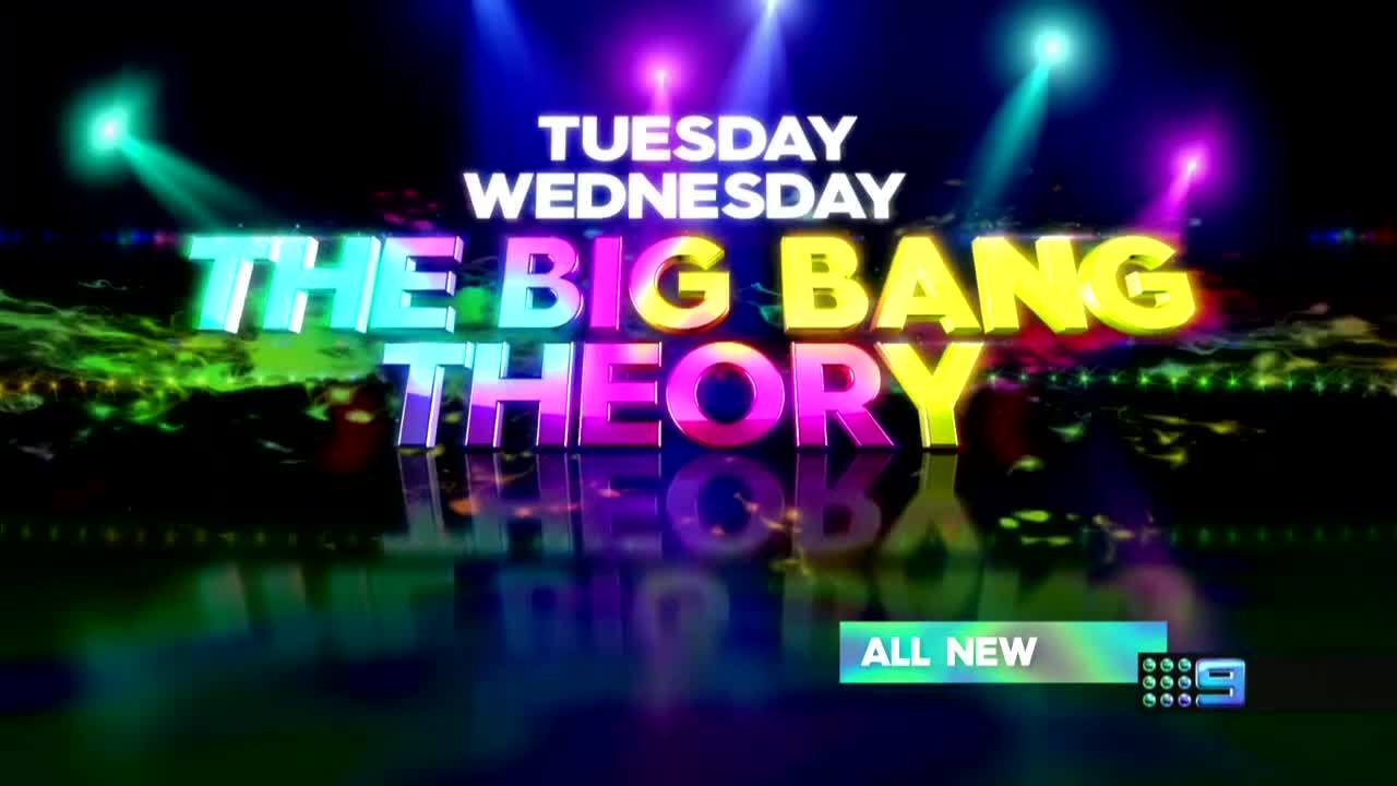
Another good infographic:
2 Likes
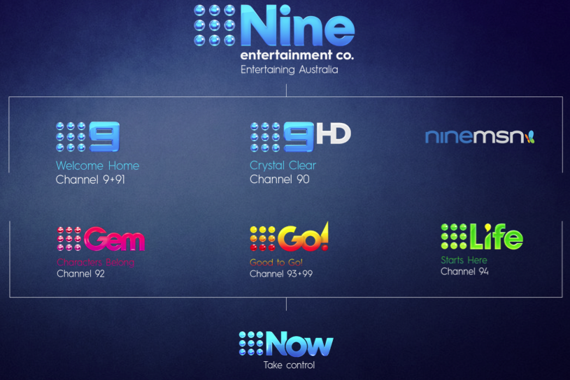
Another nice infographic:
http://cdn1.mumbrella.com.au/uploads/2015/10/Nine-rebrand.png
1 Like
Way too many colours. Makes my eyes bleed.
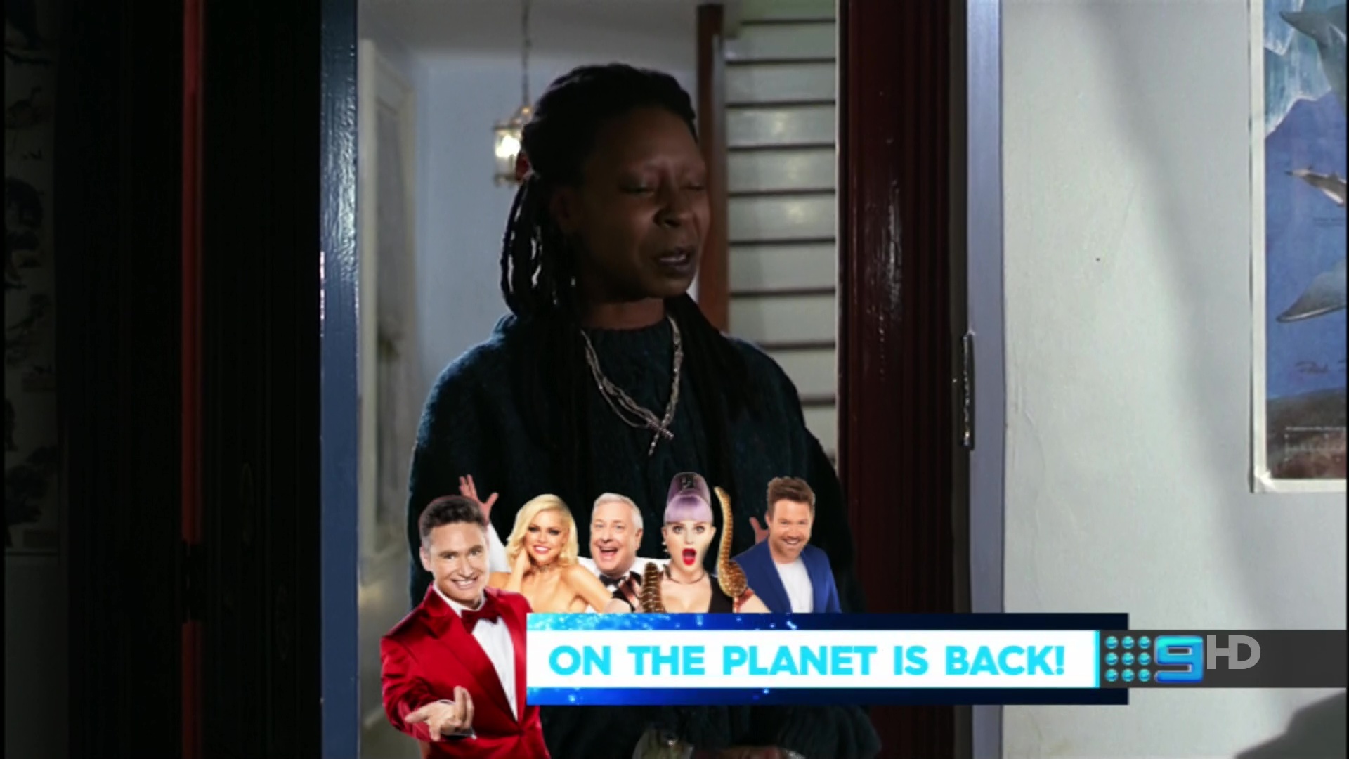
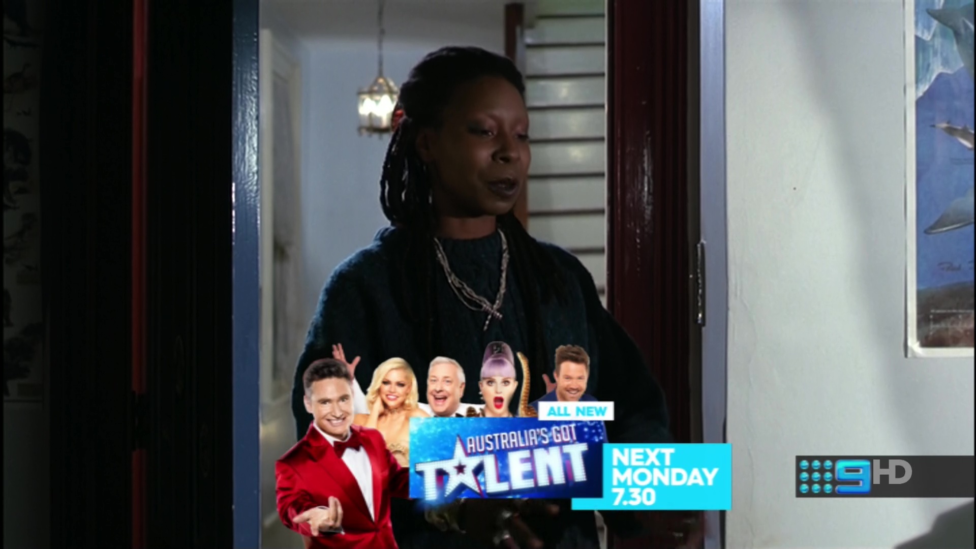
I dislike how they feel the need to insert a character or host image. I don’t have an issue with one coming on advertising a show but again, why do they need to make it really big and offensive with pointless graphics! /rant
1 Like
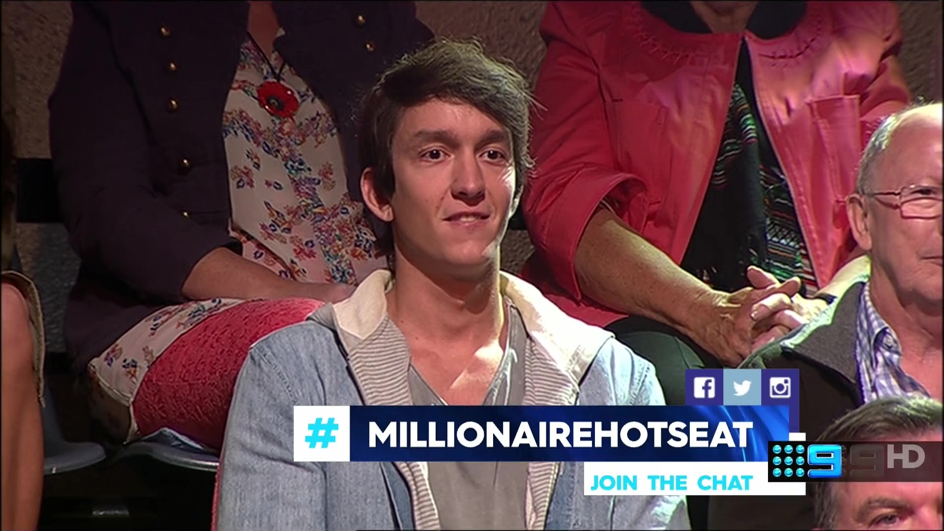
That is over the top huge. Why is everything getting so big? Why not a transparent # underneath the watermark?
Not to mention… it doesn’t line up with the watermark underneath which looks bad in itself.
5 Likes
Can 9s popups get anymore bigger honesty!
I don’t mind the style where it is out of line with the logo but agtee it is too huge.
It should sit below the logo where “join the chat” is now and be that size. The social media logos and the instruction to join the chat are superfluous. We all know where hashtags are used by now.
If necessary, flash them up initially then replace them with the hangtag.
Agree - much too big. Rather defeats the purpose of a HD picture if the opportunity to used smaller fonts and presentation elements is not used. I really dislike this look now, it started off being a bit of a novelty but now it seems way to intrusive. The elements don’t match or harmonise especially in colours; one red is used for a logo, another for one box, then a gradient on another then an image in a different pallet again with three different font sizes.
Looks terrible, at first some of them looked okay but this looks like add-on after add-on. It really needed to be more cohesive and not so out there.
2 Likes
2 Likes
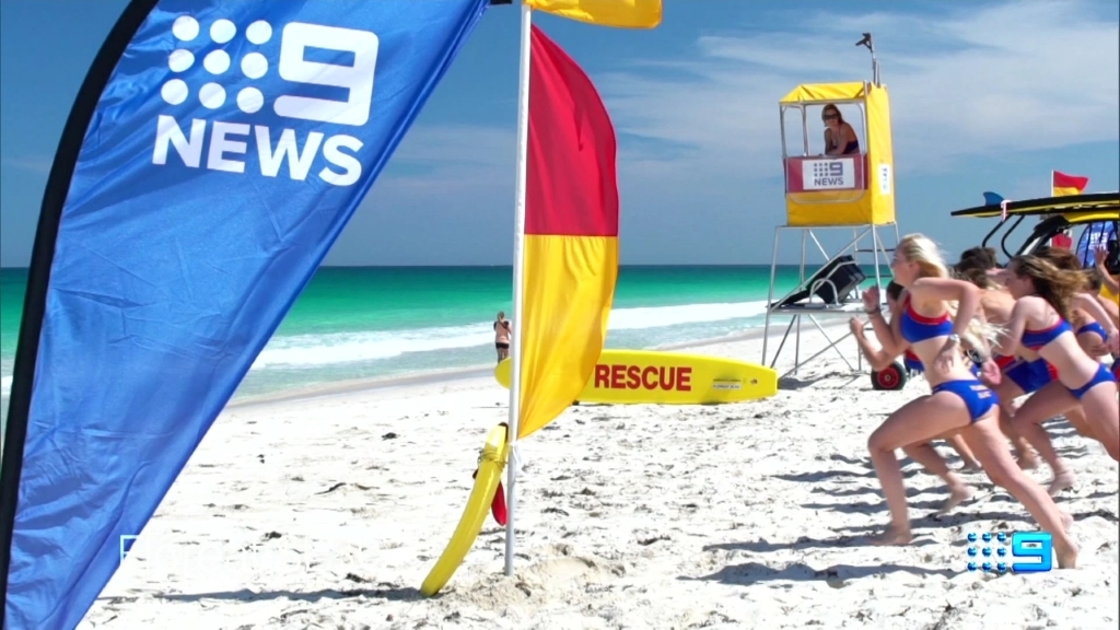
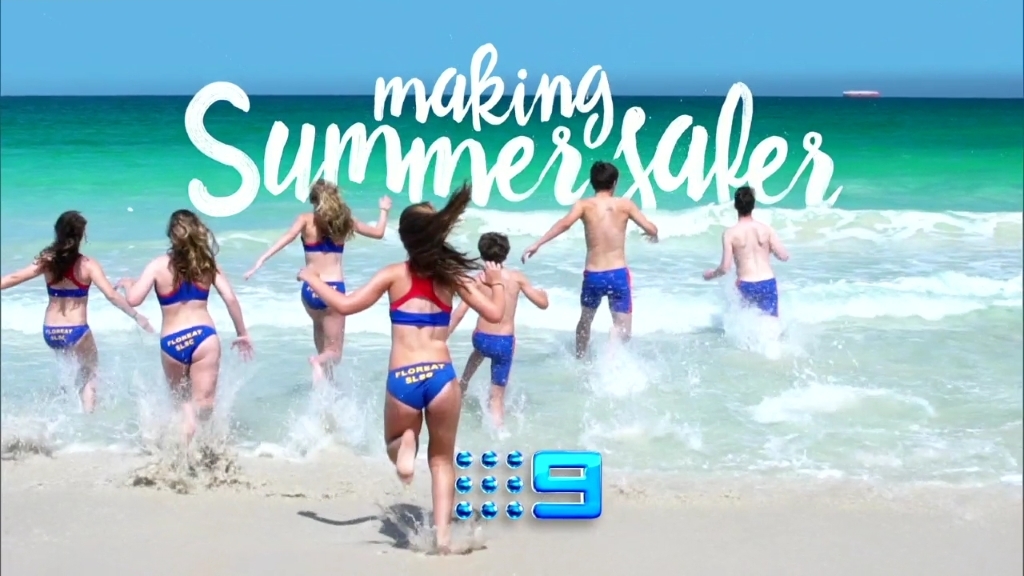
Reminds me of when Nine ran their ‘Swim Between the Flags’ ident some years back.
Noticed all next week promo straps have the fireworks type animation instead of the ribbons. Wonder if the last of the ribbons will go which means the PRG will change once again or it’s just a next week thing! Still seeing old sponsor boards here in Perth unlike Seven which have already fully moved over to the new look.
3 Likes
A pop-up just appeared during Hotel Impossible on 9Life for Australia’s Got Talent but the large intrusive picture shown was a farmer with a hay bale on his shoulder - clearly intended for Famer wants a Wife.
Idiots, just get rid of them.
1 Like
The gold looks great. The psychedelic looks shit.