I haven’t seen that version before myself, looks a lot better than the quicker version we got fed all the time.
The original incarnation of Nine’s 2006 package wasn’t that bad, however tweaks that came after about May that year with the “warehouse” look was absolutely terrible and it never really worked as well for news/sport compared to their iconic predecessors.
Above all else, it was definitely a big mistake for Nine to drop the dots from the logo and I think the network realised that when the dots were reinstated to the logo less than two years later along with the more recent decision to use the dots in the logos of all of NEC’s TV and online/digital properties.
3 Likes
I’d argue news was pretty amazing graphics-wise. Simple and clean but still authoritative, and the music was great.
1 Like
The look of the News was great, and the tweaked theme was much better than the older version that later replaced it.
And yes, it’s a travesty that Hot Seat continues to air while Temptation got the chop. The latter is the far, far superior format.
1 Like
Didn’t like that short lived era. Don’t mind the current look
Hot Seat is a terrible format, the original was better, there are other models they could use, but stick with their iteration for some reason.
5 Likes
Nine News (National Nine News) short-lived on-air look during the dotless era was good.
Only GTV didn’t changed the theme, instead sticking with the traditional Cool Hand Luke theme until the reinstatement of the dots in 2008
The problem is that the Hot Seat format at least guarantees the show ends on a high note (as does Fast Money in Temptation/Sale) - something much harder to do with Millionare’s normal format.
And if they fixed the horrible unfairness of the format, they’d be giving away too much money.
2 Likes
Don’t know how I know but I have seen those line-ups. I think it only lasted until they changed to the warehouse look.
This is the WIN style lineup…
…Then in the “Warehouse” look, they used this…
 (30 Jun 2006) - The Infamous \"Vibrator\" Episode and $100,000 win")
5 Likes
Lots of people disagree but I didn’t mind the 2007 look. Not quite the 2006 look.
I liked the 9 logo without the dots and without the square part either.
I liked the cube with the dots on the side.
4 Likes
I liked the Nine logo before it went on a diet. #FatNine #GetInOnTheAction
5 Likes
I really liked that. I remember Imparja using a variant of it.
You’re stuck in the 70s just like this logo. 
2 Likes
Disagree. The old Nine dotty logo is better than present.
6 Likes
Do the ad creators at nine have ears? In the promo for this week’s episode of Britain’s Got Talent, the background music clashes horrifically with the singer’s vocals. 
Tonight’s lineups across all of 9’s channels
3 Likes
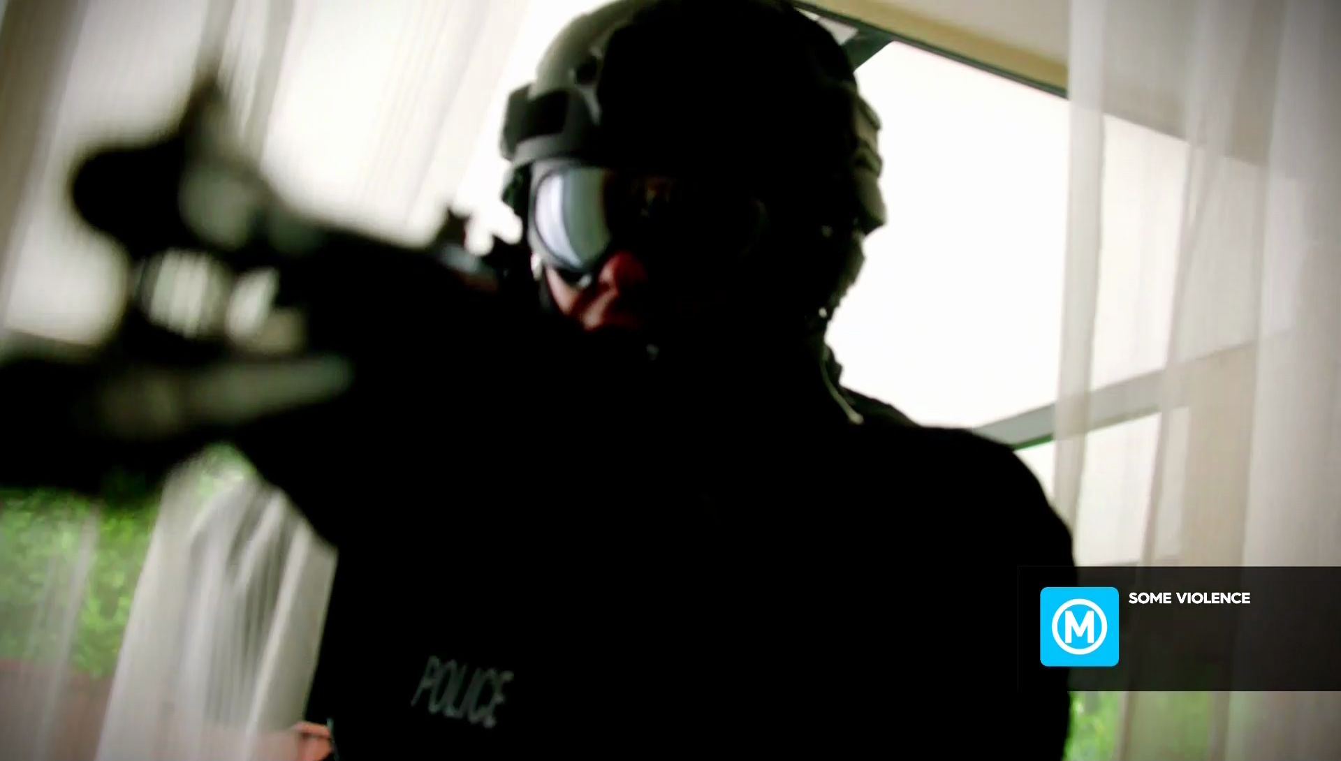
Extended Preview for upcoming program Hyde & Seek.
Note, the classification warning shown at the start of the preview.
5 Likes
Saw a long promo for the block on SC it had a big yellow 9 logo was very well done.