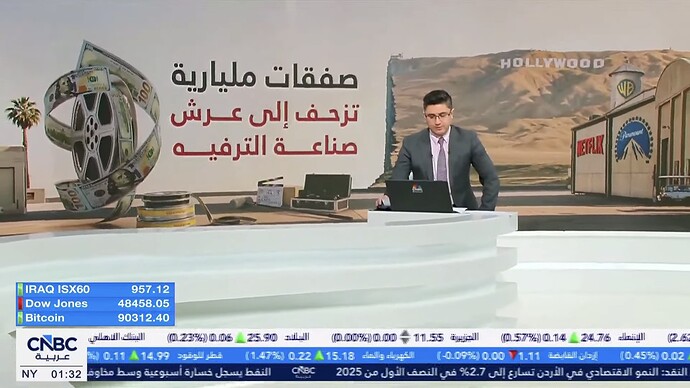
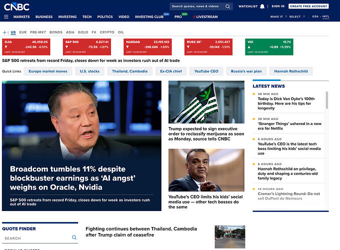
I understand it’s a business channel, but it still feels just too cluttered
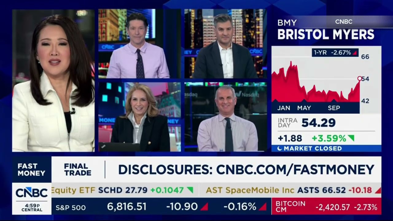
Looks the same as the current graphics but with a new logo, looks fine!
Sheinelle Jones is joining Jenna as permanent host of the fourth hour of Today.
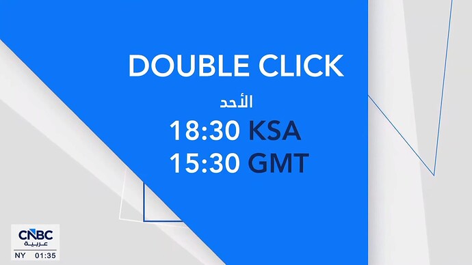
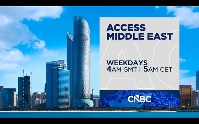
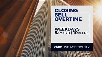
CNBC Arabia in Dubai has jumped to the new logo… with the existing supers that made no sense with the right-corner arrows.
While CNBC US is showing Shark Tank repeats with the peacock watermark.
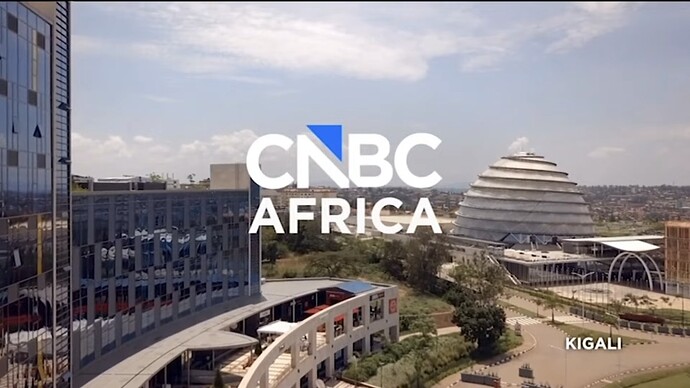
Africa too, but they always have an issue with watermarks
I don’t understand why the logo change can’t be done on a business day when it gets eyeballs.
At least they roll out the new logo faster than the new graphics, as predicted.
The US feed will change morning ET/late AEDT.
US feed changed at 4am eastern.
They have never not had an issue.
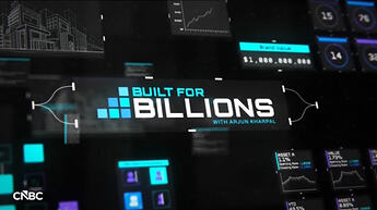
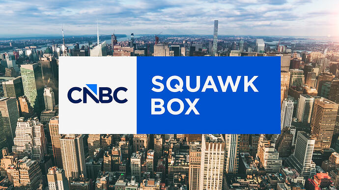
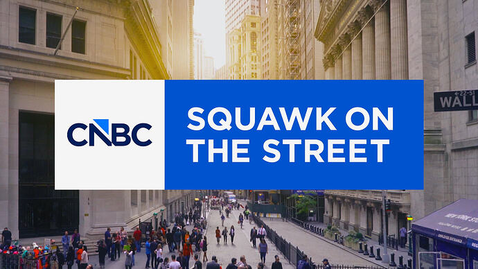
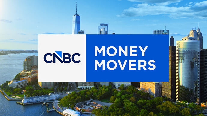
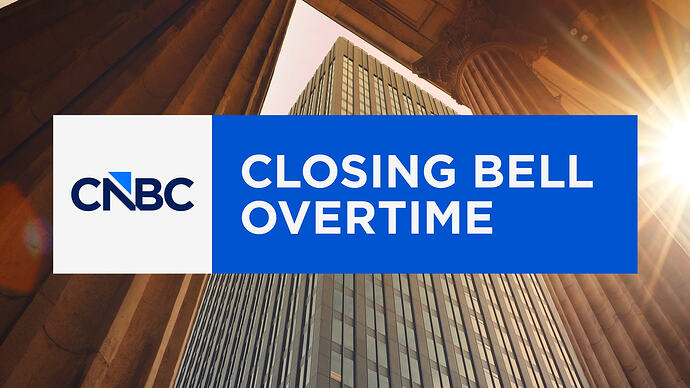
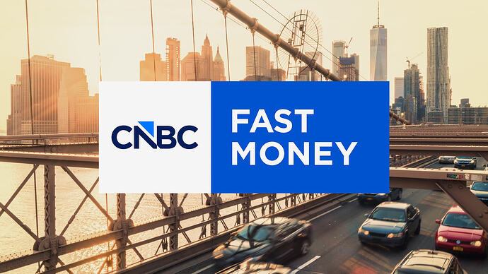
New show openers have been released. Notably, show names have been bizarrely reduced to the bold variant instead of black.
And somehow the covered-up area grows as the logo shrinks.
Yeah, I think we need to go back to the drawing board.
So they can iron out any kinks
Hello there, new logo.
Time bar appears to have more room but they still insist with the small text size.
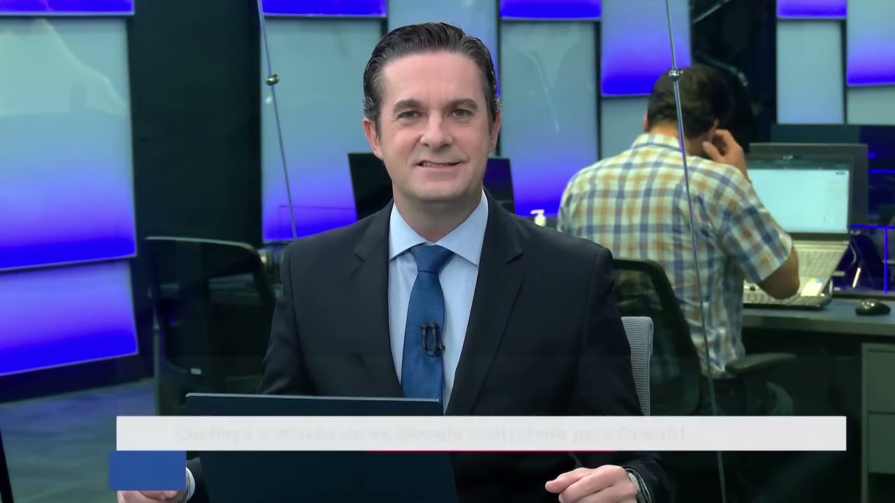
With the JVs still having the peacock for the moment - Indonesia, Turkey, Italy, Brazil, Japan and India - we have strange moments like this: An Indian affiliate (CNBC TV18 Prime) airing the US Squawk Box, which was highlighting the logo change, while being surrounded by a mixture of supers between the flat boxes from the last rebrand and the cluttered aesthetic of Indian TV news…
Japan (Nikkei CNBC) is even holding onto the old wordmark and peacock…
Update welp, Brazil has flipped.
India took two years to switch to the US graphics so you can look forward to the peacock for another two.
Prime is their HD channel, the main CNBC-TV18 feed isn’t quite as cluttered.
Nikkei CNBC/Class CNBC? They’re even holding onto the obsolete 2014 graphics pack!
