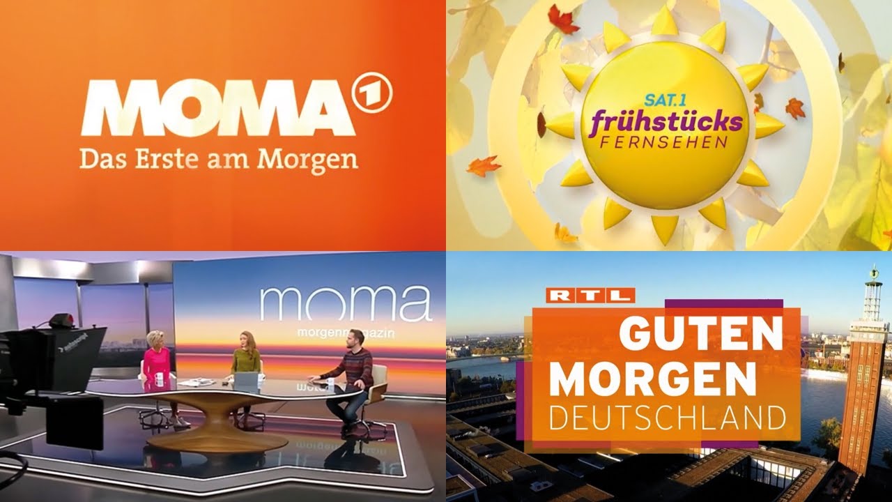
With the news on Germany’s RTL set to get a new look in 2021, here’s a look back at the channel’s news opens since 1984:
Former 7 News reporter Emily Angwin is returning home to Australia after finishing up with CGTN.
Hopefully she finds something back home.
- courtesy of the CGTN lawyers
This actually sounds like google translate AIR? “metaphorical book of my life” “has solidified my values”.
Anyway good luck to her. Hopefully someone picks her up as she is a good talent.
I’ve got no doubt she wanted out ASAP.
News Breakfast should pick her up.
She’s a great asset.
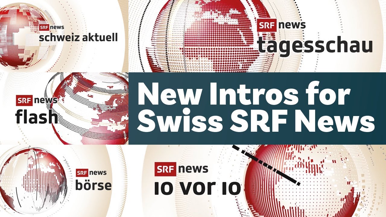
The news on SRF, the public service broadcaster of the German-speaking part of Switzerland, has a new look:
Agree. I don’t know why it’s taken her so long in all honesty!
Studio is shit, graphics are 

 (tagesshau)
Schweiz aktuell reminds me of BBC.
In the U.S., stations owned by the group Meredith are moving to an in-house graphics design. Rather than expounding upon that, I just want to chip into the old discussion that skylines are boring in these packages and there’s better ways to illustrate or reflect your locality. Like a unique streetscape.
Sky’s Italian news channel, Sky TG24 (countdown/filler, commercials, top-of-the-hour headline sequence):
TVA Nouvelles in French Canada debut their refreshed theme and opening graphics in November to coincide with a new network logo. They still have their CNN-inspired L3 supers.
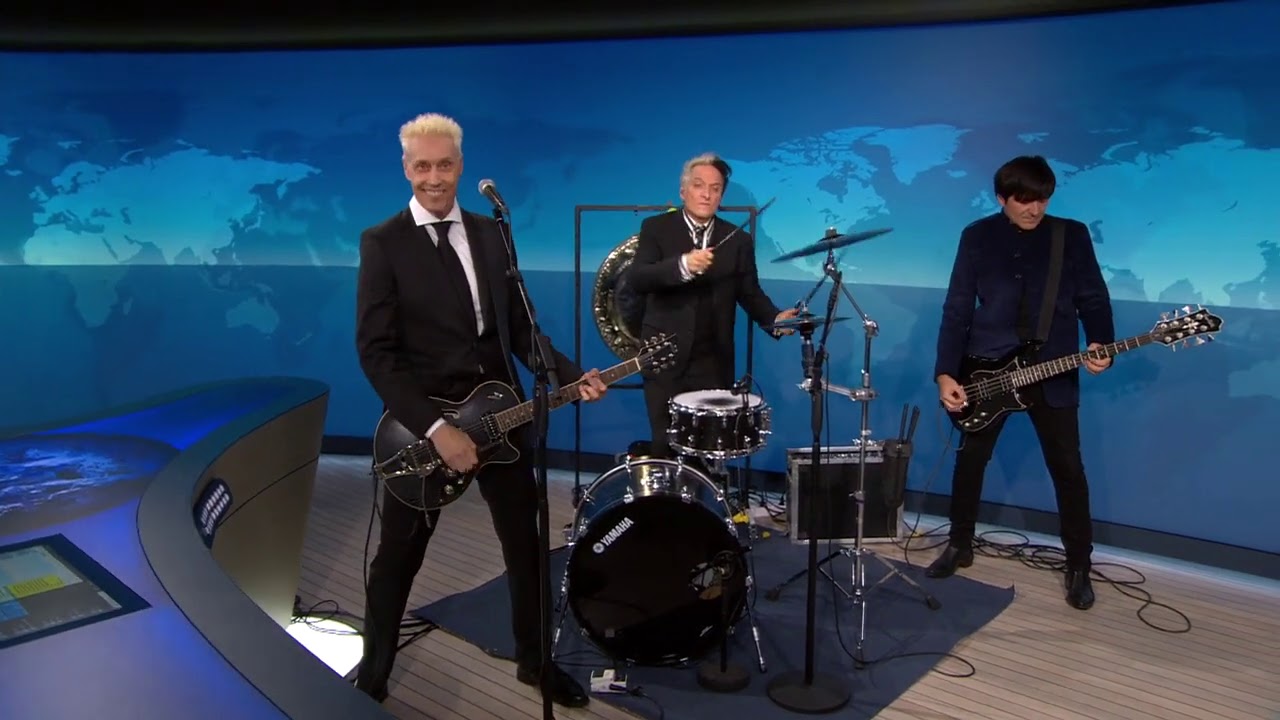
Not too out of the ordinary considering the very popular cover of the ABC News theme here by Pendulum some years back 
