Here’s your chance to identify the best and worst radio station logos of all time…
Given the comments on the new SeaFm logo, thought it might be interesting to find out what radio station logos rate as the best and worst. It’s all subjective, but IMHO the best:

And the worst (by a country mile…around Wang to be specific):

3 Likes
Fox logo looks great if it was 1984.
1 Like
Saw this from the news about the sale…

5 Likes

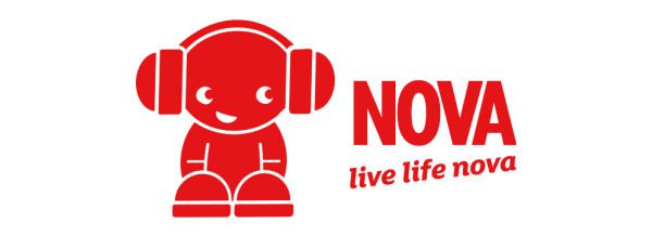
100% agree. Nova’s original logo has to be one of the best ever produced for Australian radio.
End thread.
3 Likes
Yep, agree. Can’t believe they dropped the Nova boy. #SecondChanceForNovaBoy
6 Likes
For a regional broadcaster, B Rock FM in Bathurst has a pretty good logo. Introduced 2018/19:

11 Likes
The worst in recent years is surely KROCK Geelong. It looks like a 12 year old’s school project with Word.
The current 4AK one is pretty bad too.
Agree on the original Nova being among the best.
6 Likes
As far as terrible radio station logos are concerned, surely this one has to be mentioned?

While 2CH’s current logo wasn’t as good as the 2017-19 version, it’s still better than this!
11 Likes
Mornington Peninsula 3RPP’s old logo. Better than what they currently have.

3 Likes
Agreed, but only the original one. The second one they rolled out (during their “Live Life Nova” phase) was horrible. HORRIBLE!!
6 Likes
I’d take this Novaboy over the current incarnation. Ghastly.
2 Likes
I’ve always liked this one 
5 Likes
Some of the Super Rsdio Network ones are pretty ghastly too.


The original NEW FM logo (below) from 1989 was much better

7 Likes
Have you seen 4AK? Horrific. Sorry I can’t seem to upload an image.
4 Likes
I kind of don’t mind that one!
But the stylised font looks more like YAK than 4AK.
2 Likes
Grant Broadcaster stations, particularly Hot 100 in Darwin has possibly some of the most tacky branding over the past few years.


It would be good if they decided to take on the Star FM branding like QLD, but people in Darwin are severely allergic to change.
6 Likes


The old StarFM logos were great.
6 Likes