some changes to Studio B’s designs on their screens …..
hopefully more changes on the way ![]()
Much better! Studio B no longer looks like a meat freezer!
There probably will - there’s a new globe graphic in place of the faux ‘corridor’ scenery, on the side of the desk:
Versus when it first debuted:
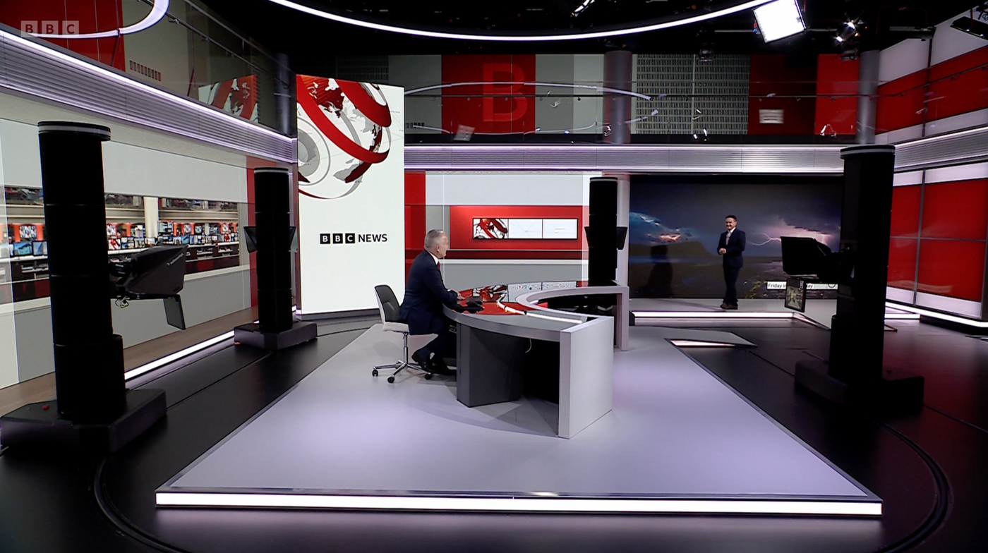
Didn’t really find the old shoulder graphic that nasty, but the new one is definitely an improvement. If it brings the 17-year old titles to rest, the better!
I don’t like the top graphics much, and the red ball behind the stairs looks like an afterthought
They need to retire the titles. I still like the pips but I wish they’d go back to the longer 2008 version of the theme and try move away from the “globe coming together” titles that have been running since before Barack Obama became president.
Is there actually anything upstairs on that balcony or is it just screens?
The old look is clearly screens but there is some depth to the new version…
Also is Studio B where Impact/Global etc used to come from when World News still existed?
Yep - after COVID hit the programs were suspended before resuming in Studio C until they were axed just before the merger
No it’s all just screens.
Politics Live and its new host Vicki Young will unveil a revamped approach to BBC Two’s lunchtime look at the UK’s politics on Monday 22 September.
The graphics look like they’re finally gonna fit the rest of BBC News.
i see the “off-centred circle pandemic” (as @WestKnight lovingly put it) continues…
Haha! There is a centre circle for this one though ![]()
3 dots, huh? ABC US says hello.
")
Or they can get old school with the animation…

You say that like it’s a good thing ![]()
except for the 2008 titles they still intend on using for some reason for the flagship bulletins/unbranded news channel bulletine
still great to still see some creativity over at BBC News
Er, umm, it’s not the worst…

But why do you need a GIGANTIC wordmark at the end of the sequence? This plus the bright colours make it louder than a daytime politics show needs to be IMO…
Also, good for them to bring the semi-transparent supers back, but it doesn’t fit with the rest of the graphics in both its shape and colour. And now it’s a place to make the programme wordmark bigger, but they left it with wide blank spaces instead.
And, and, ow, pointless pushbacks!
that theme music is rather weak… bring back the older theme


