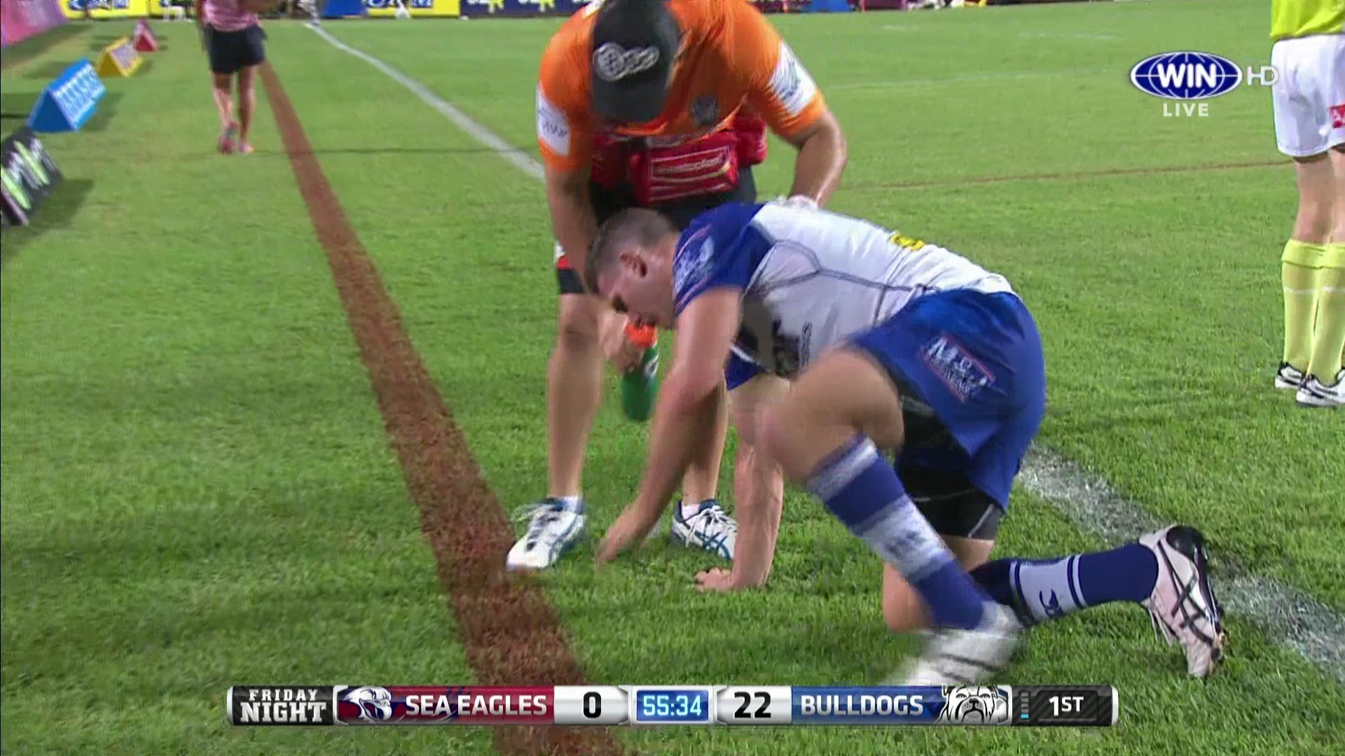
Having some W/M issues in Queensland


That didn’t work - perhaps we’ll try this?

Back to solid blue

PS: Some faces weren’t meant for HD!!
Watermark fixed now.
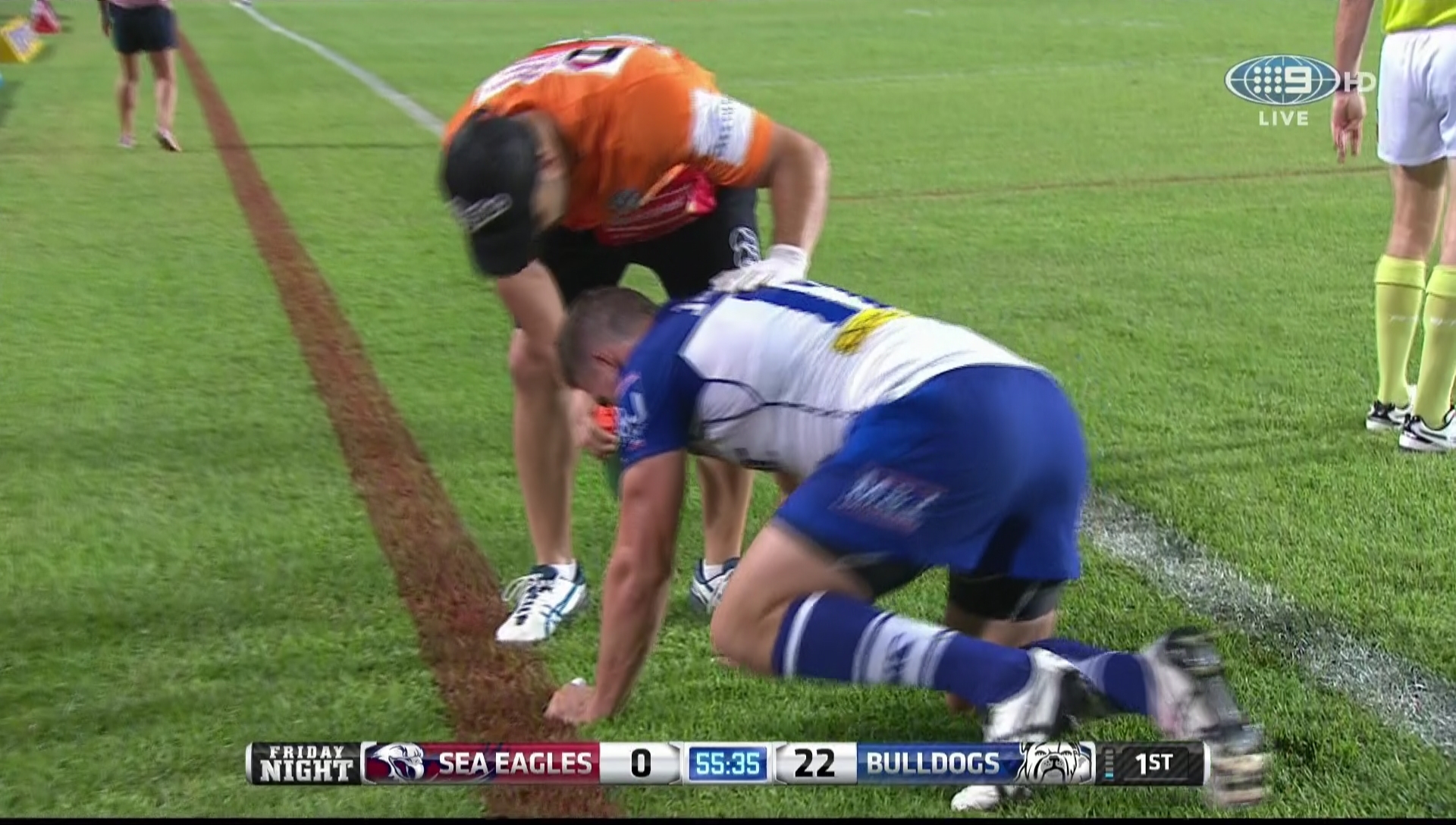
Having some W/M issues in Queensland
That didn’t work - perhaps we’ll try this?
Back to solid blue
PS: Some faces weren’t meant for HD!!
Watermark fixed now.
The new Ten watermark is the best watermark i’ve ever seen on Australian Television. Shame the promo watermarks are a horrible mess.
Ten still has not fixed the alignment between the Ten logo and HD (but that’s a minor issue).
Prime in Victoria started watermarking when it commenced in 1992, Shepparton (and I presume Albury) used a “prime” watermark in an Arial font while Bendigo, Ballarat and Gippsland the font was different (more of a Times Roman styled font at that time) and it was skinnier. A year or two later Shepparton and Albury changed to the Times Roman styled font in line with the rest of the state (as well as the “Prime Victoria” PRG). That was in use until 2001 when Prime got their new logo and the watermark was the same font as in that logo.
Wow! The quality of the broadcast actually looks better on WIN!
Looks better!
Yes! So much better. It actually looks classy now.
Just noticed it too, much better!
Although you can hardly see the HD now compared to the logo.
Is that really a bad thing?
To be honest, I think that the “HD” additions to the watermarks are somewhat pointless. Sure, have it in the LCN name but if viewers have access to the HD channels, I think they definitely should be able to notice the difference in the picture quality between SD and HD!
looks fantastic
Definitely not.
The addition of HD seems to be a UK/Europe thing where from what I have seem, many of the HD channels use it. In the US, it is less common for the national feeds but the local watermarks seem to sometimes include HD.
Some UK and European watermarks with that use HD - (even countries where HD is not the correct abbreviation!)
Most of those are pretty hideous actually. AXN is a solidmark. Watch and BBC3’s have a disgusting shade of pink. ZDF and 4HD’s are too big on screen and sit uncomfortably.
The only watermark I like of those belongs to Das Erste.