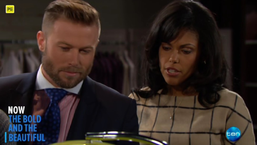
Not what I was expecting. 
Hopefully things change soon.
I certainly hope so… Ten’s previous supers and show PRGs don’t suit the current look. Like people mentioned before, I hope more is added over time like Nine’s refresh.
I hope they’re brought in to line too, have never been a fan since they were introduced personally!
So Does Ten have a new logo or not?
Their social channels all have the old logo with white border
Ten HD has new borderless disc Ten logo
What logo are promos using?
They have two different logos now
New logo which will be rolled out slowly as the weeks and months progress.
What about the big TEN logos at the top of the Pyrmont tower? I can’t remember if they ever updated those
They’re still blue & yellow, same at TEN in Brisbane plus Adelaide I’m pretty sure?
Outdoor advertising is the most expensive part of any rebrand. I can see why Ten didn’t bother replacing the logos on buildings during a time of financial uncertainty.
To coincide with the premiere of The People Vs O.J Simpson, Ten has followed up with Nine and Seven, and used a on-screen classification during the beginning, and has adopted the “CC” symbol. The Classification PRG is the standard one used on DVDs and other media.
-heart attack-
After 10 years, IT HAS FINALLY BEEN REPLACED???
Being Ten, we’ll probably see it again tommorow on another show 
I like the idea that it shrinks!
I’d say we will see Ten use it for “tent pole” programming. It’s clearly done so people don’t change the channel.
Wouldn’t be surprised if the full screens stick around for quite some time yet though…
Ten has updated its logo on the Adelaide Studios.
Good to know, I thought they just superimposed the new logo over the old one on those panels for the news backdrop.
Yep!
The signs on South Yarra building here in Melbourne either half light up or are just completely dead and black. So if they can’t afford to fix the illumination of the signs, I highly doubt they will update it… Sad.
I’m really confused now on what TEN is intending to do with the logo. The promos still has the pre March 2016 logo, the PRG has the new TEN logo while the watermark is now a hybrid of the two.
It’s a bit of a mess at the moment. Another thing to mention is the new Classification PRG and the CC symbol is only seen on The People Vs O.J Simpson, while the old one is still used on other shows, and the revised watermark has received its rim back, as well as that fact it doesn’t fit with the current logo. It would of been better to make all the changes coincide with a show, like how Seven refreshed it’s presentation during the end of the Day 1 of the Australian Open.
I’m really confused now on what TEN is intending to do with the logo. The promos still has the pre March 2016 logo, the PRG has the new TEN logo while the watermark is now a hybrid of the two.
I think Ten is confused too. They don’t seem too know what their logo is.
With some planning you can actually turn on a new look / logo with a “light switch” so everything changes on one day.
Cable channels run by Foxtel manange to do this perfectly - from say 6am on a Monday every single promo, bug, PRG etc will change.
For some reason Ten (and 9 and 8) have trouble planning this.
I’d say what has happened here is that Ten have some promos in the pipeline much earlier than others. I’d say they prepared those Masterchef ones months ago, before the new logo was announced/released.
They probably didn’t want to wait to finish them or go back and redo them. I’d say Ten is probably stretched to the limits with resources so they can’t just “turn on a new look / logo with a “light switch” so everything changes on one day”.
Even Seven took a week for all their old promos to be updated to the new look, earlier this year.


