I agree with every point. 
I seem to be in the minority:
I quite like the graphics and actually prefer the theme to the previous one. I would like to see a local backdrop but based on Lexington’s comment that will still happen.
Not a big fan of the name ‘Ten News First’ though.
2 Likes
Even that Nine backdrop in 1990 had some SCALE — see the tiny monitor to George’s right!!
3 Likes
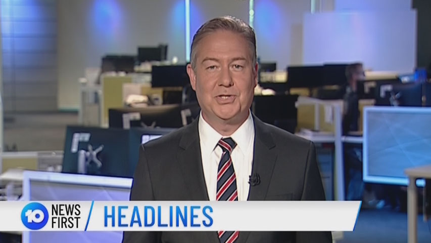
2 things I like about it, George and the Backdrop!
2 Likes
Why not? Based on what I have seen, I just think the change of the news graphic is way too americanized… It reminds of CBS and ABC NY’s local news for some reason and that doesn’t sit well with me. And add to the sell. I could get used to it in time, but i don’t watch Ten news anymore but seeing the graphics as it is now doesn’t seem to want to entice me back into it. Just how I’m thinking.
I do love the logo for 10. It has one redeeming quality.
1 Like
I also have to say…
I don’t like the animation. I don’t like that zoom out of Australia in one animation. They should have had some more impressive representation of that globe spliced with CUTS.
3 Likes
Ironic.
Other than a globe backdrop, which is also used by broadcasters across the world, I simply don’t see how it’s American. The design is fundamentally flat, which is a hallmark of European news design.
9 Likes
Oh how I completely agree with this post. If I could like it twice, I would!
I get that Ten needed a new On-Air Presentation package for their news (especially since there’s some striking similarities between elements of Ten’s now former news graphics and Nine News’ 2016-current look), but what I’ve seen so far doesn’t look very good at all. And as for the theme music, please tell me that Les Gock isn’t responsible for the 2018 remix?!
Now to be fair to Ten, we’ve so far only seen Updates and not full bulletins where we’d see a lot more of the elements in action. But I really hope there’s some more impressive stuff in the full package! ![]()
3 Likes
-
The themes signature sounds like it is the old 2004 one and they have just sped it up and it’s changed it’s pitch. Sounds a little cheap and rushed.
-
The headline bed sounds like a jumble that is similar to the 2010 jumble when they added the beeps. There’s too many sounds happening on this one

-
The logos animation on the title card reminds me of the previous sbs animation of their logo too!
-
I don’t like the use of the “lines” globe. Reminds me of 9news in the 90s and it’s making the look dated. And it seems I’m not the only one on here thinking that.
It’s not fresh and innovative like the on air presentation.
I also still fail to see the meaning and relevance of this “first”. All I can see is they have joined 7 and 9 in wanting to “be first” and in this case named the bulletin that. You’d think if there was a biger plan behind you’d present it at your upfronts and showcase it to your advertisers.
Another missed opportunity.
I agree it should be just 10 News
3 Likes
“In 10 News First, police on the trail of a heartless hit-run driver who slammed into a disabled man at Docklands” - the story that was the lead on 7 News Melbourne last night.
I actually like the new theme and graphics, don’t like the backdrop.
There was hardly anything “eyewitness” about it’s previous bulletins, so why now try to claim “first”. “10 News” is fine. People aren’t going to say they watch “10 News First”. It’s going to be “10 News”, if that.
As much as I love the new look of the network overall, I think the idea of 10 News First just doesn’t work. Keep it simple. 10 News.
12 Likes


Instantly better, still not loving the super or logo.
2 Likes
So what aired instead? Just ads?
1 Like


I hope Brissy pulls it off well… because I loathe Sydney news. Prefer the format and presenters up north.
It just doesn’t scream serious news to me. Reminds me of a mock news bulletin in a movie or tv show.
The circle outline and ‘update’, look like an after thought - the logo isn’t even centred.
13 Likes
I give it six months before it gets tweaked
4 Likes
A bit BTN?
1 Like