@Travis good point forgot about Sandra.
I understand that’s Rob’s choice but l have different opinion l would of liked to see one of the regular team as well.
But it’s Rob’s show after all not mine.
2 Likes
1 Like
I actually agree with Rob on this one. The role of the host is to steer the discussion rather than offer strong opinions on topics. Jess being able to express her opinion is crucial as she is more often than not the point of difference.
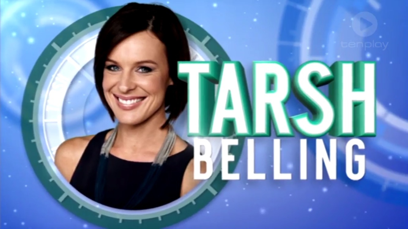
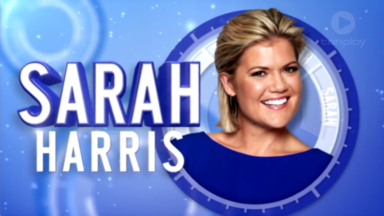
Like Tarsh, Sandra does an excellent job in the host’s chair. They’re both rather reserved when it comes to expressing their opinions, unlike Jess.
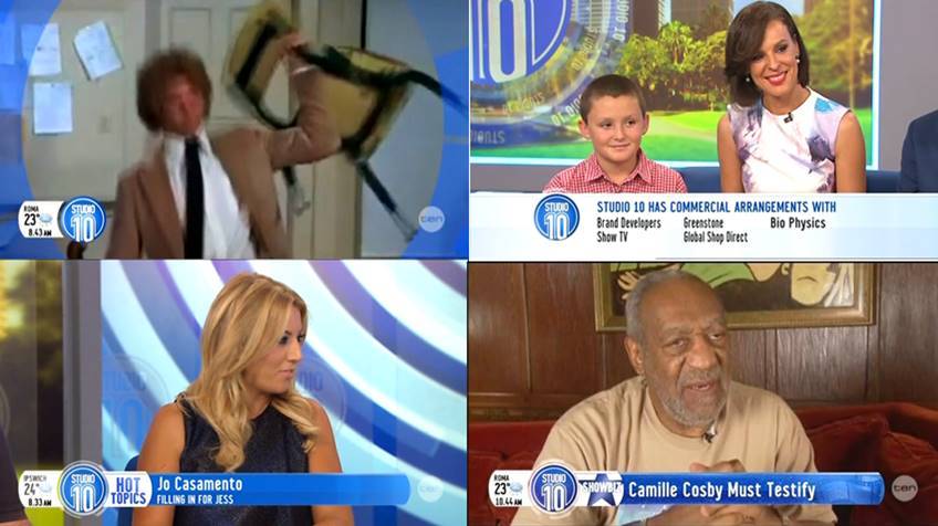
Dont mind the new graphics definitly a improvement
I like the new super and graphics.
However, I would make the Studio 10 logo smaller which would allow the bar to sit closer to the bottom, Today has the best placement which is less intrusive, right at the bottom of the screen.
Couple of caps from today of the new refreshed graphics package, definitely an improvement but still lots going on on-screen.
I like the use of the matching box on the other side of the Studio 10 logo for Daily Dilemma, Hot Topics, Live text etc rather than changing the logo all the time… much better!
4 Likes
I agree with Rob here, as you should leave it to the best, whether it is Sandra, Tarsh or Sarah. I don’t think Jess would have the skills to control the show, as being ‘the bus driver’ would be hard to do.
I actually don’t mind the graphics at all.
I don’t doubt for a second that she has the skills, she would be more than capable. The impact it would have on her offering her strong opinions on topics is more the issue in my opinion.
Don’t think so. That’s what she’s there for. I agree with the notion that the driver has a different role to the passengers and would not like to see them changing positions daily.
The way it’s done now works and they should keep it that way.
not sure if I’m a fan of the new opener or not
I’m not sure I like it either, all the different colours looks tacky in my opinion. Sometimes I think the show runs with a great idea, such as the roatating circles around the logo on the cross backdrop and then ruins it by overdoing it… now it’s part of the graphics package & intro for the hosts at the beginning of the show.
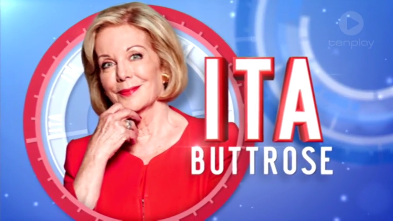
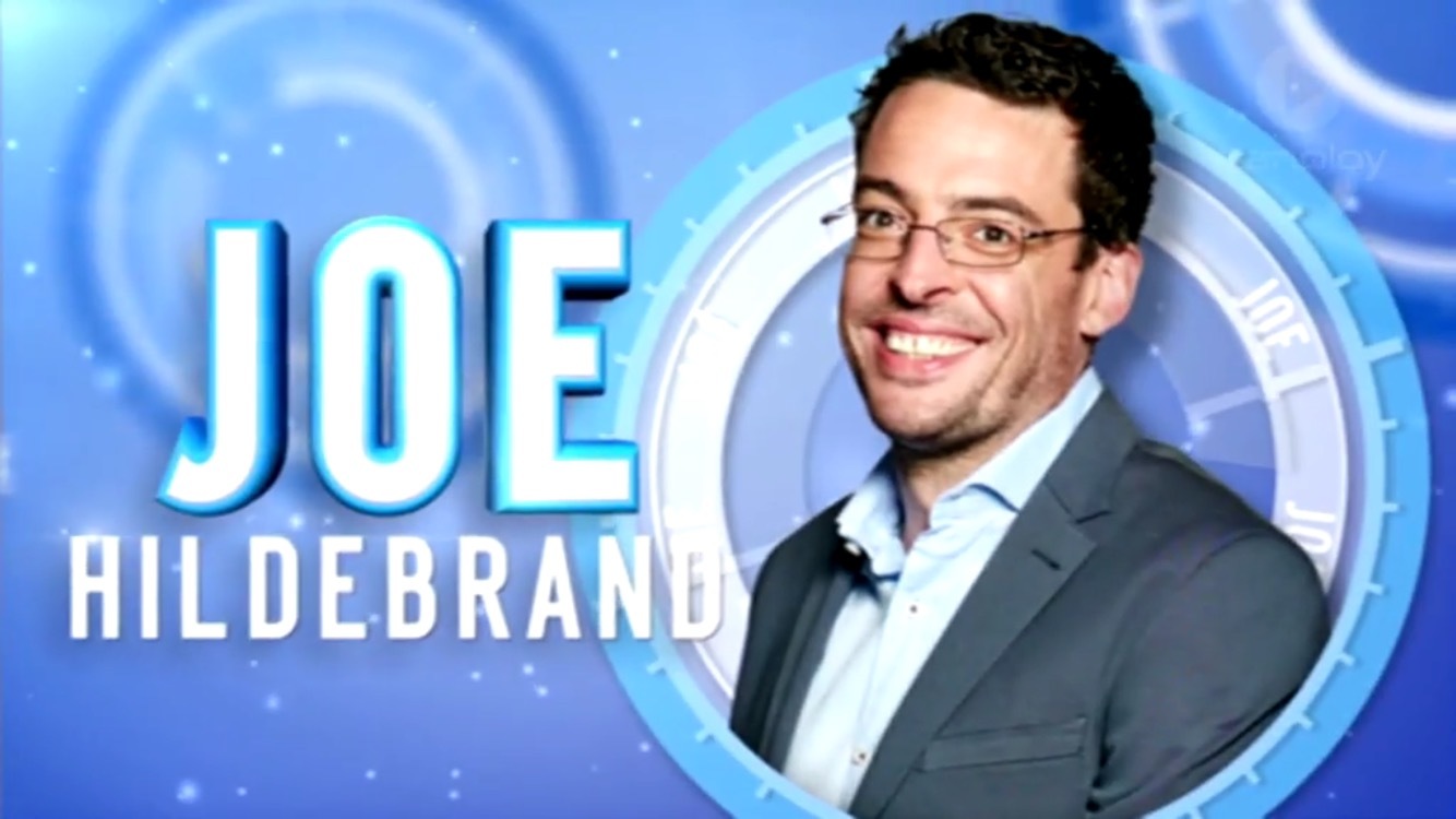
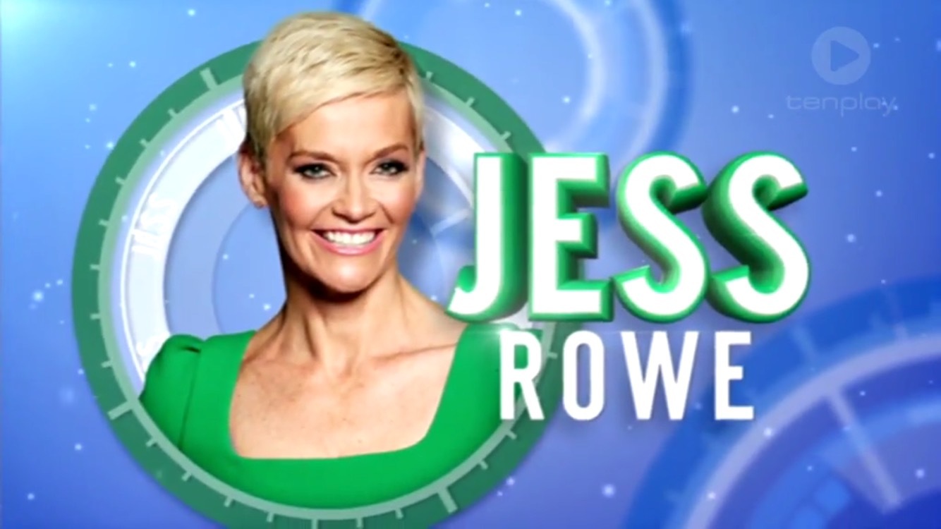
I do like the image of all the hosts together though! Some caps from tenplay:
1 Like
looks like snow flakes in the background
Not a fan of the different colours. Also, the colouring for Jess and Tarsh is too similar
1 Like
Don’t know who it is this morning, if it is Jonno or not but whoever it was this morning WOOOOING at the top of their lungs every 5 seconds, need to be told to cool it down a bit. Was coming across as tacky and just not needed, haven’t noticed as much before so may have just been today it was a bit more to bare than normal.
Otherwise a great show as always from what I saw this morning. 
1 Like
Appears as if Jono’s segments were all prerecord today so unlikely he was there, I think it might actually be one of the crew members there… have heard it before on the TV and I’m sure while I was in the studio audience too.
If they’re trying to make into an Aussie version of The Talk then it’s a bad move. The constant whooping and hollering on that show makes it largely unwatchable. Let the audience react to the show naturally. Don’t mind them being prompted to clap when they’re off to a break but otherwise cut out the unnatural reactions.
1 Like
Studio 10 with 89,000 viewers yesterday.
I doubt it will be too long (hopefully) before we regularly see it cracking over 100k.
The little show that could.
3 Likes
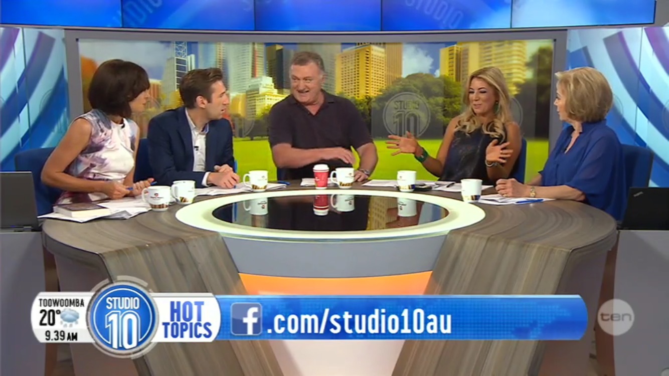
Anjali a great addition to the panel today, as she is when she guests on The Project. She is someone who would probably be capable of filling in as host.
1 Like
She’ll be back on the desk tomorrow.
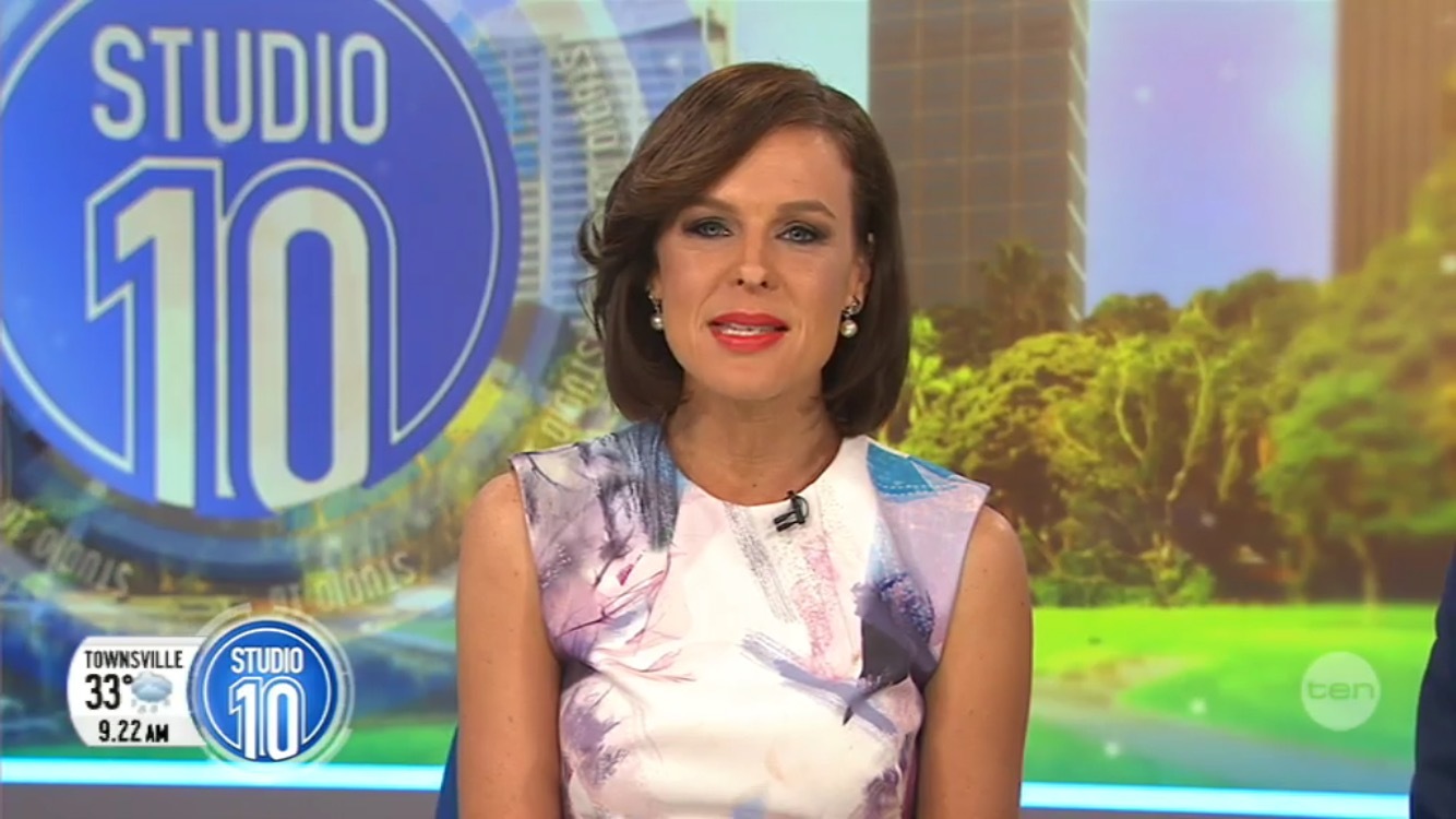
Not too bad. The supers are definitely an improvement, especially the clock, and I really like the bug on the right hand side of the logo.[quote=“JBar, post:46, topic:97”]
However, I would make the Studio 10 logo smaller which would allow the bar to sit closer to the bottom…
[/quote] I disagree. The Studio 10 logo needs to be bigger than the supers so it’s noticeable but glad it doesn’t rotate anymore. The only thing I would do is align the blue super glossy top in line with the white two. I would also like to see the white bug with things like LIVE and Daily Dilemma appear more often as it looks better there. However, the dark supers conflict with the backdrop on set. Rob, could you get a backdrop with more of a blue hue, like the one in Melbourne, as currently it is orange, along with the green, would have looked nice with the first light coloured blue.[quote=“killy06, post:54, topic:97”]
I’m not sure I like it either, all the different colours looks tacky in my opinion. …
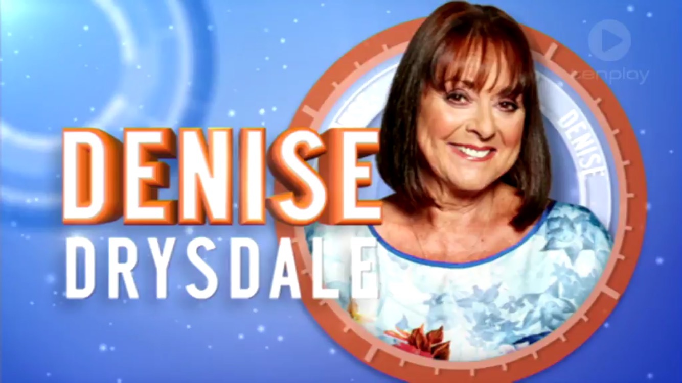
[/quote] I must admit that when Ita appears, it makes you look. I suppose it is a way of representing the presenters in different ways. IIRC, Denise is the last name to be mentioned, so can it be changed to Sarah. Also can Jono not make out there is so many names and don’t pause at the four presenter. It didn’t sound too good. [quote=“killy06, post:54, topic:97”]
I do like the image of all the hosts together though!
[/quote] So do I. That image with a ‘Tomorrow 8.30’ appears now as the endtag of the promo. Speaking of which, there is a ‘no one can do it better’ promo for the showbiz file.