The Brisbane promo has now changed to Queensland with the logo updated.
In the spirit of what 10 News First have done with their profile pictures I think that Seven reversing their profile picture colours would look even better. Would probably need a slightly darker shade of red though.
I’m going to go out on a limb here and say it was breaking news?
I don’t think they are, it seems that’s exactly what they’ve done.
Looks pretty good too.
‘Embrace the red’ they said.
Instead of all red, could they reverse the colours on either one of the desk or the background… ie, red on white.
An overwhelming amount of white on a screen in the studio is never going to look good. It produces too much uncontrolled light - it looks off colour or over exposed. It’s just awful.
Just like black looks like the screen is off.
I’ve learnt these lessons the hard way.
Sbs seem to do fine with white?
If it’s your main colour scheme, sure, you can adjust for it.
But most of SBS’ news graphics are off-white (grey) gradients, not pure white. It’s why everything on their set looks kinda dull and not bright. They’ve had to compensate for the light generated by the screens.
Not to mention that full white isn’t broadcast safe for SD (Rec.601). What looks white is usually Grey (235, 235, 235).
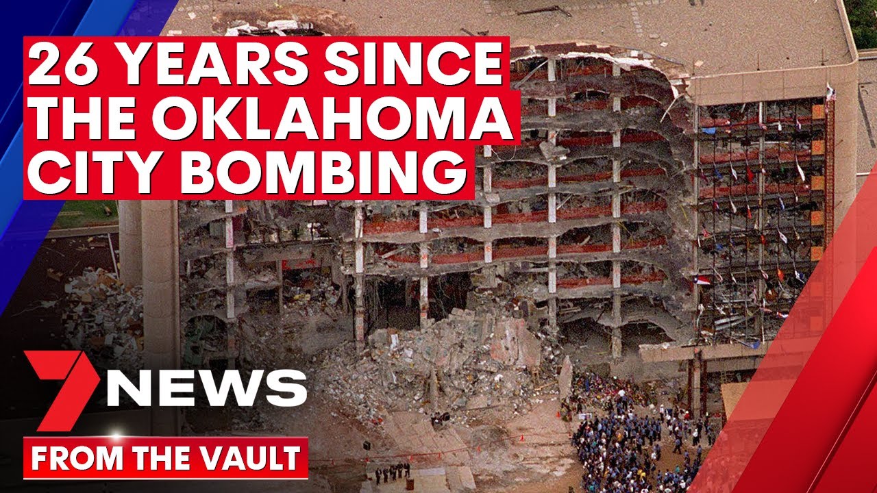
7 has uploaded some archive footage of the Oklahoma City bombing, including some old school Today Tonight.
Fair enough. I just don’t think all that red is particularly effective either.
Neither do I.
We’ve lost the art of subtle.
And in brisbane the red is actually maroon and clashes with graphics and logo.
Maybe have “breaking news” on just one of the backdrop panels, and on the desk, just have “breaking news” in smaller white font scrolling across the bottom


