What’s with the poor audio sound in the weather broadcast?
I think I would have switched off when the group chat started. It signalled an end to any more news being shown.
NNN headlines.
Unfortunately I wasn’t able to watch half the bulletin (the portion which seemed to be pointless); how would you guys compare this to 10’s Lunchtime offering?
Some elements from the beginning are good. But after 12.15 (for me) it goes down hill. The bulletin becomes too drawn out with long entertainment segments, discussions and interviews. It seems very padded out.
There clearly needs to be more focus on the news. And the pace needs to move faster.
Having two people chat at the desk about topics of the day is too similar to Sunrise IMO and doesn’t add anything much to the stories.
I prefer more in depth interviews with experts on subjects like you see on 10’s bulletin.
100% agree - the interview about the flower was way to early IMO, and would’ve been better placed towards the end of the bulletin.
Also both guests are young. The older audience (yes a lot at home) really can’t relate to some of their opinions or views.
There was very little news in the bulletin.
The main stories were Hostages, Tony Jones, Election, Trump and a mention of TikTok.
Then after Finance, 5 brief RVOs then onto the flower interview. After the break it was entertainment then sport.
Yes, it has Anthony De Ceglie stamped all over this bulletin.
Apart from a brief drop out it doesn’t sound any different to me that it usually does, though that might have something to do with me being use to it since I live in Adelaide and watch it regularly.
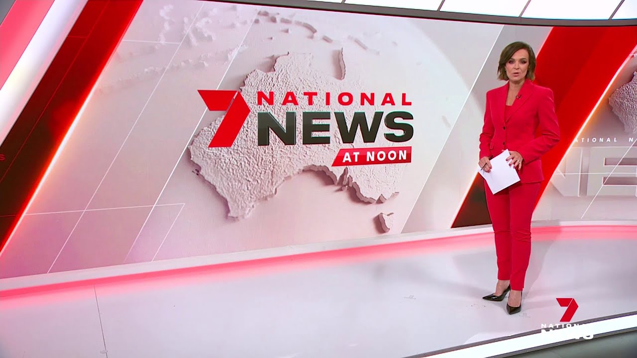
Visually I think it looks appalling. They’ve botched the package with all these different elements which makes the set and graphics look extremely cluttered.
The new backdrop behind Tarsh is way too busy. The old national backdrop is so much easier on the eye.
Too much red on the set too now. Doesn’t help that Tarsh blended into it with the choice of clothing.
As I also mentioned earlier, the logo/name is terrible and it looks terrible on the desk.
If they want to persist with this “National News” branding, just have “7 National News” on the desk.
Compare the compare and notice how much easier on the eye 10’s package is
If they scale back some of the clutter it will look much better.
The new backdrop looks nice. The old one looks blurry to me
It’s because (for whatever reason) Ann Sanders wanted to have a soft blur on her face.
I watched 10 News First Lunchtime in comparison. It’s a far better product than Sevens offering. Even the entertainment segment moves along nicely and more news provided.
It’s a bit like a less newsy version of NBC News Daily, should have called it 7 News Daily.
It is literally just The Latest, but at midday.
The Noon-est? ![]()
The Earliest.


