I hate how they have again used that angled shade of white in the corner…similar to what the blue square which housed the 7 logo had!
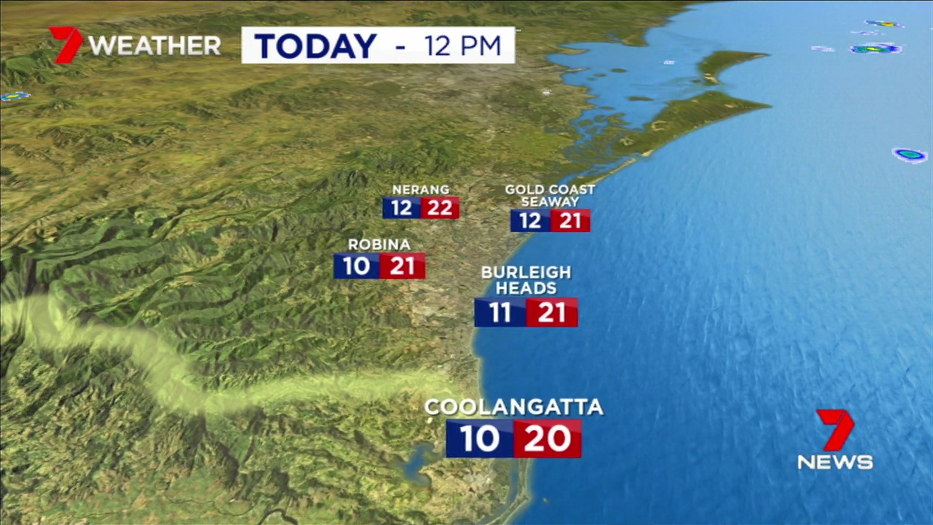
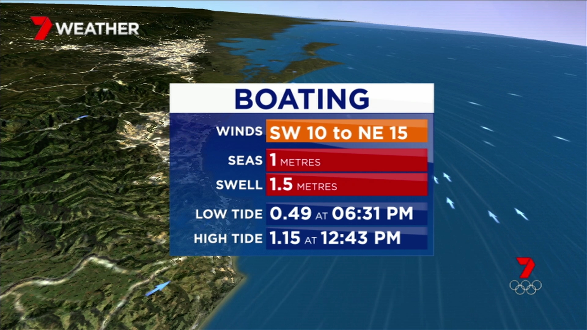
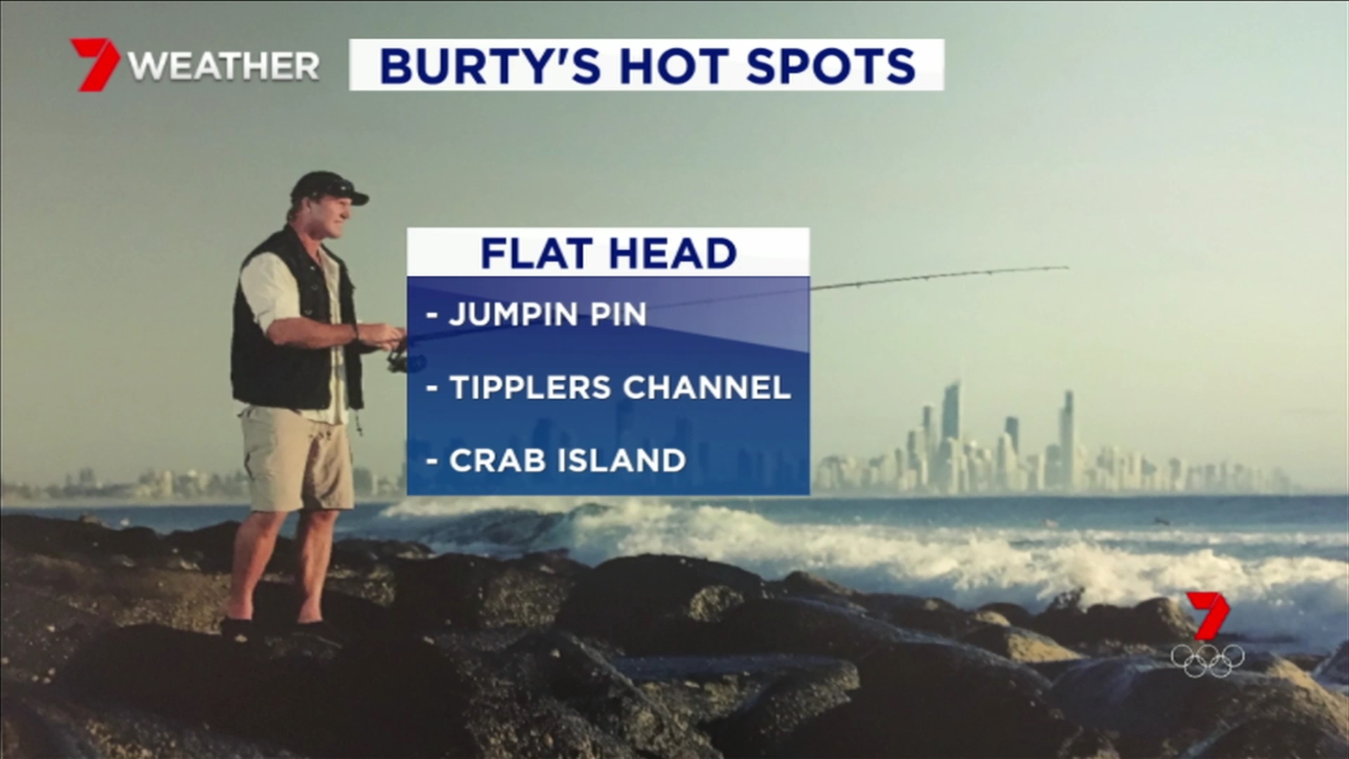
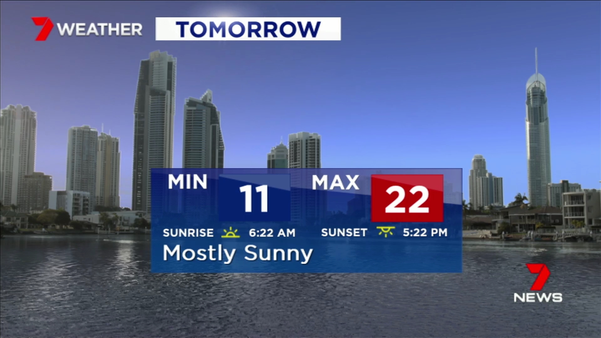
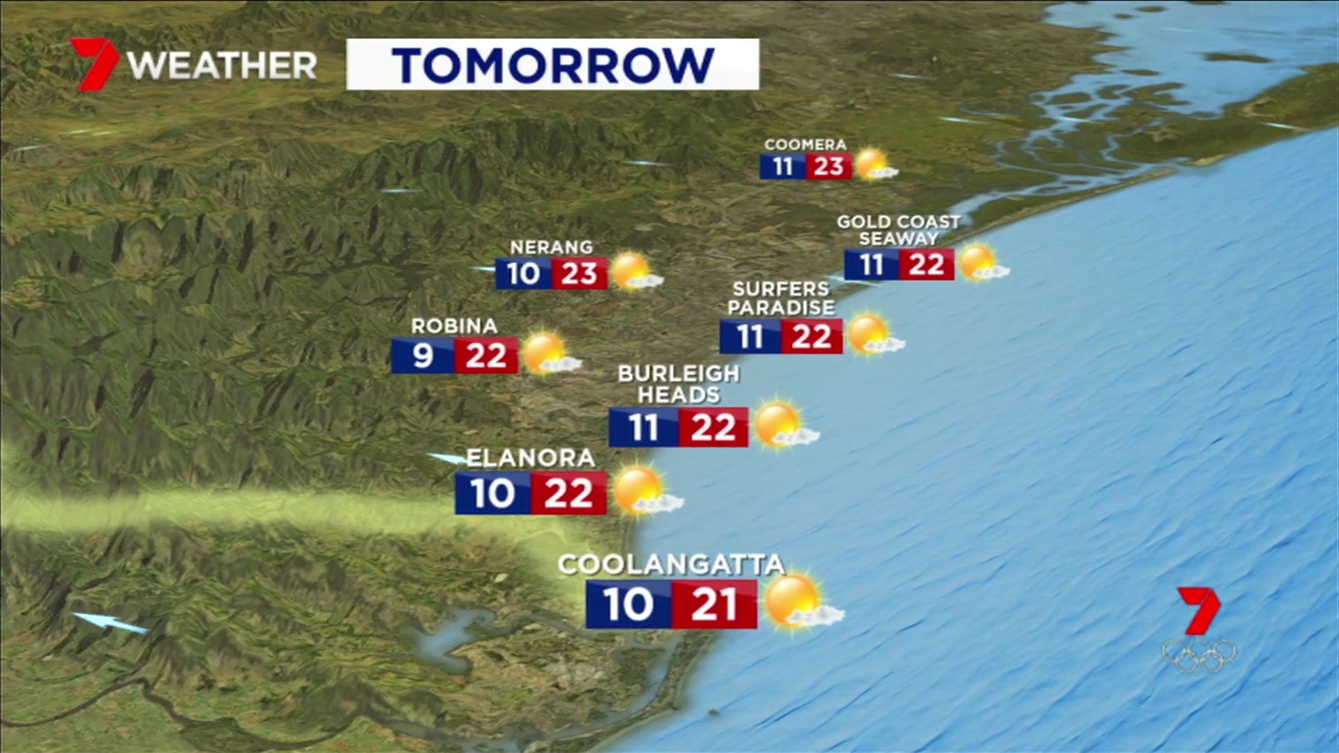
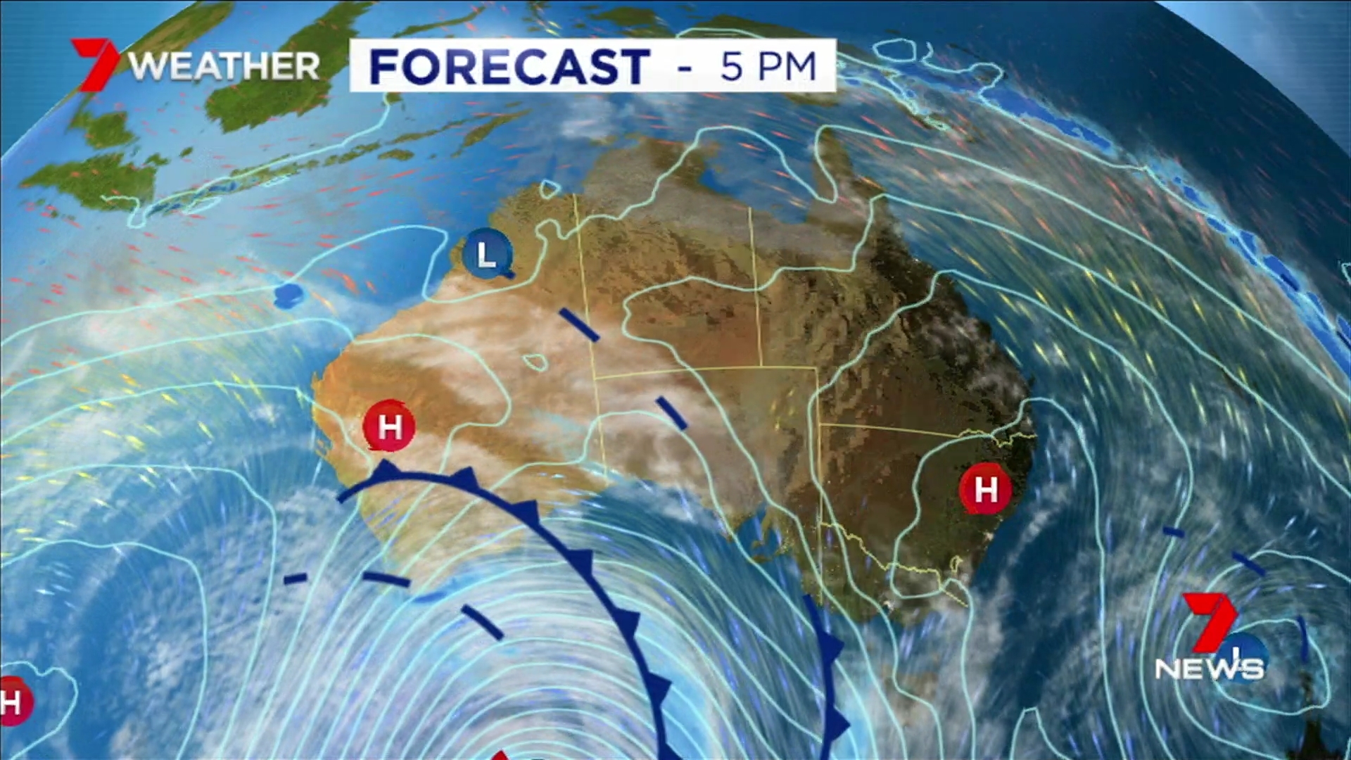
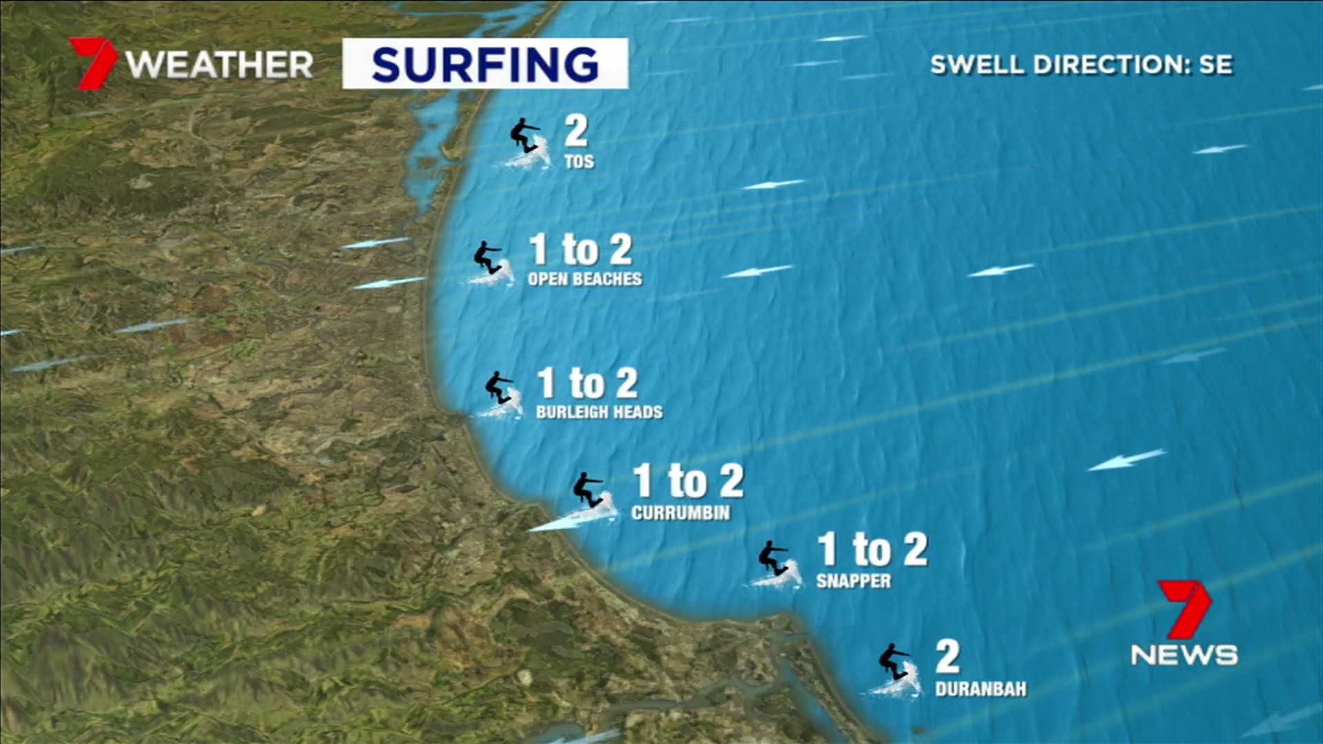
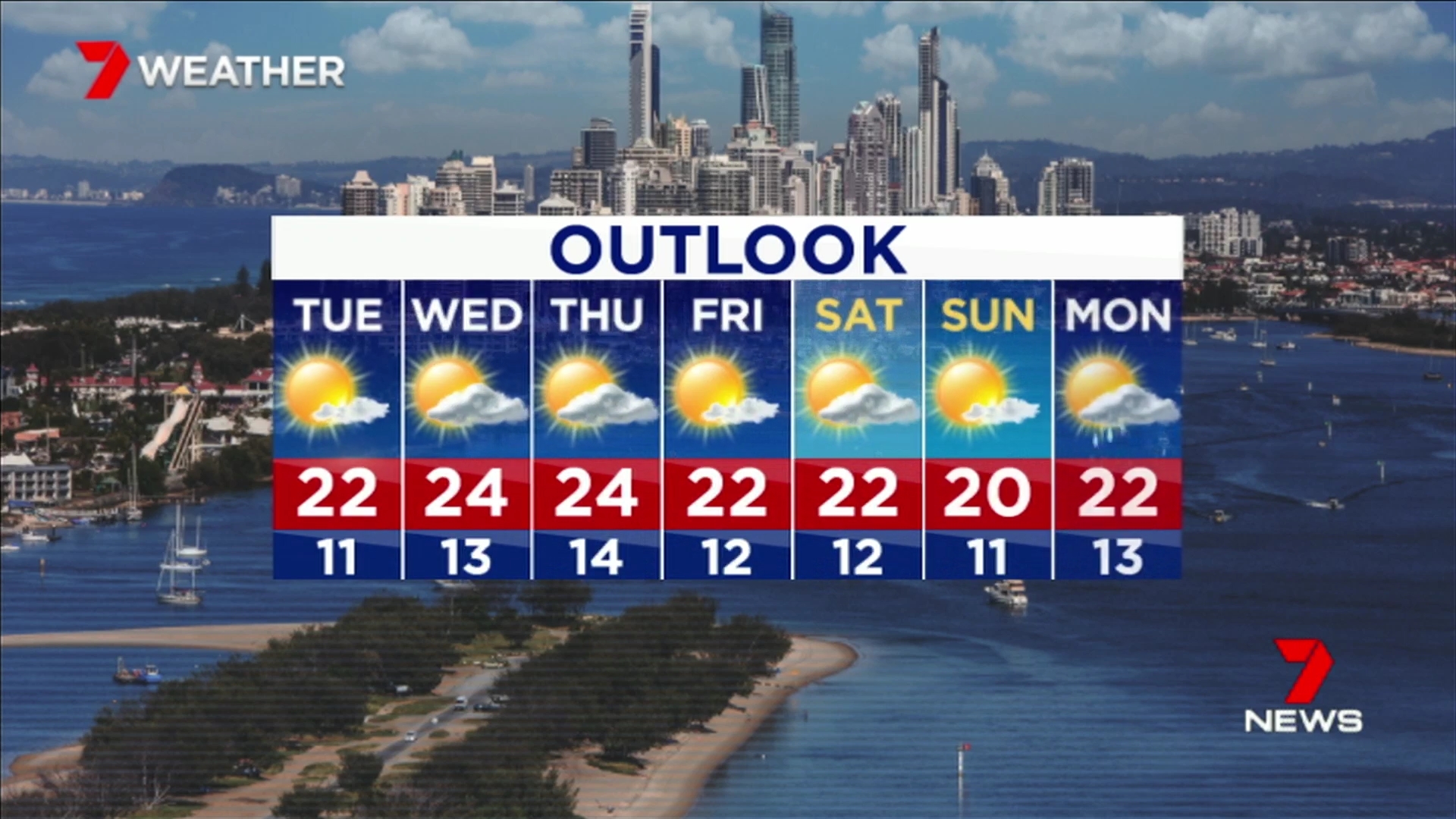
New weather graphics as well 
3 Likes
Disagree. Colours are different but the general layout does look similar.
Seven Brisbane got the updated graphics but not Seven Local News Queensland.
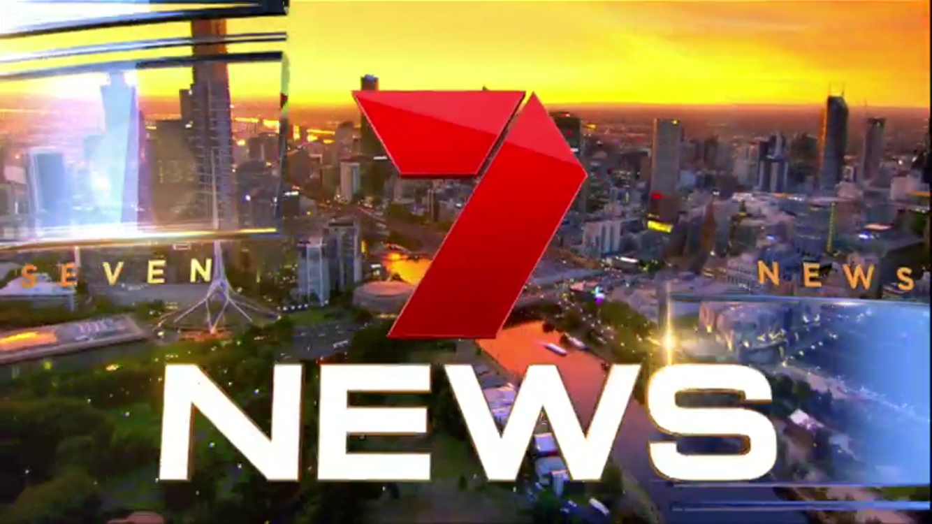
Seven News Sydney have finally refreshed their titlecard footage! Thank God for that…
Seven News Sydney Headline Opener features old logo/font
1 Like
Going to upload to Youtube.
1 Like
2 Likes
7 Gold Coast opener
looks like it’s both Red and Blue.
1 Like
Anyone else think this whole look is horrible?
The opening supers are the best part about it. The new title card is yuck!
8 Likes
Really!! Headlines red, transition swipes red, logo red. You would think the next update to the supers would be… red!! But it’s blue wtf!? 7 always fks it up they’re so obsessed with blue 

7 Likes
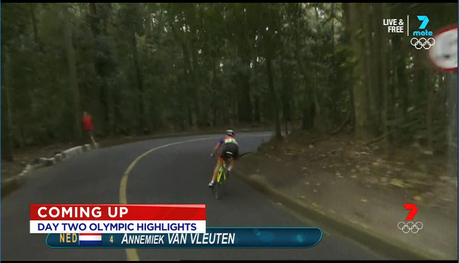
WHY IS COMING UP RED???
8 Likes
Just turned it to 9HD.
I hate the new gfx.
1 Like