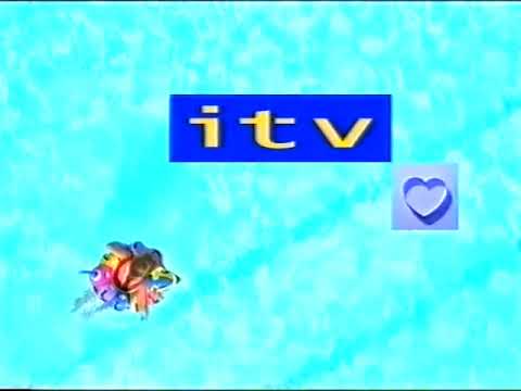
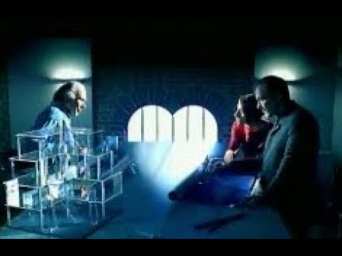
Speaking of unused idents, Adam Martyn explains, in the latter video, idents which were commissioned by ITV back in 1998. These idents were a part of ITV’s large scale rebranding project by English & Pockett and HHCL & Partners, the infamous “TV from the Heart (of Life)” campaign. The idents were produced by SVC and featured music from Lord David Dundas (E&P and Dundas were also involved in the “Get Ready” campaign rebranding which attempted to introduce corporate branding to mixed success back in 1989).
The idents nearly debuted at the same time as the rest of the presentation back in October 1998, but were pulled at the last minute (even if these were already set for broadcast in all regions). Further revisions and changes led to a very lengthy and protracted development, due to disagreements between E&P, the Network Centre and the companies themselves (by then Carlton, Granada, UNM, Border, Scottish and UTV plc). Eventually, the final version of the idents (these with the rotating blue hearts), which included more heart scenes and those from the original unused idents, debuted in November 1999 in the Granada, UNM and Border. Dundas also composed and produced a generic soundtrack which were included in these idents.


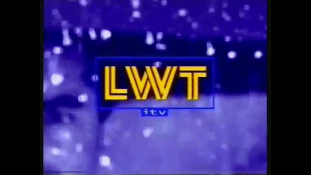
Carlton most famously rejected the new look, switching to the “star hearts” look for all three regions from September (now renamed Carlton as in London), Scottish had already commissioned a mandated new look for both franchises, which debuted in February 2000, and UTV stuck with its existing look for a time. LWT dropped the idents in February 2000 too (seeing them as ‘pedestrian’) in favor of a more brash, modern videowall design that screamed “it’s the weekend” (it was further revised after staff and viewers had complained about the first version’s soundtrack).
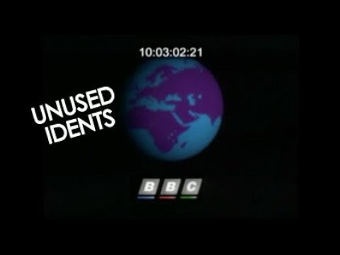
These idents might have been part of a pitch that the BBC commissioned as part of its attempt to bring corporate branding to the mainstream UK TV channels. This story is discussed with heavy detail in Martin Lambie-Nairn’s book (Brand Identity for Television: With Knobs On, Phaidon, 1997).
After having much success with their Nine O’Clock News transmitter mast titles, Martin Lambie-Nairn was asked by the BBC to consult on its presentation, working with Pam Masters, freshly hired from Channel 4 as head of presentation. The review, which involved BBC TV staff, viewers and stakeholders, was revealed in February 1989, which saw the BBC 1 COW as “unsophisticated” and the “TWO” symbol used by BBC2 as “worthy (…) but dull”, something which contrasted how Alan Yentob was trying to bring to the channel, with more edgy and experimental content that dropped off the “highbrow” image of the network. As a result, BBC1 and 2’s presentation needed “refreshing” (p.122) and these “should be complimentary”, but sharing a common framework.
Further problems emerged: BBC presentation and promotion departments were in an “obvious rift” and lacking the skills of advertising in media, which resulted in no “promotional strategy”. Lambie-Nairn recommended a pitch (p.125) and wrote a design brief for it; the company also submitted into competition. Eventually, down from eight companies at a first stage, Lambie-Nairn faced the shortlist alongside two other joint groups: Wolff Olins with the BBC Graphics Department, and English and Pockett with Michael Peters (the designer of the 1988 BBC logo). The idea which helped Lambie-Nairn to be selected was the idea of BBC2’s branding, having a “2” numeral appear in various guises and situations, a branding which lasted a long ten years (plus a further four years in the original intention of celebrating the 50th anniversary of BBC Two), however, he learned its rivals had produced “some superb, slick creative work” (p.126).

