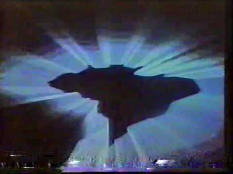
Another Martin Lambie-Nairn creation from the 90s… this time for French/German/European cultural brand Arte. The look, launched in January 1995, featured idents which reflected Arte’s unique strand-based scheduling, mixing specific genres of programming (cinema, theatre entertainment, classical music…) and thematic evenings focused on an specific topic (related or not to current events).
According to Lambie-Nairn’s book, Brand Identity for Television: With Knobs On, the new brand was a result of internal research made by the Arte board in 1994, which concluded that the channel was strong seen as “too cold, elitist and serious” (p170), not helped by low rating figures, despite a big level of money being poured by both French and German governments, plus the European Commission, as well as a near-universal distribution strategy (FTA satellite in both countries, plus a timeshare on the analogue 5th network in France terrestrially, due to the closure of La Cinq some months before).
Making things worse was the highbrow imaging commissioned by the network to French agency Gédéon, including some very creative idents produced by filmmaker Helène Guétary and with a soundtrack from producers Catherine Lagarde, Fred Leonard and Andrew Orr (imaging producers from French alternative music radio station Radio Nova at the time, now evolved as a separate company known as Novaprod/Nova Spot). This included the well-known moutons/schläfen, which has been a constant at Arte’s closedown for most of its history. Although the idents were critically acclaimed, won a number of awards and were even made as VHS tapes, the audience perception was as it was.

![[TV Archive] Arte (France) • 1993 | Schedule, Closedown & Testcard](https://img.youtube.com/vi/8Hf5iC4oBW4/maxresdefault.jpg)

As a result of the research, Arte began asking European design companies to work on a rebrand of the network, including Lambie-Nairn. Given the work had to be done within a short period of time, each of the invited companies “had to make creative pitches”; something that Lambie-Nairn weren’t very interested; however, after convincing Arte to make a quick research to deliver a “strategic pitch”, the board was more than interested to follow this path; the findings made by Lambie-Nairn had to reflect a more broad view of European culture, including a more accesible approach to the concept and in a wider, friendlier concept.
The initial ideas by Lambie-Nairn embraced a pastiche of European products or characters: “the Perrier bottle was reworked as Arte […] Asterix became Arte” (p170-173). The report and this idea was the key to Lambie-Nairn getting the job, but it was quickly discarded, given the idea was too similar to a recent work Gédéon had done for M6’s advertising culture show Culture Pub. Lambie-Nairn quickly saw an approached that remained strongly focused on European brands, but “avoiding the use of copyright brands”, in a sort of spoof ads serving as idents. Arte’s board nixed the idea as “too commercial for a channel that carried no advertising” (p173).
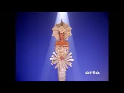
After looking at Arte’s unique schedule, they took the idea of making the idents easy for the viewer by carrying in them “a slightly offbeat and intriguing character […] based around the idea of a man or woman in various dramatic guises illustrating the subject”. The idents featured “a mysterious figure spinning a luminous globe on his finger” (used for generic programming), “a futuristic person, half-woman and half-film projector” (for films, made in two guises, one in color and another in B&W), “a character as a metronome in a dress of sheet music” (used for classical and highbrow music), “another in bizarre costume” representing a curtain (used for theatre entertainment), another featuring a disguised woman flying over the space (used for news and current affairs) and a final pack “developing an imagen of a person as a tree”, designed for their themed evenings (filmed in three versions for current affairs, cultural profiles and for topical film sessions).
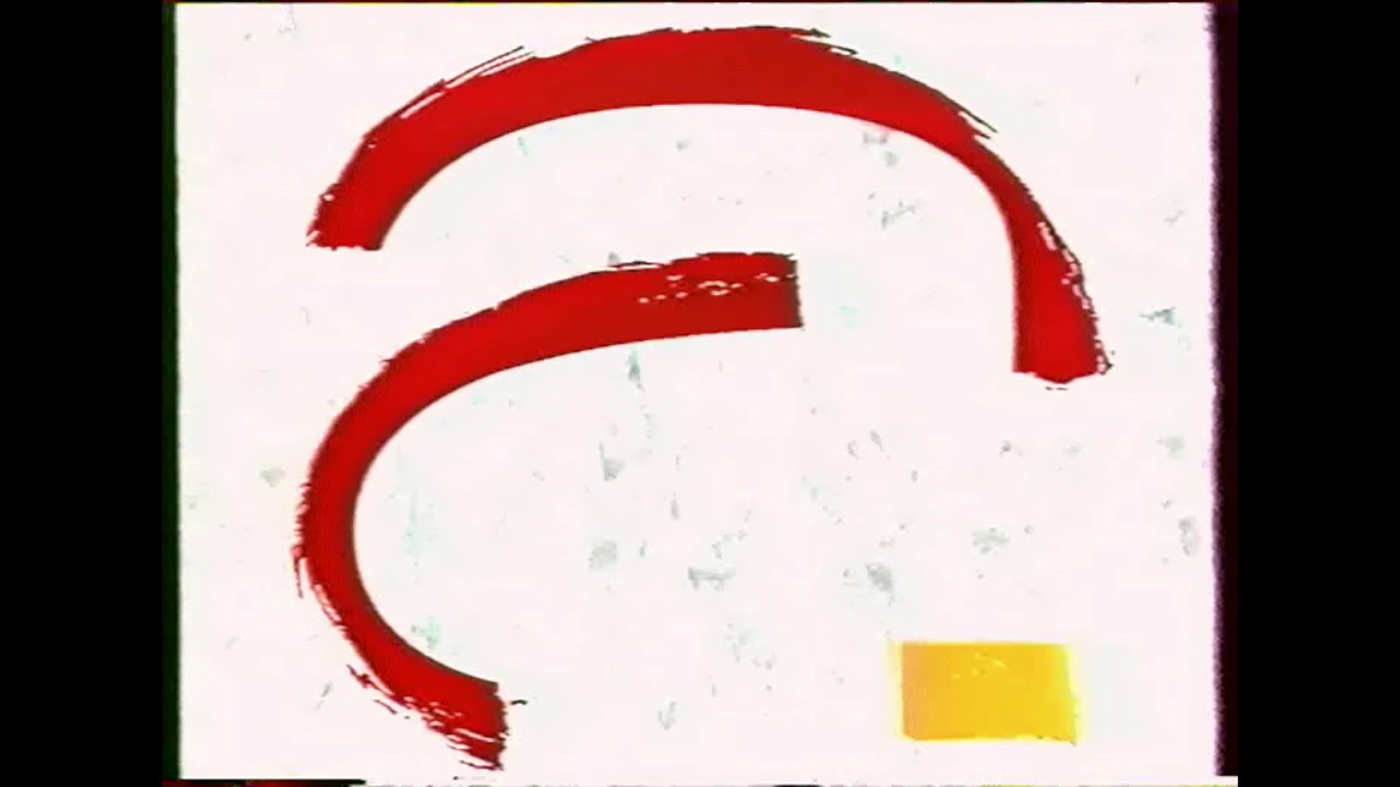
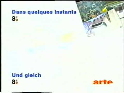
Another thing Lambie-Nairn did was to tidy up the Arte logo, dropping the “overly complicated” design in favour of a straightened up wordmark, coloured orange to make it “look warm” (p176). Alongside the tidied up logo and idents, Arte also introduced the channel’s unique angled “canvas” devices (often shown on a 4-degree tilt), being an important part of presentation and promo devices from now until 2012; the company also designed a presentation kit for Arte’s newscasts at the time, 8 1/2, a bilingual pre-produced newscast with no anchor (Arte Info/Journal wouldn’t being until 1998), plus the weather forecast after the programme.
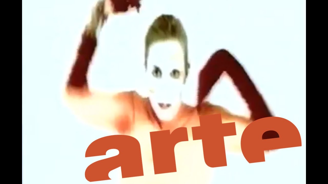
In collaboration with the launch of the new branding, Arte released a promotional Eurodance track and an accompanying music video playing with the channel’s then-new branding; it was often aired on the channel as a filler when programmes ran out of time.
The channel’s new look would have a great effect on the brand’s future: it not only established it as a “trendy” cultural brand globally, but also will help on the channel gaining steady ratings increases (impressive for a minority-interest channel), a loyal viewership, and increased collaborations with public European and international broadcasters. It would also define Arte’s perception with viewers as a “centre for design innovation and excellence”, something that Lambie-Nairn himself had very successfully championed when delivering his work for Channel 4 back in 1982.




![[TV Archive] Arte (France) • 1993 | Schedule, Closedown & Testcard](https://img.youtube.com/vi/8Hf5iC4oBW4/maxresdefault.jpg)



 (based on a magazine brand). Launched in 2000 and closed in 2012, Q TV had started as a jukebox channel (same as The Box and other branded music TV channels there) until it became a rock, indie and alternative channel (same as MTV Rocks which is formerly MTV2 and VH2).
 which the slogan is “we just play good music” and which is launched in 2003 and closed in 2006.







 . Owned by both Sky and Sony Entertainment Television UK, launched in 2003 and died in 2018, Scuzz is the only Sky/Sony owned music TV channel that not only plays rock’n’roll, but also plays punk and hard metal. (Same as their competitors, MTV2 which is rebranded as formerly MTV Rocks and Kerrang!). The only show that’s went huge and now-