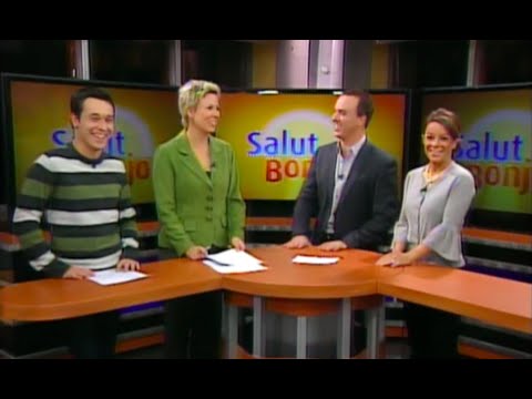
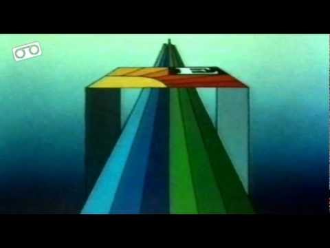
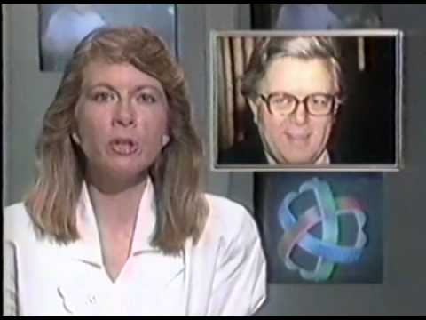
From 2008, the opening minutes of Salut Bonjour, a morning show on Canada’s French-language TVA network:
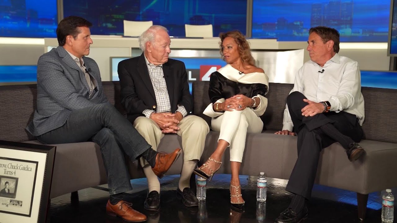
A 2022 “reunion” special from WDIV Detroit, where some of the station’s main faces (newscasters Carmen Harlan and Mort Crim, sportscaster Bernie Smilovitz and meteorolgist Chuck Gaidica) get together to share some memories of their tenure at 4. This special includes some interesting News 4 promos.
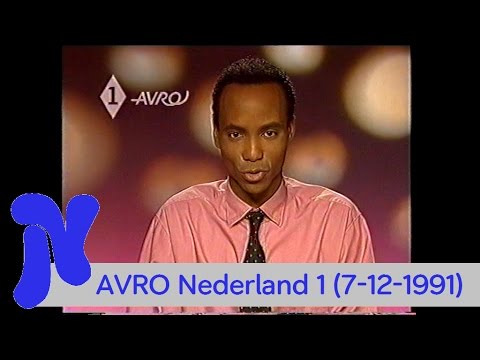
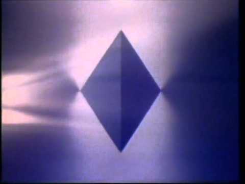
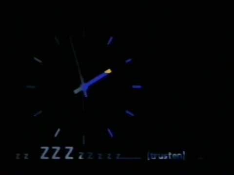
An ident from Nederland 1 in December 1991 (completely creative and ahead of its time! ![]() ; if I’m not mistaken, Lambie-Nairn produced this ID), followed by an ident from broadcasting organization AVRO. Humberto Tan does the continuity announcements.
; if I’m not mistaken, Lambie-Nairn produced this ID), followed by an ident from broadcasting organization AVRO. Humberto Tan does the continuity announcements.
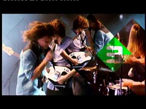
I was very impressed when I originally came across the NPO and especially the Nederland 1 idents of the 90s/early 2000s - and they must’ve hit a winner with the diamond motif as it became the unified motif for all three channels and (a re-organised) NPO as a whole about fifteen years later.
Presumably the Ned.1 bit at the start was a bumper filling in between organisations’ time blocks or at the start of day - that was still happening back then; member organisations still managing a whole block of time (aside from the required deferring to, say, NOS for the news for instance) unlike the situation now.
The idents themselves though, yeah, the first diamond ones where certainly anything but staid for 1990s European standards, and esp. compared to 80s NPO. (Of course, they had competition from RTL Veronique/RTL4 by then, so they kinda needed to…)
Actually, this ident (which was short-lived, I will explain shortly) came at a time commercial TV was beginning to be legalized in the Netherlands, which allowed RTL4 to broadcast under a Dutch license, and PSB became subject to a new law, in which the vertical programming system (in which a single broadcast organization could program an entire broadcast day, bar news, sport and special events) was gradually replaced by a horizontal program system, in which broadcasters were allocated specific time slots for programming, alongside a decentralization of the NOS (Nederlandse Omroep Stichting) to focus on news, current affairs, sport and special events; two spin-offs were created: in 1988, NOB, which focused on production facilities; in 1995, NPS, which focused on educational and cultural programming. This also led to the then-new Nederland 3, initially designed for minority programming (including schools TV) before evolving to a Channel 4-style remit.
The reforms were gradual, so the broadcasters began gradually to share content provision: in 1988, Nederland 2 became operated by AVRO, TROS and Veronica; except on Sundays, where VPRO continued offering its avant-garde programming. That same year, in 1991, AVRO moved to program Nederland 1, joined by the KRO and the NCRV, with VPRO filling the void left by the AVRO over on Nederland 2; that is when the Lambie-Nairn ident went on air.
However, in 1992, commercial television was formally legalized, causing the NPO to completely get into horizontal programming: Nederland 1 switched to a more generalist channel to compete with RTL, where Nederland 2 became targeted to children and young adults, and Nederland 3 went into a fully highbrow schedule; the remits of Nederland 2 and 3 were switched in another reform in 2006.
As part of Nederland 1’s new remit, a massive rebrand came on air on September 28, 1992, designed by Lydia Pees at NOB Design, with music by prolific composer Stephen Emmer (son of former NOS newsreader Fred Emmer). Additionally, in-vision continuity was replaced by British-style voiceovers before programming; and the individual broadcasters’ OSP was dispensed in favor of front caps and endboards during shows.
Appreciate the better explanation - there was a bit of a muddled understanding at my end as to when the “horizontal programming” bit came in, but they wouldn’t have had those idents in the first place if they didn’t do it then.
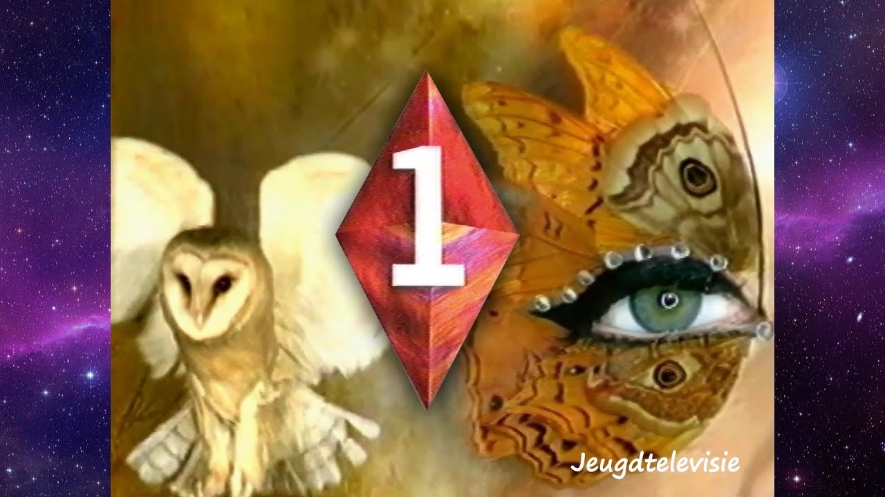
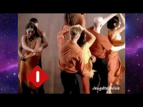
I forgot that original set of idents existed, which weren’t too bad, although I probably had the updates to these in mind, which came in around 1997 or so 1996 (compilation below):
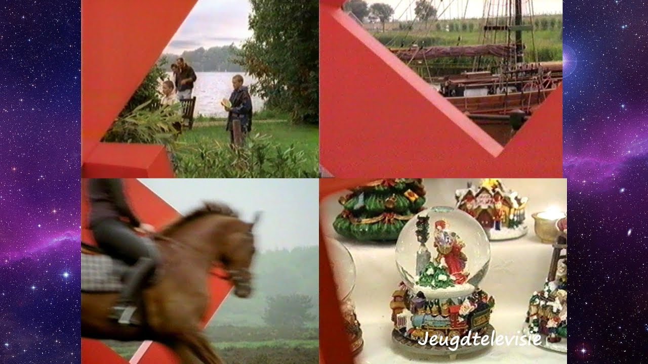
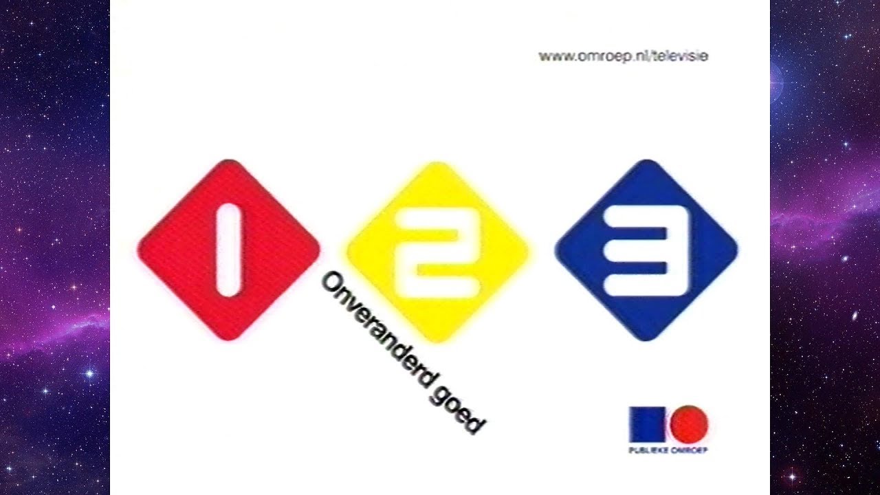
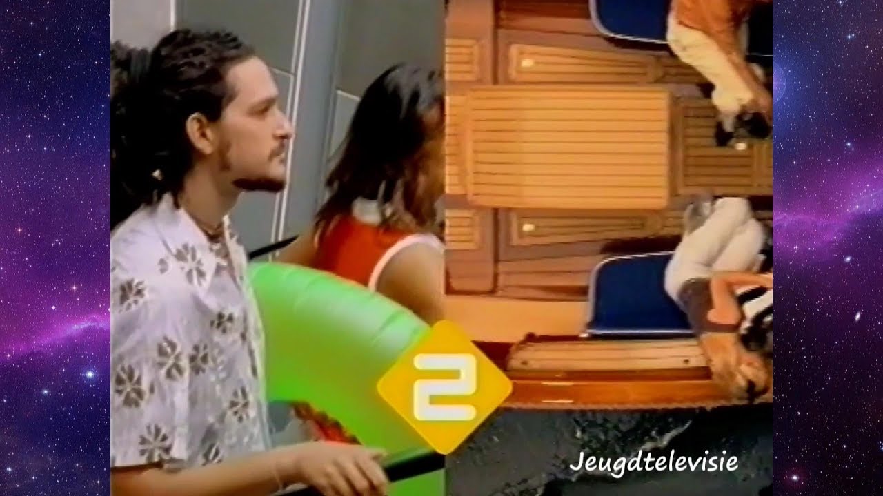
And I guess to complete that era, the following set used between late 2000 and late 2003, looking inside the diamond to views of the Netherlands, and having ordinary folk interact with it… 2003 was when all three channels started using their current diamond logos (the “NPO” addition and some colour/style changes came later).
Worth noting the “square-and-circle” tag that was added as a “superscript” to the channel logos at the time, which was an initial attempt by NOS to connect 1/2/3 via an umbrella “PO” (publieke omroep) brand - the forerunner to the current NPO when some of the network responsibilities were sliced off NOS later in the decade - focusing it more tightly on news and information and the like. (It’s unclear as to whether that PO tag was added later though… as some grain-of-salt info says the PO brand was brought in during 2002. May need clarity on this.)
(Looks like some of the commenters on this video were thinking it was influenced by BBC One’s balloon look, at least the live-action part of it… I guess it was likely one of the starting points for the trend for that type of thing, especially for somewhere like the Netherlands where they still used continuity announcers… and apparently it was Red Bee Media, well would’ve been its BBC-owned predecessor, that made them. Certainly was still classy enough though.)
Here’s a longer except about Soviet TV from that 1972 book by British journalist Timothy Green I mentioned above:
Actually, the Publieke Omroep brand was implemented gradually from 2000 after the NPO foundation was spun off from the NOS. From 2002, this bumper aired regularly after the Ster commercial breaks in all three public channels.
Then, in 2003, the NPO asked British design collective Kemistry to create a unified brand for all three TV networks. Kemistry based itself on the “De Stijl” artistic movement led by Mondrian and Theo Doesburg, as well as pointing at the diamond design used by Nederland 1 to unify the brands. The rebrand also further personalized the break bumpers for each channel, with the Ster brand only used to refer to the commercial breaks.
The rebrand was further updated in 2006, after another reform of the TV channels, in an attempt to give them a stronger identity in the run-up to the digital switchover. As already told, Nederland 2 became the highbrow channel, whilst Nederland 3 became oriented to younger audiences; Nederland 1 remained as the general entertainment channel, but with a stronger emphasis on news and live programming.
The rebrand was expanded in 2007 to the rest of the NPO, including the corporate identity and the radio channels. Between 2009 and 2011, the three channels got new idents and bumpers, coinciding with the introduction of a new common OSP system; Nederland 3 will eventually drop the 2006 logo and switch to a new version of the 2003 logo in 2013. When the NPO launched a new logo that same year, designed by Studio Dumbar, the channels would drop the Nederland () brand the following year, including a small update to the presentation, as well as a new custom font by Pieter van Rosmalen.
Then, in 2018, NPO asked Total Design to consult on a complete rebranding of all three channels, due to the increased streaming competition. The result was the creation of a so-called “multiverse”, in which each channel retained its own identity, but working with a common brand framework.
A full, hour-long weekend 6pm newscast from WCVB Boston in December 1990, presented by Brian Leary and Dawn Fratangelo. 'CVB certainly had one of the coolest CGI news intros for a local American station! The theme music (composed by Michael Karp) was superb and very triumphant.
A beautiful, fast-paced opener of TF1’s Sunday night double movie session Ciné Dimanche in March 1998. The flicks presented that night were “Lethal Weapon 3” and “La fille de l’air” (a 1992 French film)
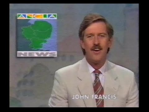
A lunchtime junction from Anglia TV in July 1993 that includes a local news round-up with John Francis, the ITV national weather with Alex Hill, the Anglia weather, a clock and some promos, commercials and slides.
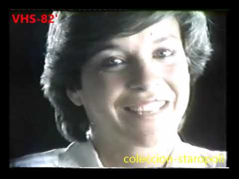
A 1981 sales video from ATC (channel 7 in Buenos Aires), where they highlight some of its locally-produced programs and its purpose-built facilities. At the time, this public TV station was commercially oriented and had very good ratings: it aired telenovelas, dramas, children’s programs and imported series and movies, interspersed with sports events (soccer and Formula 1), culture and music shows.
For most of its history, Canal 7 (now known as TV Publica) has been accused of being the mouthpiece of all administrations (democratic and non-democratic). Its credibility and viewing figures were severely damaged by these accusations. Today, the channel has little to none ratings, except for its coverage of the FIFA World Cup, that brought in huge audiences.
BONUS: a promo of The Incredible Hulk in 1982, when ATC had the rights to show the program. The background music is the song “Abacab” from English band Genesis.
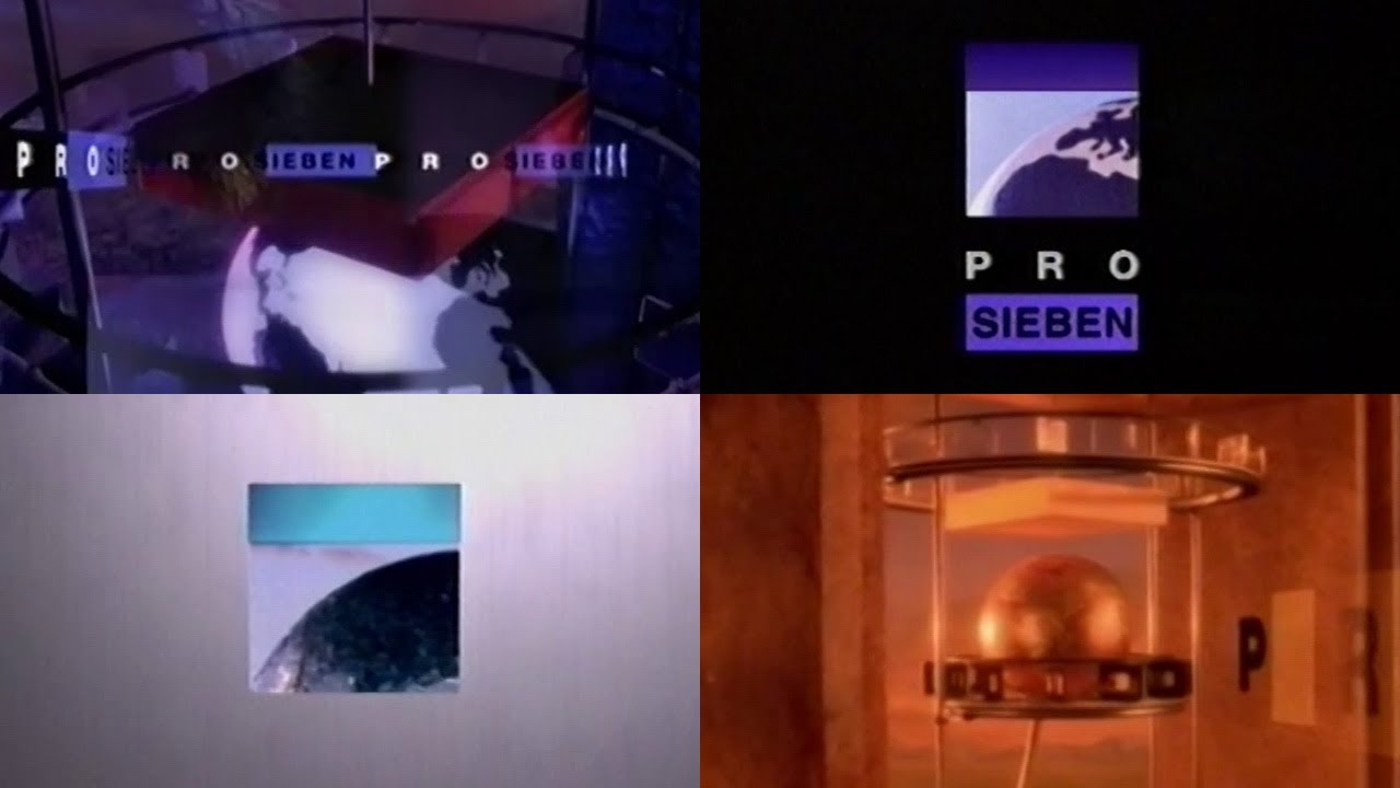
A compilation of classy idents from German TV channel ProSieben in the 1990s. Includes the intro for its movie session Blockbuster.
I have always had a fond memory for these idents and presentation. These idents (and the logo, still used today) launched on 24 October 1994, as part of a dramatic overhaul of ProSieben’s entire presentation and content, after successfully establishing itself as an imported films and series channel. However, its presentation wasn’t particularly attractive to viewers and advertisers.
As a result, ProSieben management, concerned about the station’s branding looked old and tired, went for new branding. The new logo and graphics were designed by now-defunct American design group Pittard Sullivan (one of the to-go companies for TV graphics at the time), and featured a geometric interpretation of the 7 numeral, as well as edgy graphics. The changes also marked a big turning point on ProSieben’s strategy, as they began transitioning to target a younger audience, which included adding lots of cheap original programming and acquiring series targeted at the demographic, including the rights to The Simpsons and The X-Files, which allowed ProSieben to finally become profitable and get in par with its rivals.
A station ID and a news update from WTTW (ch. 11 in Chicago) in April 1998, read by one of the channel’s announcers. These news briefs were branded as Chicago Tonight, like 11’s nightly current affairs program.
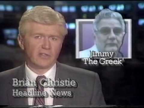
Strangely for a PBS station, WTTW aired segments from CNN Headline News during the day for a number of years. Here’s an excerpt from January 1988, presented by Brian Christie, where 11’s logo is superimposed on the screen.
16/12/2003: VH2, the UK’s now defunct indie music channel was launched
Another excerpt from Timothy Green’s aforementioned 1972 book, this time about the Netherlands’ unusual television system:
And here’s a compilation of Dutch idents from the 1970s featuring many of the broadcasting organizations you just read about, as well as latecomers such as Veronica (which launched in 1975):
And here are some from the 1980s:
Can anyone date this edition of Today? NBC Today on Channel 7 Australia (unknown year) - YouTube
They started by mentioning the OJ Simpson case, which went 1994-95 - but then there’s an ad for “Real Life” which didn’t run any later than 1994 (Today Tonight replaced it the following year).
So probably late 1994?
There are segments from at least two different editions of Today in that clip. The court case against Simpson didn’t begin until September 1994 (and the murders themselves happened on June 12), but President Clinton’s first official visit to Germany took place on June 12, 1994, and the death of Kim Il Sung, also mentioned in the news segment in the context of continuing national mourning, was announced on June 8, 1994.
In other words, the O.J. Simpson segment predates the news segment by at least a few months.
The English-language news from ATV in (British) Hong Kong during the Tiananmen Square massacre, 1989:
