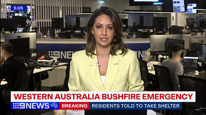
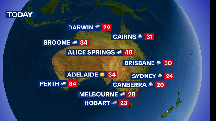
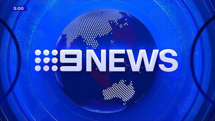
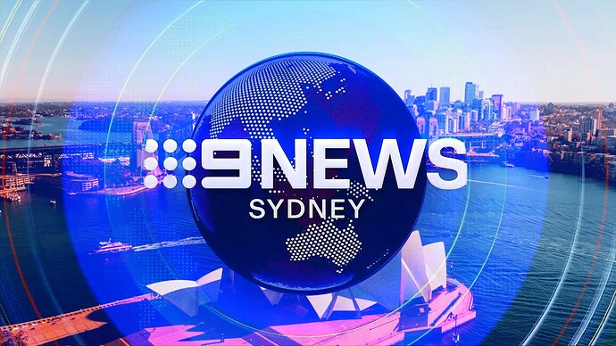
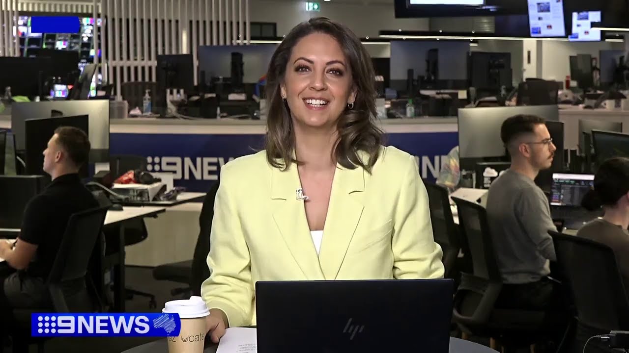
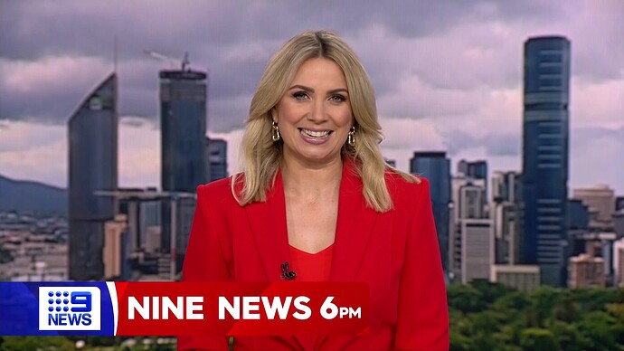
Early edition using the new graphics. Just basic with no mention of “Early Edition” but interesting placement of the clock.
I’m sorry, but how can any of you think this is an improvement? None of it flows, and it looks odd. Everyone seems to have a hard on over the globe and overlooking the basic elements.
This is early days. It could improve maybe by the end of January.
All things that’s recognisably National Nine News for like four decades.
For a first draft, this is a good mock. 6/10.
Really love this concept
Having seen a little more, I’m
Not a fan of the darker navy and the blue in the 9News bug when close to one another.
Naturally your eyes read from top to bottom, not top to side. The bug needs to be moved to the RHS to allow a natural flow for the supers.
Yikes. Can’t even have the clock next to the logo. The supers are a mess.
None of us have said that the supers are an improvement. They read incredibly badly.
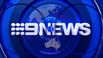
They didn’t even have a titlecard specific to the “Early Edition”?
This looks like a mock.
The pointless circles either side just ain’t it.
It’s giving 10 News Vibes
The supers really don’t take into consideration how people read. Right now the flow is
Person name —> 9 News —> Person title
Could and should be just person name and title. End result currently is that people spend more time looking at the supers, getting tricked up by the weird flow and not paying as much attention to the actual story. Not a great choice by Nine.
I can see what they are going for but as is usually the case with Nine the execution is poor.
I think it is great they are trying to use the dots more in this package but things are all over the place.
The different blues do not work together. At all. The navy blue looks terrible with everything else. It should be the same shade of blue. Consistency is key.
The globe also doesn’t sit well with me. They’re trying to modernise the 90s globe but this just doesn’t look good compared to that.
As others have pointed out having Australia next to the logo just screams Sky News rip off and it’s just extra clutter, especially with the supers.
I don’t even know where to begin with the split screens. Did they just give up when they got to those? Were they deleted in the cyber attack and someone was too lazy to recreate them? Seriously WTF?
This package has the potential to be slick and professional but instead this looks like a bad Canva mock.
Try again Nine. This is shit.
Not even updating the opening title theme, very lazy. Still the same one from
2012-16 package.
This was 9’s opportunity to change a theme they’ve had since ‘08 and they missed it. They’ve stated they care for a unified brand and design but this makes me wonder how much they do care.
The lighter Melbourne blue hue is better than Sydney, the supers and live, sport, weather transitions are lacking. The 9 news bug is a bit too big.
I personally like the opening titles in general and the background to the set. Their best package is 2016 -2020.
I also have to agree that, with no disrespect to the late Peter Harvey intended, the voiceover intro that has been used for the Sydney bulletin since at least 2012 is outdated.
Be interesting to see if Queensland uses the same VO when it relaunches.
