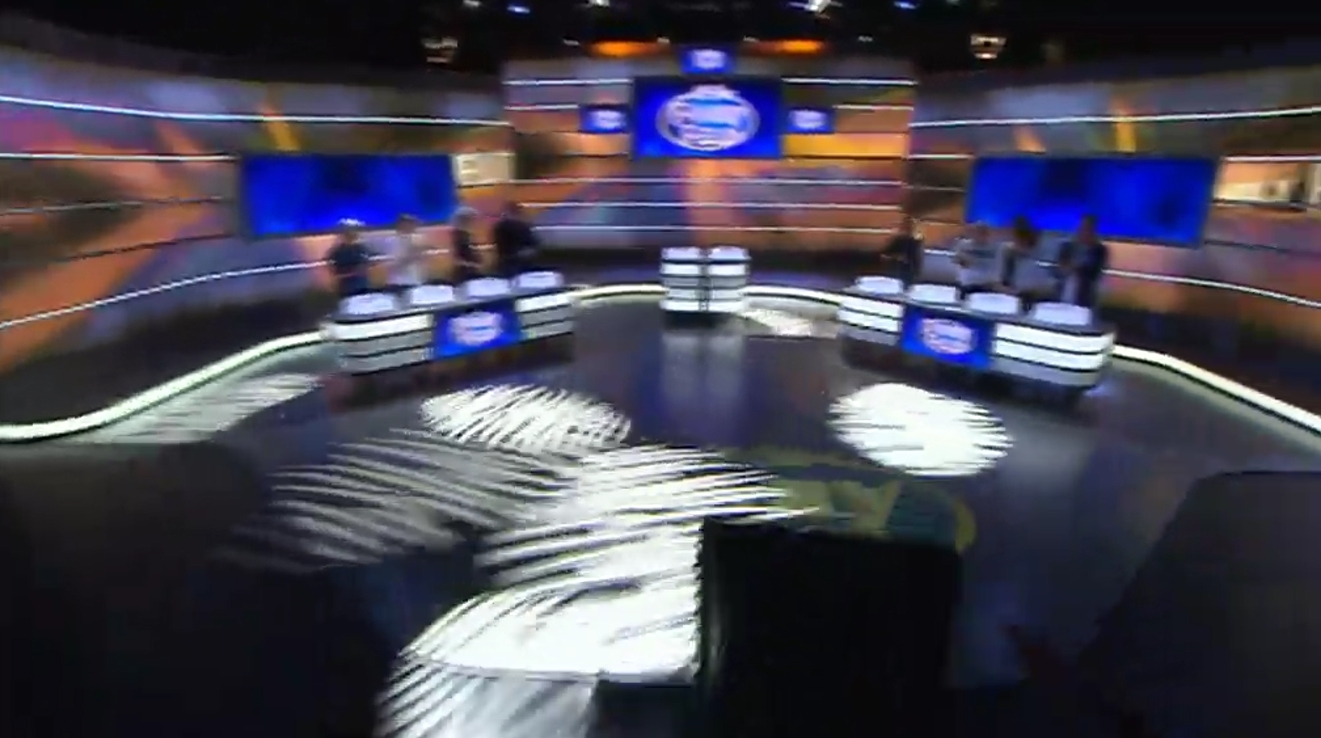
If they didn’t already have enough reason to kill Family Feud, surely this is it.
A sneak peek of the new Sydney set before the regular version airs in 2018.
That new set looks good. Love the colour palette. 
What a disgusting set, I mean it’s not horrible, but seems cheap to me.
Preferred the 1980s era set. Reminds me of Granny’s living room:

OK…I’m going to say it.
The orange lighting and the design of those new tables (or whatever you call them) reminds me of a heater!
They could have blurred out the score
Much prefer the Melbourne set.
Considering the studio at Ten is much smaller than NEPs’ in Melb i think by the looks of it a fantastic job! Great work!
A nice behind the scenes look at the new set and studio: https://m.facebook.com/story.php?story_fbid=1566611113414570&id=484837171591975
They’ve done well with the new set in the smaller studio.
Notwithstanding that I still the show needs to be axed.
Not sure what they’ll replace it with. Some executive is paid big money to come up with the ideas.
Everything in the set is generally fine, except for the camera position when they cut to the answer board. The shot is far too tight and claustrophobic.
Its meant to be a tight shot…exactly like the melb studio 
The Melbourne studio is a bit looser and higher up. It definitely looks different.
It is gonna look slighly different due to new studio/set 
Tje lighting will slso be different as we see with Thr Sunday Project from Sydney.


