My favs:
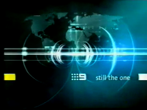
2004-2006 Channel 9 (slightly over the 2002-2004 one)

2002-2007 Channel 10

2001-2002 Channel 9
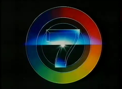
late 2003 Channel 7

And Channel 10 from 1999/2000 (don’t have an ident from my collection for that one!)
My favs:
2004-2006 Channel 9 (slightly over the 2002-2004 one)
Agreed. Still looks great to this day, same can’t be said for most on-air pres from the same era.
7’s late 2003 Lucky 7 look was slick before the revolution began
Seven’s Lucky Number 7 (late 2003).

Funny how there was a similarly-named jingle used during the summer of 1981/82.
The 2003 version was a revival of the earlier jingle
Okay, I’ll take this thread on by doing the best on-air presentation element from each network. The only rules are that I’m limiting it to things I actually saw on TV for myself, not things I’ve watched back on YouTube years later.
ABC:
Seven:
Ten:
Nine:
Channel 31:
SBS:
A number of flops as well as very bad ratings in Melbourne (where it finished third) were to blame. Not to mention it was also the middle year of the five-year period in which it did not have the AFL or any major winter sports.
For Channel TEN:
The 2009 Look (although I still like the calm piano music).
The 2006 Look
The November 2018-onwards look
I loved the long-running “Seriously… Ten”, but the 2007 year in particular with all the “I believe…” idents, as well as the ad break bumpers, line-ups, etc. All themed and recorded with then various Paramount-CBS personalities (such as NCIS cast). NB/ 10 had just picked up that output too.
Examples:
Network ID
News ID
Ad break bumper
Next ID?
Summer Packages
Seven (2003-2004)
")
Nine (2007-2008)
Ten (2009-2010)

I liked 7’s catchy Brand Spankin’ New summer look for summer 2003/04 before the grunge look
Who sings this 2009-10 package ident for Ten?
The brilliant on-air package launched on 7 just before the 2000 Olympics Opening Ceremony
My favourite On-Air Presentation packages of all time are the same as yours, although I’d probably say that just about any Channel Nine Idents from the Early 1980s (or whenever they started doing “flyaround” IDs centred around the map of Australia) until the mid-2000s were pretty good.
In my personal opinion, the best On-Air Presentation package of the last 10 years (at least on the main FTA channels) was Channel Nine’s 2012-15 package. Just a pity that we never really got to see it in HD though!
None of the looks currently used on our FTA networks are particularly exciting IMO, although I am optimistic that Nine might have something special in store for the move to North Sydney.
It’s a pity that the “X TEN” logo only really lasted about 18 months. The darker 1989 Ident looked like one which probably still would’ve worked on-screen as we headed into the Early 1990s unlike the “TV Australia” Logo which if it wasn’t for the on-screen animation, looked like something which easily could’ve been from a decade earlier! ![]()
I reckon the 2002 version definitely improved this package. I would say this is my favourite One To Watch Era Ident
Unsure if this version ever went to air in full but it shows a version of 2001.
That one is bloody good. Two minutes long though! We’re lucky to get a five second one now…
It was just so well executed and created. Almost a little story about 7 - Each scene so well planned and thought out.
Love how Georgie Parker was the start of the story in all of the One To Watch Era too.
There was another version I remember seeing but can’t find the YouTube video of it where it has one of the colourful men on the big 7 made of tvs and he dives off it. That was also great.
But yes, two minutes long.
Ah the days when they didn’t sell every single second of airtime to make $$ including the branding of the station… memories
Prime really ruined this ident with that ridiculous stock music. The proper version is so good. I love the shift the music makes at 1:21. Really uplifting.
If I’m not mistaken, there were many shorter versions of Seven’s 2000/01/02 Idents produced for more regular airplay.
The full 1 or 2 minute versions were probably just shown for a few weeks or so after they launched? Because I find it incredibly hard to believe that they were played all the time when Nine seemed to only air their yearly Launch Promos/Idents on air for a few weeks over Summer before the normal/shorter Idents resumed?
Correct! There are many shorter versions posted.
The creator involved with these indents uploaded quite a few variations to his YouTube channel.
There’s a lot of branding including some others have already mentioned 1999 - 2005