And a whole stack of old British sitcoms as well.
1 Like

")
6 Likes
Question time.
Watermark history.
In which year did each metro/national network start watermarking?
My recollection is:
Seven - 1999
Nine - 2001
Ten - 2004
ABC - 2005
SBS - ? - this one I’m not sure of. May have been 2005 as well…?
2 Likes
I think 10 started watermarking on the left side of the screen in 2005? Though I could be wrong.
1 Like
10 was def on the left at the start - over summer I think, I remember seeing it on Two Guys and a Girl originally.
Seven was first with the circle 7 in 1999, Hey Hey mocked it and sprayed windex on the camera (hilarious).
5 Likes
Here’s one for those with long memories: Did Channel Nine air any form of Christmas Ident in 2001?
Was just thinking about this earlier because while I’m aware of/have previously seen clips of Seven’s 2001 Christmas Ident, Ten’s “Summer Of Love” campaign for 2001-02 and even ABC-TV Christmas Idents for 2001, I don’t remember ever seeing footage of Summer or festive-themed On-Air Presentation for Channel Nine’s during the same era. That’s despite having memories of viewing just about all other Nine Summer/Christmas/New Year campaigns from the mid-1990s to 2018 either as they aired or (as the case is with most prior to the mid-2000s) years later via old recordings that have surfaced online.
3 Likes
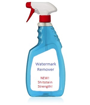
I made a bottle of it once - a new high strength version to deal with WINs blue blob.
4 Likes
Seven’s
2 Likes
Re: watermarks, I can remember WIN and Prime had them in 1994. SES8 were using one in around 1998 onwards and Ten Capital had one in 2000. All of them were in the top right hand corner of the screen.
5 Likes
Prime started using them within a few weeks of aggregation starting in 1992 here in Newcastle. Theirs was solid and bright, and was the subject of several letters and articles in the Newcastle Herald.
Prime stated at first that was designed to be an aid to help viewers tune that in (as well as NRTV) and that after a few weeks it would be “gone forever” (though conveniently it wasn’t displayed during ads).
It was still there after a few months - to which the Herald reported that it was now designed to help local viewers differentiate from Channel Seven, as it wasn’t then shown during breakaway programming.
I still think Prime’s use of the watermark was one of the main reasons why local news failed. They simply couldn’t build any viewer loyalty by persisting with the watermark, even though it wasn’t shown during the local news.
3 Likes
Perhaps NBN’s lack of watermarking until 2010 could’ve been a very small factor behind their longtime ratings success and the other two commercial stations almost always struggling to gain any real traction in the Newcastle/Hunter market.
But in the overall scheme of things, that’s nothing compared to being a Nine Network affiliate during some of their best ever years, having a historically strong local news service, just about always having the rights to telecast rugby league in a market where the sole local team is largely supported almost as if it’s a religion…
3 Likes
The same can be said for Southern Cross in Tasmania, which its main channel was watermark-free during normal programming until it rebranded to Seven in June 2018, and also dominates in the ratings there.
Like NBN with the NRL, Southern Cross has long held the rights to the AFL, even when Seven didn’t have it in 2002-06. This is because it also had a dual affiliation with Ten, and therefore took its AFL matches, including all the finals, during that time.
4 Likes
I wonder why Seven went so strong in branding in 1999 to add a watermark only to ditch their logo for the awful new one the next year.
It’d make sense to start using it with the rebrand in 2000, to reenforce the channel branding change, unless they wanted to take the PR hit for it in 1999 knowing they’d be doing such a big rebrand in 2000?
I thought the original watermark was a lot nicer than all the ones that followed - being a lot closer to how the US networks did theirs, looking like the CBS/NBC/ABC marks of the time. Ten’s Sport watermark was also like that, but their general programming one was more solid.
2 Likes
Plus NRTV’s local news was straight out of Coffs Harbour. Mind you most of the adverts they had on.there too were for business in that area.
3 Likes
I can’t recall any specific source but I vaguely recall anecdotal evidence at the time suggesting that the logo change was not a long time in the making. It might not have even been on the radar when the watermark and “The One To Watch” branding began in May 1999 (28th to be exact).
3 Likes
That would be odd - that Seven would make a relatively late decision for a total rebrand ahead of what was going to be probably their biggest ever year as a broadcaster being the Sydney 2000 host broadcaster. So I always assumed it must have been a longer term strategy.
I suppose that would explain how there were quite a number of elements that didn’t change much between the 1999 and 2000 graphics packages, as well as stuff like the Melbourne news still having the old logo.
Did it leak ahead of time or get much press coverage?
1 Like
The first i even knew about it was flicking the TV to 7 at about 3am on New Year’s Day and seeing the new logo as the watermark. It was not promoted or teased in advance AFAIK.
The first thing I thought of when I saw it was that resembled the old RTQ7 logo from Rockhampton in the 1980s ![]()
2 Likes
I was sitting in a McDonalds eating breakfast and reading the newspaper the first time I saw that logo in a print network advertisement. I thought it had something to do with a charity at first. Couldn’t wait to get home to see what it looked like on air.
For some reason I believed the 1999 “The One To Watch” branding (particularly the multi coloured band under the old Seven logo) was meant to tie in with and transition to the new logo. I have nothing to base that on, however. I certainly don’t remember reading any gossip about it in the television news lift outs where you’d be most likely to get a heads up about such things in those days. That suggests Seven kept it very much under wraps and/or it wasn’t long in the making. There was a bit written about the Ten logo changes before they took place around that time.
EDIT: Perhaps I got the idea about the colour band being a transition to a new logo based on some of the letters in the media section of the SMH in September 1999 about it and the introduction of the watermark.


8 Likes
I’ve said this before. I believe that the current Seven logo was born out of the aborted attempt to rebrand the Seven Network to the Australian Television Network after aggregation. The red part of the logo below has almost identical proportions to the lower trapezium in the current Seven logo, albeit being a mirror image (I can definitely picture in my mind some kind of animation to flip between the network logo and the 7 logo).
I think they designed the current logo for the capital cities, found it a few years later on the cutting room floor and decided to go with it for a rebrand.


4 Likes