No, furniture.
4 Likes

American designer Michael Kors has brought shoe maker Jimmy Choo for $1.5 billion
Surely that’s just a lazy/cheap supplier who couldn’t be bothered sourcing the proper logo? 
4 Likes
Hard to believe until we see a definite source IMO. They have definitely changed the shade of blue they use and the aesthetic of their marketing recently, but can’t see them changing the logo again (there’s still a ton of stores out there that still feature the old logo on signage 10 years after it changed).

Oh dear I hope not, it looks like when the signage company doesn’t have the right font for the logo so they use an alternative:

Also if that was the case, seems kinda pointless just changing one detail. ![]()
7 Likes


Ohh, you’re not joking (not that you were, it just looks like placeholder logo), wow that is a major change, most major since the 2008 rebrand IMO.  “That’s a BIGWin” is a good slogan.
Looks like the stores which still have the pre-08 logo don’t need new signage after all…
5 Likes
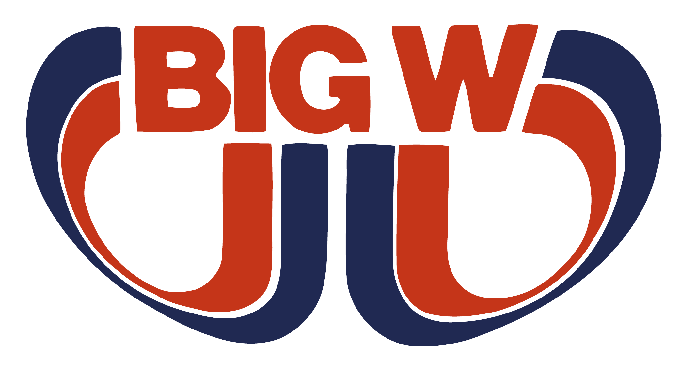
I received the catalogue in the mail too, and even though I loathed it a few minutes ago, it’s already starting to grow on me, as it’s pretty much a revival of the 1990s-mid 2000s BIG W logo (minus the “We Sell For Less” slogan with a more simplified font:

I guess what’s old is new again, back to the future in a way, though I found it quite pointless as it just looks like a font swap in the Circle logo. 
1 Like
The Whitfords City store in WA won’t need the new signage (still got the pre-2008 one) since the older one looks more like the new logo than what the previous one did.
4 Likes
Suppose we’d have to wait until midnight to see the new site?
1 Like
The kitchen utensils for $1.50 is very Kmart.
1 Like
Cheers. They’ve managed to keep it quiet a lot better than the previous re-launches! That’s a big revision, but definitely for the best.
Looking forward to seeing new store concepts that go along with that rebrand that aren’t as dark, dingy and outdated as what they’ve built in the last 10 years.
I like the (almost) return to the traditional wordmark as the font and style they’d used for the 2007-2017 logo was already looking dated. Don’t like the use of the circle though - hopefully we see a full return to the wordmark as per the front page of the catalogue.
1 Like
I guess that’s the reasoning behind the Subway rebrand…
Back on Big W though…Surprised they didn’t go with this gem…
3 Likes
Guess I’ve got to let it grow on me. The current (now old) logo was quite modern and this one just feels like a step back. Oh well 
6 Likes
To be honest, I hadn’t even noticed the change, if you asked me to picture the Big W logo, I would have thought of that old one…but comparing the two now, yes, I prefer the change back.
No point having a new logo if you never rebrand your stores though, which is probably the main reason I never noticed…
2 Likes
I feel the same way, though it’s a welcome nod to the past, it does feel like a downgrade from the 2008 Rebrand logo, as that added many brand elements that were new to BIG W, such as the standalone “W” logo on the signage and catalogues:


I feel the new Wordmark feels a lot more generic and has lost the personality that the current one had, it’s also less flexible, as the “W” from the current logo could be used standalone and still look tied to BIG W, the standalone “W” could also come in variants, such as this Christmas one featured on their Facebook Page back in 2011:

Though I’m pretty sure they retired the standalone “W” logo with the introduction of the Circle logo.
Understandable, I told my sister about the logo change and showed her the catalogue, and she wondered what was different about it, I have still spotted the old logo on Price Stickers at one point.
Yea I have to agree, the circles within the branding on the front page of the catalogue look fine, but the new Wordmark logo within the circle looks very out of place, as it was associated with the previous brand refresh and not suited to the new branding. Perhaps it’s just for familiarity before the new logo rolls out?
3 Likes
The Big W downturn coincided almost perfectly with that new logo, so I’m not surprised that they’re rebranding. It’s rare to see companies actually reverting to their old logo, though.
The same could be said about Dick Smith - that new logo they introduced at around the same time as Big W’s rebranding was the start of their downfall.
I’m not sure about this ‘universes’ strategy that they’re playing at (article about it here). It seems like a wank to me, and it will probably fail hard.
The biggest problems Big W have are their dated store designs, pitiful opening hours and terrible advertising.
At least one Big W store in Sydney and Melbourne should be open 24 hours, with a two or three in each city open until midnight and the rest of them open until 10pm every night.
Kmart are going gangbusters with advertising (that new song they’re using is pretty catchy), while the image that sticks in my mind with Big W is this shocking ad from a few years ago. It projects an image of kooky madness which probably alienated some customers:
[https://www.youtube.com/watch?v=Ulm6mhaTmic]
Quite a departure from the homely, trustworthy image they were projecting in the 1990s to 2000s:
7 Likes
Agree!
1 Like