Very rough draft, but I’m determined to finish it!


I really like the new WIN News graphics - and think that a refresh was much needed - and I do like how it relies on being quite similar to the 9News graphics - but I think more could have been done. This is still rough around the edges, but my idea currently:
@MichaelPower You’re very quick on this, haha!
Meanwhile, here’s me taking the new Breakfast style down under 
Love it
A hypothetical logo for Darwin’s flagship bulletin Eight National News had it survived beyond 2002 and into the 2006-07 National Nine News era.
It’s going to be sad to lose the FOX Sports container, but it’s also hard to get around the lower-case y
Have been working with editing software at work, decided to try my hands on animating* this. Still a bit choppy, but hey.
*piecing different TV-am and ITV clips together, recreating my original stills into individual elements to layer various transitions
Starting to upload my album of 1News remixes:
It looks great, just one thing, I thought Imparja didn’t carry 9Life?
They don’t, but WOW does
been playing with a refresh for Nine - inspired by the general design of 70 years (minus the slop, don’t worry), and also slightly refreshing the logo to make the numeral more rounded and fits better with the dots, and not just the dots glued onto the 2006 numeral (credit to a conversation i had with @Biscuit45 about how the logo itself could be refreshed!)
I’d slim those dots a bit, or widen the numeral a little - I like the idea that you can ‘draw’ the 9 logo using one of the dots as a brush, something the 2001 era logo allowed nicely, which I think perfectly balances the dots and the number.

The very subtle rounding of that logo also is much nicer than the squared off 9.
This is amazing! And it’s so versatile too, there’s so much you could do, like you could put images inside of the circles for example or change the colours, but it would still be cohesive. Also did you think about the multis and Now? Because obviously right now it’s a mess.
Elements from the iconic “Seven Colours for Seven Days” on-air package from 2002-2006 and the dots redesigned once again
Love the concept!
As per @MichaelPower’s post, we have both been discussing ideas of how Nine’s branding could be refreshed 
A redesigned numeral was my first starting thought last month and I had debated altering its curves for it to be both semi rounded and flat, but it didn’t look very “Nine”.
As the current iteration of the Network logo from 2008 is bordering on being in use for two decades, and 20 years since the digit’s counters lost its curves during the infamous dot-less 2006 relaunch, I looked at restoring the alignment of the dots to match the thickness of the numeral (ever since i noticed that detail, it always bugs me  ) and return the rounded counters.
The new counters (and spacing) are half the size of the dots, while also not being as thin as the original 1969-2001 variant in order to avoid low visibility in small sizes.
The result… 
Part of the inspiration comes from ABC America’s 2021 refresh, which restored the logo to be closer to the original Paul Rand creation, while also remaining fresh and bold:
And for fun, in NBC’s colours 
This redesign is part of a bigger On-Air Presentation relaunch I have in mind that utilises the curves, dots, and rounded counters of the logo within it, but I thought I’d share what I have so far. 
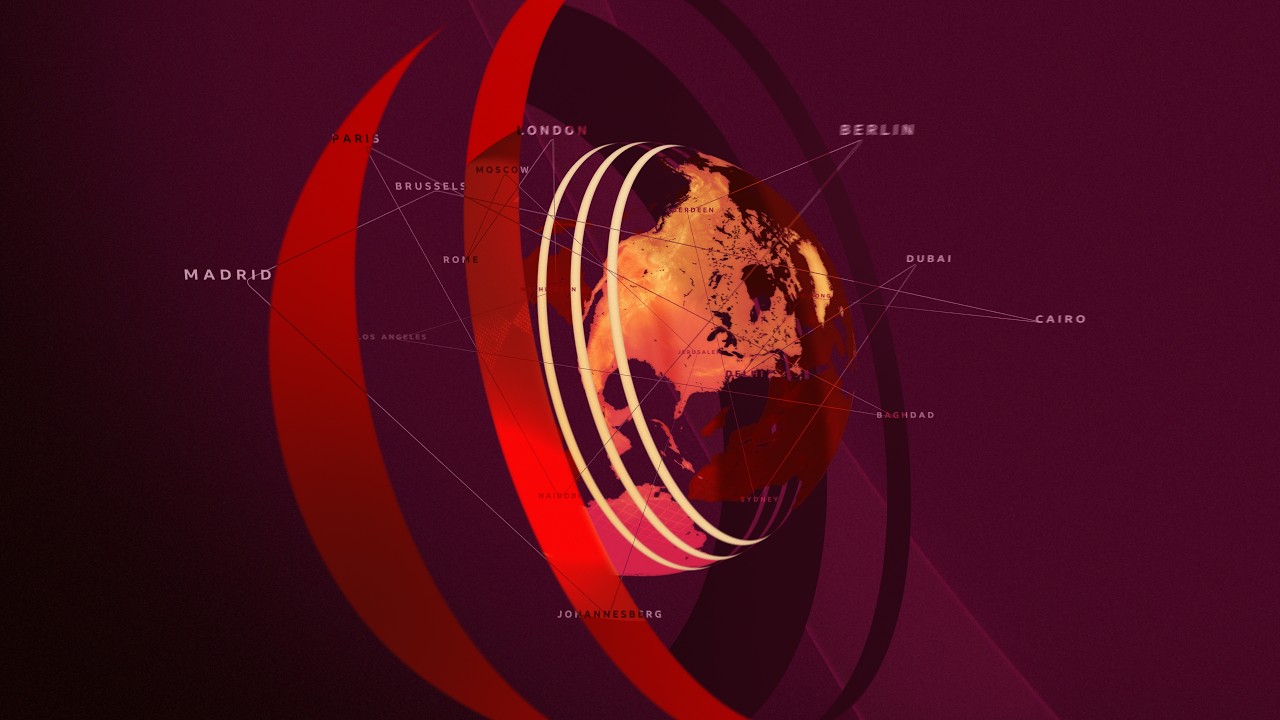
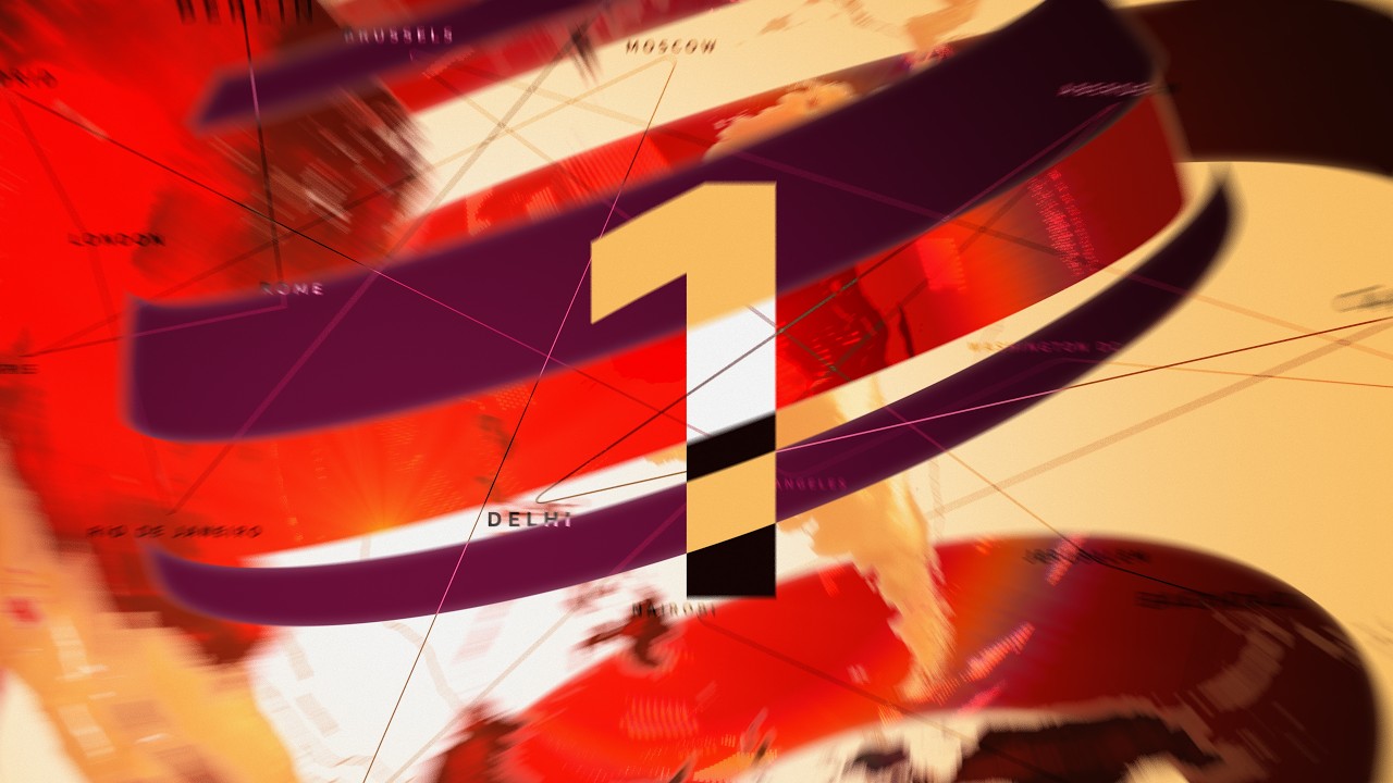
not everyday i post someone else’s mocks, but Martin Anderson has done some stuff to refresh BBC News… 
Not a fan of the egg shell colour.


