It’s too white. Just like television hosts in this country. ![]()
Speaking of that, How did WIN deal with the Nine watermark today?
The amount of desks that the Nine Network go through is astonishing!
The new look is better, but as other have said, still looks like a wall with a desk. Very temporary looking.
Unsure how I feel about the graphics, its very Nine News, but then again Nine News could be changing.
2 Likes
Can’t say I’m 100% over the moon with either Sunrise or Today…
BUT this Today set is pretty good, looks much less ‘fussy’ than Sunrises.
I guess they’ll wear on us during the year.
3 Likes
anybody get a video of the opener or anything?
This was from Sydney City TV.
7 Likes
I think the main difference between the Today set and the Sunrise set is the background, Today’s background screen can change depending on topic.
1 Like
He opener is very GMA.
The breaking news bumper instantly reminded me of sunrise though lol
It looks a lot better in video than in stills in my opinion.
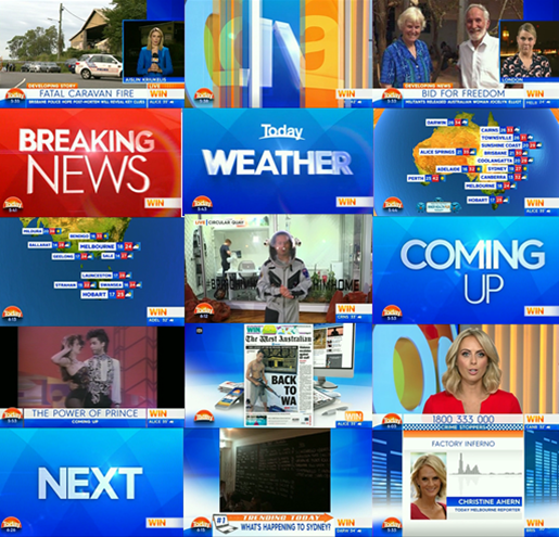
Thanks @Nicholas for the caps. And to fill the gaps. First up the opener.
For anyone instead, between 5.30-7.30, the only thing that has changed format wise is the 7am style news headlines at 5.30, which was introduced last Monday.
1 Like
Pretty sure Sunrise’s can too. Pretty sure they were sitting at the desk yesterday with an MKR red background.
Today’s graphics look flat. Sunrise’s have more depth suited to a news-type show.
Reminds me a little of the 2004 look.
AMP building?
I find the new graphics very simple and 9 News inspired, maybe that is what the were going for. I don’t mind them, nitpicking I would say the headline super and text is too big and should be able to fit the sub-heading in too and like I said for Sunrise the weather map should have also been updated . Set caps and criticisms in the AM.
2 Likes
Having had a proper look, I’m going to say that most of the graphics look better than Sunrise. The subtle 3D and 2D mixture is much more modern and in-keeping with design trends, in comparison to Sunrise’s obsession with 3D everywhere.
3 Likes

Love the colour palette and the general vibe, really resolves all the issues I had with their previous look (drab, dark, everyone looking Trump orange) without actually making any substantive changes. Liking the newsier look, too.
The set looks great in close up shots, particularly news and sport. Looks awkward and cheap when seen in full, and that soft set area is really weak.
For such a huge, flexible studio they’re still very much restricted in what they can do compared to Sunrise’s great-from-every-angle set.
7 Likes
That’ll about do it for this relaunch thread. The main thread will re-open momentarily.
1 Like