Ten probably could do with an On-Air Presentation refresh, but the chances of them changing their logo (or going back to the type of graphics they did ten years ago) in the foreseeable future are approximately 0%. It’s like the people who want “Move Closer To Your World” to be used by Ten as their news theme again…why?!
That’s what I hope for to happen eventually. I just feel that Ten’s creative efforts for On-Air Presentation was very different to what the other networks had between the early to mid 2000s. I was just using previous examples of their On-Air Presentation attempts to show how Ten was creative in refreshes.
I don’t think at all Ten needs a new logo, but at least just use the variation of the Ten HD version. Ten was always tweaking the blue and yellow version for years, using 3D, flat and glossy for most of the 2000s, as it didn’t shift too far away to the corporate logo.
I’m not asking for something we’ve already seen, I’m just hoping it’ll be something creative that Ten hasn’t done.
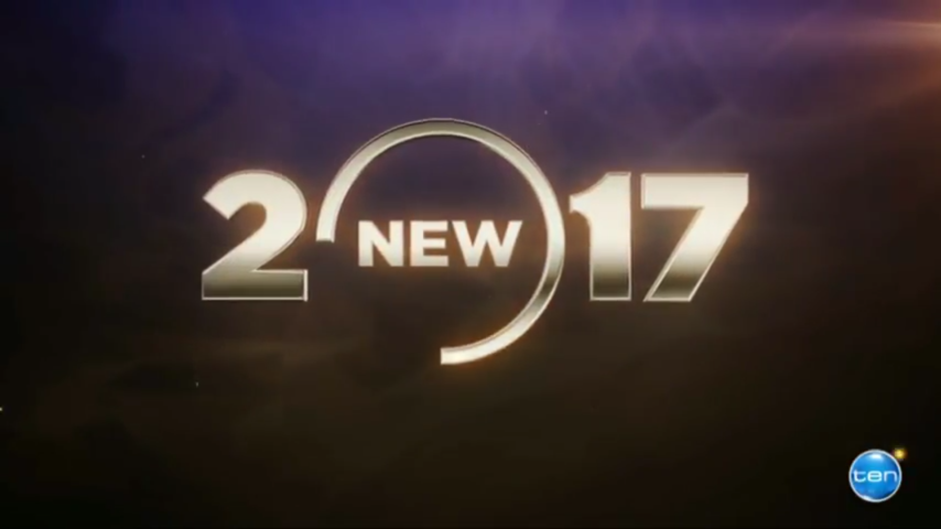
I wonder if the 2017 lineup promo, especially this cap, is a sign of a new refresh of ten’s on air presentation? I’m not holding my breath for it though. But I quite like the 3/4 circle thing going on there. Would it look to 80s if that was the ten logo?
For anyone wishing Ten would do a massive rebrand, perhaps with a new logo, be careful what you wish for…
If Ten’s largest shareholder gets his way & media ownership laws are relaxed, he may well do what he did to the other TV stations he’s bought and inflict the always large & solid mappy across his new affiliate’s stations (thanks to TV.Cynic for this image):
I spoke to someone who works at Ten about the “new” 10 logo and was told it was on the cards to change it and then the Foxtel thing happened and they pretty much shelved the idea with everything that was going on at the time being more important.
I know a lot will disagree, and I’ve said this before. Ten should completely start off fresh, with a new logo and visual presentations, or adopt the current ten HD logo as their main logo.
Well I watch Via WIN, so I get to see what WIN dishes up unfortunately. I always liked Seriously Ten, it just sounded a bit different, but those days are unfortunately gone.
I know a lot here are talking about a possible relaunch of ten and it’s multichannels, which I unfortunately don’t see happening soon, so how old is the current package on Channel ten?


 Could do worse!