What? Can you show me?
What is yellow exactly?
Yes, I’ve seen the changes and read the press release a few days ago. When he said “up”, I thought he meant the current bulletin, not the App.
The amazing thing about the ABC’s apps is that there’s so much redundancy. Why are they bothering with an ABC Radio app, when I can now stream radio on the ABC app? Why have they bothered with a Triple J app likewise?
1 Like
EXCLUSIVE. Everyone seems somethings up about the radical new look of the ABC App, so I felt I could elaborate on what I think is happening.
Everyone, I’ve been wanting to write this post for about 2 weeks, but I haven’t gotten around to it until now. I’ve made a few significant discoveries in the past few weeks and would like to explain them to you to explain the direction I think both ABC News and the ABC is going next year. I’ll try not to go too off-topic. This will be a bit of a long post. I’ll probably post this to the ABC Operations discussion too, but would like to explain here since we are on this topic.
To start off: The new ABC News logo.
Everyone was a bit skeptical about the font chosen for ‘NEWS’ when it was first revealed in early November. To my understanding, the new font is not any random one picked from the thousands in the ABC’s font library, it is in fact a new custom font family dubbed, ‘oneABC’ that has been designed by ABC’s new ‘Digital Network’ department that replaced the ‘ABC Innovation’ department in 2015. The goal of the ‘oneABC’ font family is to replace the thousands of fonts the ABC currently uses, in favour of one font family used in the Corporation.
To quote the ‘oneABC’ blog post:
And so we set out to create a single font family that was best in class for readability and accessibility. It would be designed to replace the thousands of font configurations in use across the ABC, allow for a proud, uniquely Australian typographical expression, and align with our charter to deliver content that contributes to our national identity. A single ABC font family would also reduce annual licensing costs associated with the numerous fonts currently used across the organisation.
We have already seen evidence of this font in use already by the ABC so far, though haven’t noticed it that much, as both ABC ME (with the logo and On-Air Presentation), the ABC Radio rebrand teaser, the 2017 upfront trailers, some ABC News pages and now the App fully have all used the ‘oneABC’ font family in some way, as you can tell by the letter characters themselves. I highly expect we’ll see this font family used entirely for graphics in the rebrand next year, so no more Gotham or any other fonts as it seems the ABC want one font only corporately.
You can read more and watch a video here: https://digital.abc.net.au/2016/04/22/oneabc-typeface/
Second point: The yellow colour & website.
If you go to the ABC’s about page, (http://about.abc.net.au/), the website is using a completely new refreshed cleaned up design a few weeks now, as well as the “classic” ABC logo and yellow for press releases. From my understanding so far, it seems the ABC is dropping the classic blue as the corporate colour in favour of yellow instead. The upfront trailers were predominantly yellow instead of the gradient blue we’ve seen since the 2014 relaunch. And now the new look App that launched this week has dropped the darker corporate blue for the yellow and is now using the white and black colour scheme like the ABC News rebrand. They’ve also dropped the ‘ABC’ wordmark in the App in favour for the iconic factor of the “classic” logo to express the ABC as it’s one of the most iconic logos in Australian history. ABC ME, News and soon Radio have both dropped the ‘ABC’ wordmark to indicate this. Regarding the design of the About page on the ABC’s website, I expect that to replace the current design of the website, and judging from the App itself, I expect the black, white and yellow will become more prominent next year, both on TV, digitally through the website and apart of the Corporate Identity as it’s clear they are dropping the 2000s logo and current corporate identity.
To finish: It seems the ABC is going through a corporate rebrand, and ABC ME, News, Radio, the website and now the App seems evident of this. It also seems they are trying to also merge the Corporate and Television identities together for one unified identity. I know this was a huge post, but I thought that could shed some light on what may be happening next year. ![]()
16 Likes
Thank you, that was an excellent read.
I think this corporate overhaul was going to happen from the moment the main ABC station dropped the metallic lissajous in favour of the 2D version. That being said, I really, really hate the yellow; light blue just worked better and was a nice evolution on their previous corporate identity (which was more dark blue).
In addition, yellow is seen as quite a ‘weak’ colour, whereas blue is more ‘authoritative’ and red more ‘emotional’. Colour choices are important in branding because various colours elicit various subconscious responses. There are a host of reasons why Telstra and Nine use multiple colours across their brands nowadays (although both use predominantly blue for the more ‘serious’ areas, such as Business plans and Nine News for Telstra and Nine respectively). It’s the exact same reason why the announcement of a black colour scheme for ABC News attracted some criticism off the bat on this forum - black is dull, uninteresting or in some contexts grim.
I do like the creation of a corporate font however. Sky and ITV in the UK, and more recently CNN, have been employing in-house fonts across all their outlets, as to subliminally show some form of ‘unity’ across platforms. The font you see on Sky News on TV is the exact same one you’ll see on Sky Atlantic and on the Sky website. BBC One also made a font for itself back in 2006.
The ABC deploying a font across its various brands is a good strategy; until the relaunch of ABC Me, the ABC TV services had logos from three separate eras of branding. The next step will hopefully be an overhaul of ABC2 to bring it into line with the other services, most likely with oneABC being the font for the TWO/2. The real test will be whether the ABC maintains consistency - many outlets begin deviating from branding guidelines almost instantly, creating the exact same dilemma the guidelines were supposed to prevent.
Good research.
p.s. on that video about the creation of oneABC, there is a very sneaky A-B-C theme interwoven into the music. Awesome.
2 Likes
You can add the new ABC HD logo to the list too.
Great read indeed.
1 Like
Fantastic post! Thank you so much for your research and analysis and thought. Beats the “seven had massive win” / “ten will be disappointed” posts that dominate MS.
And gosh. A 2 minute trailer and specific web page about a new font
If only abc put this much effort into launching an HD channel
Ironically the trailer for the font looks HD to me
Something abc can’t manage on air
4 Likes
I hope that yellow doesn’t appear anywhere on air. Horrific.
Knowing how useless and amateur-hour the ABC is compared with every other state broadcaster in the world though, it wouldn’t surprise me.
In a way, the yellow reminds me of the Australian Outback and our indigenous culture in a way. I kinda like the change a bit, though I’ll miss blue being the primary colour, and it seems some people already dislike the yellow and the black and white colour scheme judging from the new reviews since the new look App launched. This picture of Gough Whitlam passing over the land through the symbolic pouring of the sand to Vincent Lingiari as the App’s download page further enforces that for me:

Unfortunately, it seems the inconsistencies have already started in some parts from what I can see, with 2 already with the ABC ME brand. The Middle of The ‘M’ in the ABC ME has a sharp point, where as the ‘M’ in the oneABC font family is flat. It is probably an aesthetic choice for the design as it does make it look more playful, so I can see why they did that. However, some parts of ABC ME’s branding uses a round font that is not apart of the oneABC font family as you can tell the letter characters are different. The ABC should request the Digital Network department to create a round font variant to add to the existing family. Another inconsistency is the new ABC Radio logo. While the teaser trailer uses the oneABC font in the introduction, the new logo uses the current Radio font instead for the word ‘Radio’ and the State name.
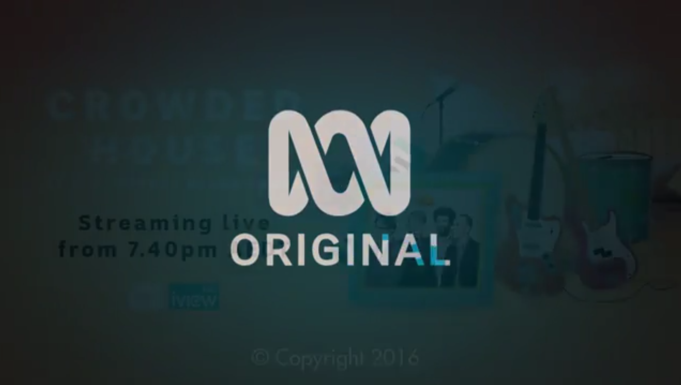
Another inconsistency (or inconsistencies) was after The Crowded House performance. The ABC has a new production ender that no longer uses the Corporate logo, and instead uses the “classic” logo and the oneABC font for the word, ‘ORIGINAL’. However the colour used for the background is a gradient blue instead of yellow, and the Copyright text is in a completely different font. The “classic” ABC logo also animates as fragments instead of the forming worm animation they have now, and the ‘ORIGINAL’ texts also animates similar to ABC ME’s On-Air Presentation. I think if The ABC’s Digital Network want to make the goal of only one font in Corporate use with the creation of the oneABC font family, I’d imagine The ABC will retire the current corporate identity, (that was originally introduced in 2001 I might add!) and create new strict brand guidelines in 2017 and onwards using the ‘classic’ logo and yellow, black and white colour schemes.
I know, I loved that too! Glad The ABC has gone back to using the classic jingle since the 2014 relaunch. It’s instantly recognisable, and can be adapted into different tunes as the #ourabc promos have shown. ![]()
Thank you! I appreciate all the nice comments everyone has given me. I had been dying to share as it felt very significant changes are happening across all of The ABC, and could explain all the changes that have been happening recently both on air with the approaching News rebrand and off air with the also approaching Radio rebrand. ![]()
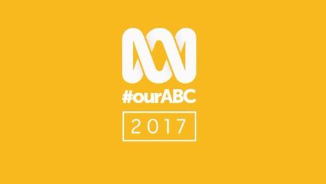
It seems The ABC as I said is going though a Corporate Rebrand by merging both Corporate and Television identities, and is retiring the blue in favour of the yellow, so I imagine, you’ll be seeing the yellow, black and white colour schemes both on and off air in the near future more frequently. The 2017 Upfronts uses the same yellow prominently in all trailers:
And as well as the fact the “classic” logo will be used again Corporately for the first time in 15 years. It’s really a timeless and iconic Australian logo, so it makes sense when going digital.
5 Likes
Yellow caaaaan work… I guess. This was a pretty famous campaign by not-our-ABC back in the day; it took them to #1 in the ratings.
1 Like
ABC is a PUBLIC Broadcaster, not a STATE Broadcaster. There is a difference
2 Likes
True. However, I don’t think anyone understood the term state broadcaster to mean that the ABC was the propaganda arm of the Australian communist government, did they?
No, but it’s the exact kind of word play some quarters love to participate in. State broadcaster obviously sounds more negative than public, therefore it has a subconscious impact.
Kinda like “alt-right” or “gay marriage dissenters” - solid rebrands, but pretty transparent.
1 Like
Er, strike me down dead, and my mother too, if I was ‘transparently’ trying to ‘rebrand’ the ABC as an arm of the communist Australian Government. Ridiculous. Truly nutcase level.
My statement was in reference to new graphics - and sorry, no, I wasn’t comparing with North Korea state broadcasters new idents and theme.
1 Like
No idea what you’re even on about here. Tinfoil hat time.
There are several meaning to ‘State Broadcasters’ depending of its function and funding.
Just because you aren’t aware of what those terms mean, doesn’t mean I’m tinfoil. It just means you don’t know.
You’re confused.
Two things:
A) It means I don’t know.
B) It means you’ve linked me making a passing remark about the ABC’s new graphics, to individuals who supposedly ‘solidly rebrand, but pretty transparently’ the terms “alt-right” and “gay marriage dissenters”. You’ve linked a statement of an individual, to the motives of some kind of invisible conspiracy group who seek to rebrand certain terms. That is as tinfoil hat as it gets.